

Minimalist gallery walls focus on intention over quantity. This guide shows practical steps to plan a layout, pick art that reads cleanly, and use space to make each piece feel elevated.
You’ll get actionable criteria and mistakes to avoid so your wall looks curated, not cluttered. Follow these guidelines whether you’re styling a living room, bedroom, or hallway.
- Planning a Minimalist Gallery Wall Layout
- Choosing Artwork for Minimalist Displays
- Leveraging Negative Space as a Luxury Signal
- Selecting Frames, Mats, and Color Palette
- Arranging Consistent Spacing and Alignment
- Installing Hardware for Clean, Safe Hanging
- Common Minimalist Gallery Wall Mistakes to Avoid
- Maintaining and Refreshing a Curated Wall
- FAQ
- Final Thoughts
- Related Decor Reads
Planning a Minimalist Gallery Wall Layout
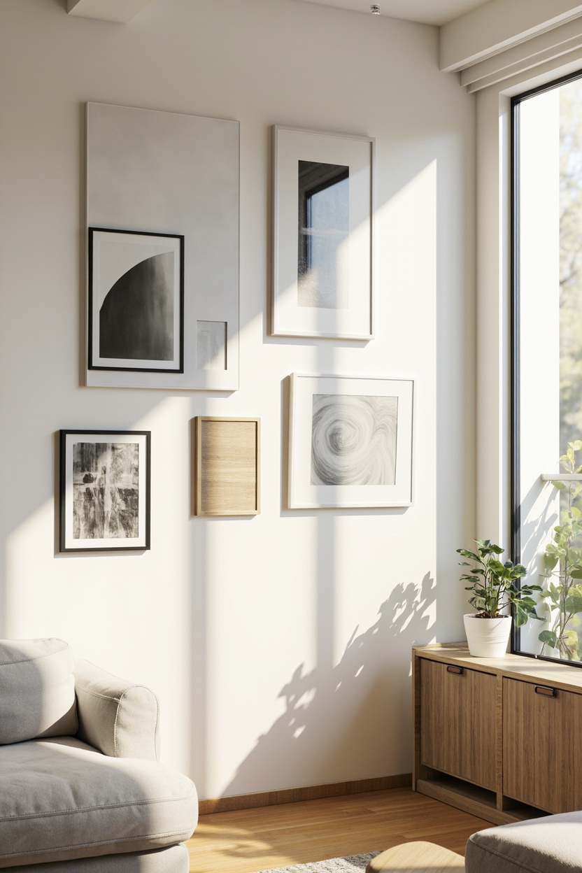
Start by defining the wall’s role: focal point, backdrop, or subtle accent. That determines scale, frame choices, and how much space to leave around the arrangement.
Practical steps:
- Measure the wall and draw a simple to-scale sketch. Work in inches or centimeters for precise spacing.
- Decide a maximum footprint—keep art within 60–75% of the wall width for breathing room.
- Choose a primary anchor piece (largest or most striking) and plan other pieces around it to create hierarchy.
- Set consistent spacing between frames. For minimal looks, use 2–4 inches (5–10 cm) for tighter arrangements, or 6–12 inches (15–30 cm) for an airy feel.
- Mock up with paper templates taped to the wall before committing to nails or hooks.
Decision criteria:
- Scale vs. sightline: Hang the center of the arrangement at eye level (about 57–60 inches / 145–152 cm) unless it’s above furniture—then center relative to that furniture.
- Symmetry vs. asymmetry: Symmetry reads formal; asymmetry feels curated. Choose one and keep consistent spacing to maintain cohesion.
Mistakes to avoid:
- Filling the entire wall edge—to—edge—this kills the minimalist intent.
- Varying spacing or frame styles randomly; inconsistency makes the layout look haphazard.
Choosing Artwork for Minimalist Displays
Select art with clear visual language: limited color palettes, strong negative shapes, or simple line work translate best at a distance. Aim for pieces that communicate quickly without visual noise.
Actionable selection tips:
- Limit the palette across the group—two to three colors maximum keeps the wall cohesive.
- Mix scale thoughtfully: pair one large piece with smaller supporting works rather than many similarly sized items.
- Use matching or subtly varied frames—same color or material ties the set together without being literal.
- Consider prints, originals, photographs, or textile art—texture can add warmth while staying minimal.
Decision criteria:
- Contrast and legibility at distance: stand back 8–10 feet to test whether each piece holds up visually.
- Emotional fit: choose work that supports the room’s mood—calm neutrals for rest areas, bolder shapes for active zones.
Mistakes to avoid:
- Selecting pieces only for sentimental value without regard to scale or color—they can break the minimalist balance.
- Over-relying on very small works that disappear on larger walls.
Leveraging Negative Space as a Luxury Signal
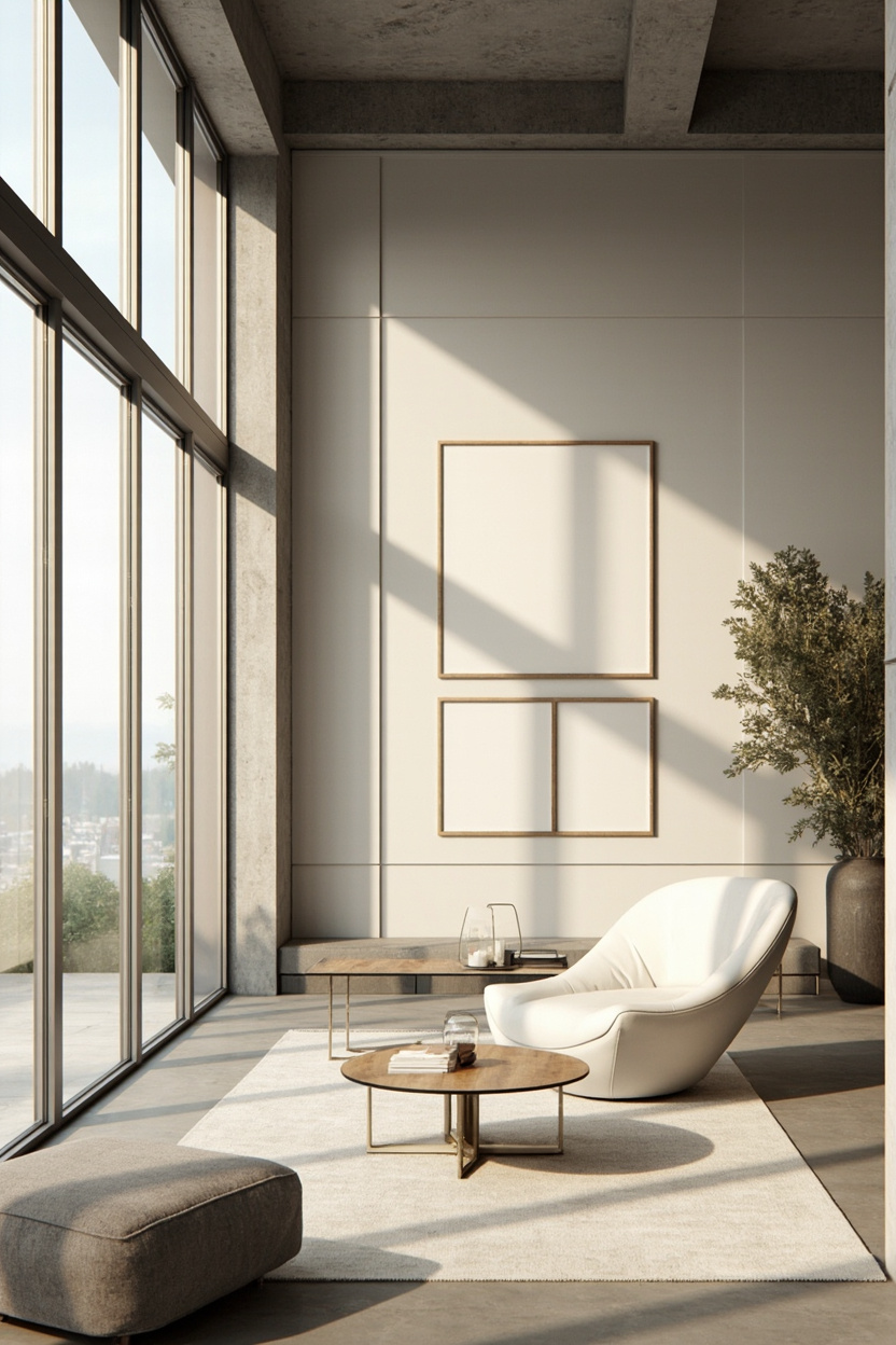
Negative space is a core minimalist tool. Generous gaps between frames and between the arrangement and the surrounding wall signal restraint and intentionality.
How to use negative space effectively?
- Make spacing part of the composition—treat blank areas as deliberate elements, not leftovers.
- Increase margins around the gallery by 20–30% compared to denser layouts to emphasize calm and luxury.
- Use wall color and texture to enhance empty areas; a subtle paint contrast can make negative space feel purposeful.
Implementation guidance:
- If you have a large wall, scale up the spacing rather than adding more pieces.
- When pairing with furniture, leave visual breathing room above and to the sides of the arrangement—don’t let the gallery compete with the piece below.
- Regularly reassess: remove one piece if the composition feels busy. Less often reads as more.
Mistakes to avoid:
- Filling negative space with unrelated decor like shelves or many small objects; that erodes the minimalist effect.
- Using tiny spacing rules for all projects—context matters. Bigger rooms need bigger negative space.
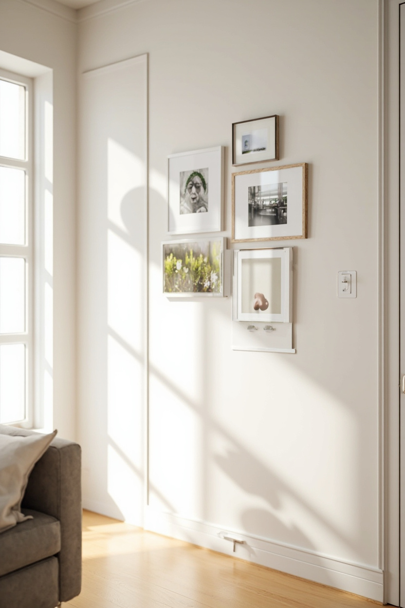
Selecting Frames, Mats, and Color Palette
Choose frames and mats that reinforce the minimalist intent: thin, flat-profile frames in one or two finishes (black, white, or natural wood) keep the look unified.
Mats create breathing room; use larger mats for smaller artwork to increase perceived scale and negative space.
For the color palette, limit artwork colors to a restrained scheme, monochrome, two neutrals plus one accent, or muted pastels, to avoid visual clutter.
- Decision criteria: match frame finish to existing hardware or dominant trim color for cohesion; pick mat widths between 1.5″–4″, depending on frame size.
- Mistakes to avoid: mixing many frame styles, using overly ornate frames, or relying on tiny mats that negate the effect of negative space.
- Implementation guidance: pick samples and lay them on the floor next to a wall swatch; photograph in room light before committing.
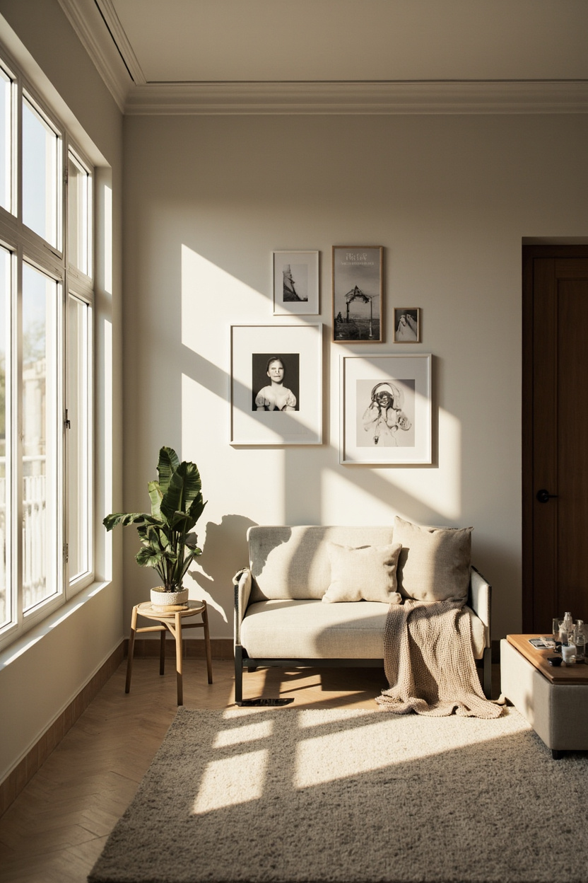
Arranging Consistent Spacing and Alignment
Consistent spacing is the hallmark of a minimalist gallery wall. Aim for generous, uniform gaps—3″–6″ between frames works well for contemporary rooms, while 2″–3″ suits cozier spaces.
Treat negative space as a design element: leave larger margins around the whole grouping to frame the cluster within the wall.
- Layout rules: choose a central axis (horizontal or vertical) or an invisible grid to align frames; align either centers or edges, not both.
- Practical method: cut paper templates of each frame and tape them to the wall to tweak spacing before drilling.
- Mistakes to avoid: uneven gaps, mixing too many orientations without a clear rhythm, and placing the grouping too high—eye level for the center of the composition is typically 57″–60″ from the floor.
Installing Hardware for Clean, Safe Hanging
Use hardware that stays hidden and secure to maintain a clean, minimalist look. Choose appropriate anchors for wall type: toggle or molly bolts for drywall, masonry anchors for brick, and studs for heavy pieces.
For a flush appearance, use D-rings or keyhole hangers paired with picture hooks or a level rail system.
- Decision criteria: weight of frame + mat determines anchor type; lightweight (under 10 lb) can use small picture hooks, medium weights need anchors, heavy pieces should hit studs or use heavy-duty anchors.
- Tools and steps: measure and mark centers, use a level and tape measure, pre-drill pilot holes for anchors, hang one piece, and check the level before finishing the rest.
- Mistakes to avoid: relying on single-point hanging for large frames, skipping wall-test checks, or inconsistent hanger heights on different frames.
- Maintenance tip: keep spare anchors and a small touch-up paint sample nearby for quick fixes after removals or adjustments.
Common Minimalist Gallery Wall Mistakes to Avoid
Minimalist gallery walls rely on restraint and clarity. Avoid common errors that turn intent into clutter.
- Overfilling the wall. Negative space is deliberate — leave consistent gaps between frames. Aim for 3–6 inches for smaller rooms and 6–12 inches in larger, open spaces.
- Mismatched scale. Group pieces with similar visual weight. A tiny print next to a large canvas will feel unbalanced; either mat or reframe the small piece to match the scale.
- Ignoring frame consistency. Too many frame styles dilute minimalism. Limit yourself to one or two finishes (for example, thin black and light wood).
- Poor alignment rules. Inconsistent baselines or centers create visual noise. Choose one alignment rule (center line, top row, or bottom row) and stick to it across the arrangement.
- Neglecting room context. Color and subject should relate to the room’s palette and function. Art that competes with dominant decor choices breaks harmony.
- Focusing only on quantity. Collecting many pieces doesn’t equal impact. Curate fewer, stronger works that share a thread: color, texture, or concept.
- Ignoring lighting. Flat, uneven lighting flattens even great compositions. Use adjustable picture lights or directional track lighting to highlight pieces evenly.
- Skipping mockups. Failing to test layouts leads to wasted holes. Use paper templates or an adjustable hanging system before committing.
Maintaining and Refreshing a Curated Wall
Once a gallery wall is up, follow simple routines to keep it intentional and fresh without losing its minimalist impact.
- Seasonal swaps. Rotate one or two pieces every 3–6 months to keep the composition lively. Swap colors or textures rather than changing the whole layout.
- Regular cleaning. Dust frames and glass monthly. Use a microfiber cloth and gentle cleaner to avoid streaks on glass or damage to frames.
- Track visual weight. If the room’s decor changes, reassess the wall’s balance. Move a darker or denser piece if it starts to dominate.
- Document your layout. Photograph the arrangement and measure spacing. That makes re-hangs exact and fast after swaps or moves.
- Introduce only one new element at a time. Test impact by adding a single print or object. If it disrupts harmony, remove it rather than cascading changes.
- Refresh mats, not frames. Changing the mat color or width refreshes the look affordably and preserves frame consistency.
- Re-evaluate negative space yearly. Trends favor more generous gaps. If your wall feels busy, increase spacing gradually to restore airiness.
FAQ
Use 3–6 inches for cozy rooms and 6–12 inches in spacious areas. Consistency matters more than exact measurements.
Yes. Anchor the wall with a dominant palette or repeat a color across pieces to keep cohesion and prevent visual conflict.
No. Various sizes but match visual weight through matting and frame thickness. That keeps interest while preserving balance.
Cut paper templates of your frames and tape them to the wall. Photograph the mockup and adjust spacing before drilling any holes.
Final Thoughts
Minimalist gallery walls succeed when you prioritize negative space, consistency, and thoughtful edits. Curate slowly, test layouts, and refresh subtly to keep the wall impactful over time.
Related Decor Reads
Read Next: 14 Craftsman Home Plans Blending Beauty and Function
Read Next: 12 Two-Story Home Plans Maximizing Every Square Foot
Read Next: 15 Small Home Floor Plans Under 1500 Sq Ft Done Right
Read Next: 20 Open Concept Floor Plans That Actually Work for Families
Read Next: 13 Gray Farmhouse Kitchen Ideas That Feel Fresh and Timeless
Read Next: 12 Farmhouse Living Room Sofa Styles That Set the Tone
Read Next: How to Read Architectural Floor Plans Before You Build
Read Next: 15 Farmhouse Teen Bedroom Ideas They’ll Actually Want
Read Next: How to Mix Farmhouse and Modern in the Bedroom
Read Next: 18 Ranch Style Home Plans Spreading Out on One Level
Read Next: 15 Minimalist Desk Setups That Inspire Deep Work
Read Next: 20 DIY Headboard Ideas from Fabric to Wood to Cane
Read Next: 16 Boho Living Room Color Combinations That Shouldn’t Work but Do
Read Next: 14 Minimalist Shower Ideas from Walk-In to Wet Room
Read Next: 15 DIY Fireplace Surround Ideas Transforming the Room
Read Next: 15 Home Renovations That Pay Back at Resale
Read Next: 18 DIY Outdoor Pergola Plans for Covered Patio Living
Read Next: 15 Home Network Infrastructure Ideas for Seamless Coverage
Read Next: 12 HVAC System Choices for Every Home Size and Climate
Read Next: 18 DIY Summer Centerpiece Ideas with Seasonal Flowers
Read Next: 20 Spring Outdoor Patio Decorating Ideas Opening the Season
Read Next: 13 Summer Entertaining Outdoor Setup Ideas for Any Size Yard
Read Next: 14 Farmhouse Garage Door Styles That Boost Curb Appeal
Read Next: 12 Boho Sectional Sofa Styling Ideas for Maximum Comfort
Read Next: 17 Boho Bedroom Canopy Ideas for a Dreamy Retreat
Read Next: 19 Cottage Garden Ideas from Wild to Structured
Read Next: 16 Cottage Nursery Ideas Timeless and Tender
Read Next: 13 Farmhouse Fence and Gate Ideas Defining Your Property
Read Next: 20 Tiny Home Plans Under 500 Sq Ft That Have Everything
Read Next: 12 DIY Built-In Bookcase Projects for Any Skill Level
Read Next: 18 Staircase Railing Ideas from Iron to Cable to Wood
Read Next: 15 Black and White Farmhouse Exterior Combinations
Read Next: 12 Winter Home Decor Ideas After Christmas Comes Down