

Warm neutrals are the backbone of modern boho: think sand-warmed whites, driftwood taupes, and soft beige layers.
They create a serene backdrop that lets texture and pattern do the talking, so woven rugs, rattan furniture, and linen drapery read richer without overwhelming the room.
Use warm neutrals to anchor bolder accents or keep the scheme monochrome for a calm, collected feel.
This palette plays well with both sunlit coastal influences and rustic farmhouse touches, bridging trends found in farmhouse interiors and minimalist home decor with ease.
- 1. Warm Neutrals for Calming Boho Spaces
- 2. Sage Green Accents for Organic Vibes
- 3. Terracotta and Clay Warmth Ideas
- 4. Driftwood Taupe for Coastal Boho
- 5. Warm White Palettes with Depth
- 6. Mixing Muted Pastels with Neutrals
- 7. Sunset-Inspired Accent Wall Options
- 8. Earthy Jewel Tones for Texture
- 9. Layered Neutral Textures Strategy
- 10. Bold Patterned Rugs as Color Anchors
- 11. Natural Wood Finishes and Hues
- 12. Moody Boho: Deep Accent Choices
- 13. Soft Metallic Touches for Glow
- 14. Balancing Color with Cozy Furniture
- 15. Plant-Driven Green Color Schemes
- 16. Color Pairings for Boho Minimalism
- FAQ
- Final Thoughts
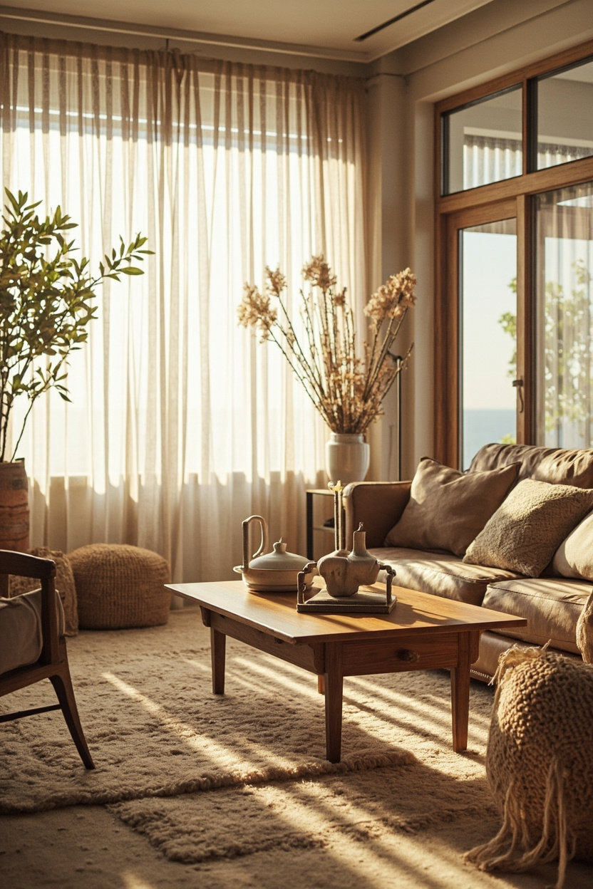
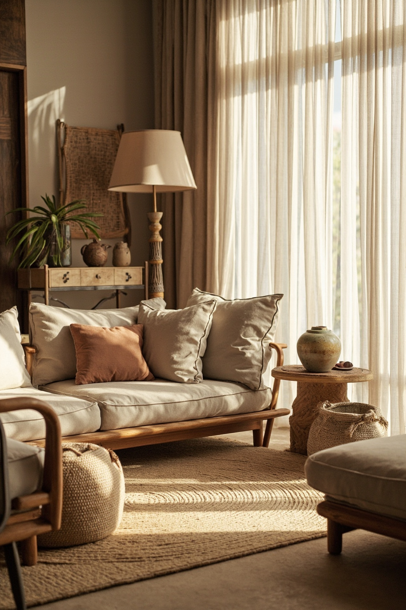
1. Warm Neutrals for Calming Boho Spaces
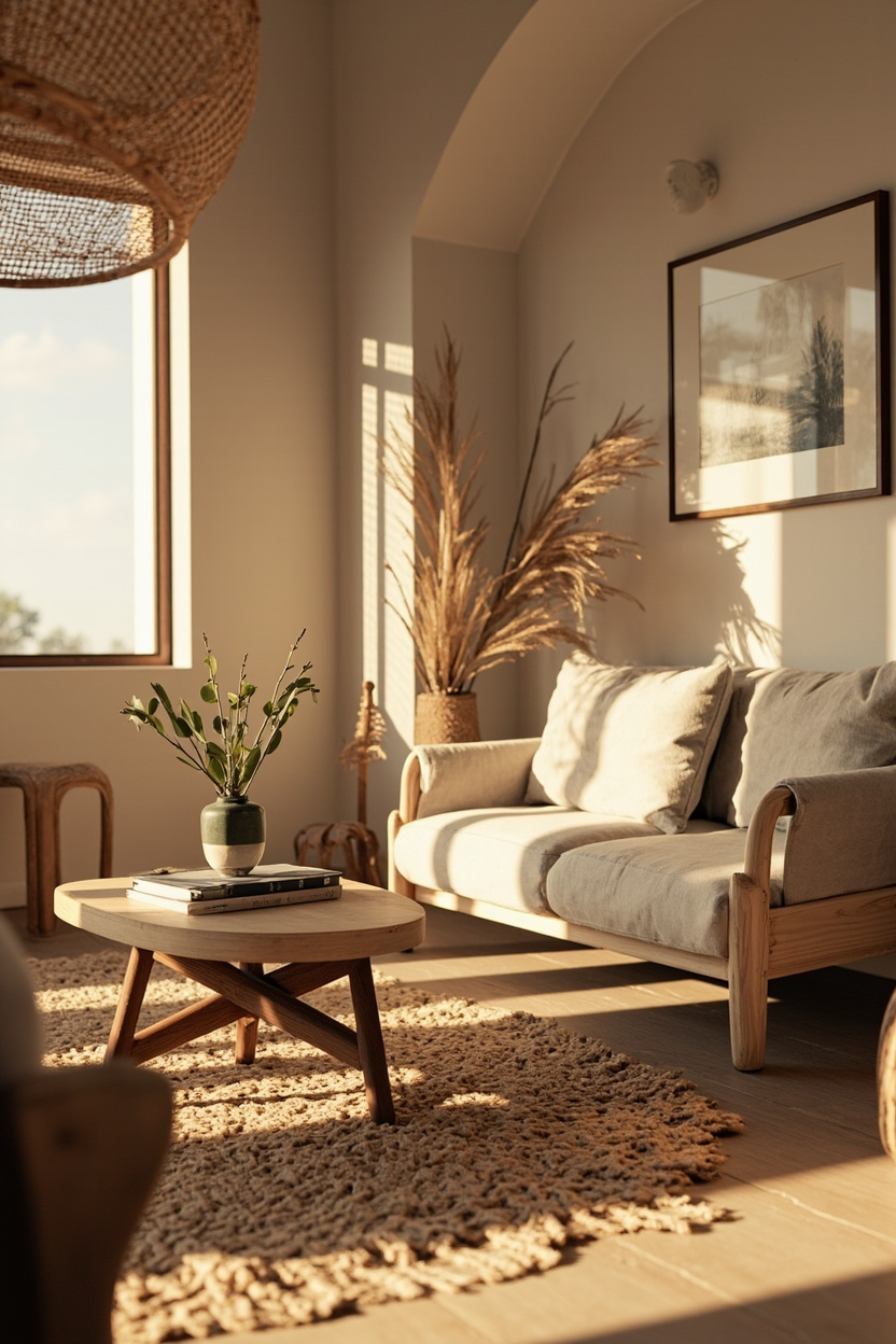
Start with a warm off-white or creamy base on walls to reflect light and soften contrasts. Layer in taupe sofas and sand-toned rugs to build depth; varying these neutrals by texture prevents the room from looking flat and amplifies the boho cozy factor.
Introduce darker wood and leather accents sparingly to ground the palette and provide focal points. A single patterned cushion or a woven wall hanging can deliver personality while keeping the overall mood tranquil and collected.
2. Sage Green Accents for Organic Vibes
Sage green brings an understated, botanical touch that pairs beautifully with warm neutrals and weathered woods. Use it on accent walls, throw pillows, or plant pots to evoke a fresh, lived-in feeling without dominating the scheme.
Combine sage with driftwood taupes and soft clays for a cohesive, nature-inspired look that reads both modern and timeless.
For inspiration on integrating organic tones into structured spaces, see approaches from boho and coastal trends that emphasize gentle, earthy contrasts.
3. Terracotta and Clay Warmth Ideas
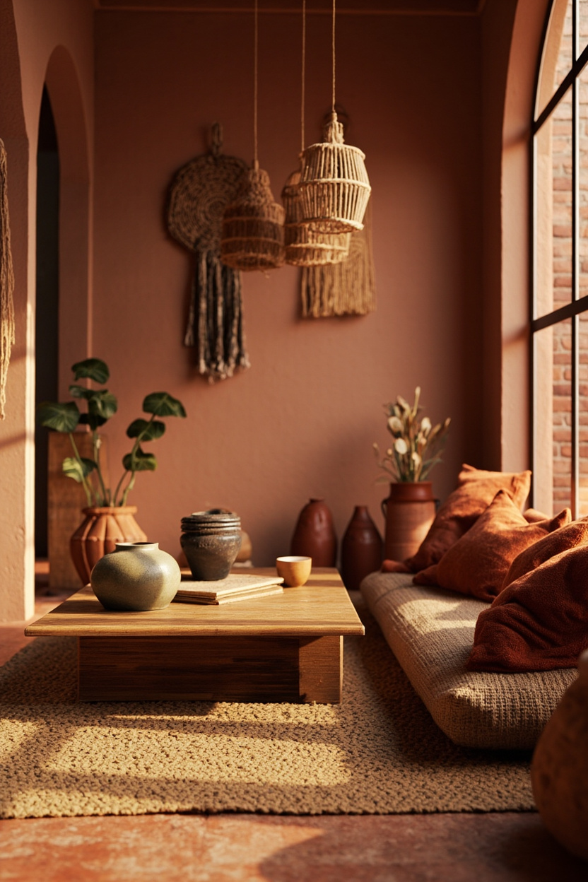
Terracotta and sun-baked clay introduce a sunlit warmth that complements woven textures and macramé details. These hues work well on ceramics, floor tiles, or a statement fireplace surround to add rustic richness without feeling heavy.
Balance the intensity with muted neutrals and pale greens to keep the palette airy; small doses of an ottoman, wall art, or pottery group can provide the right punch while retaining boho’s relaxed, eclectic charm.
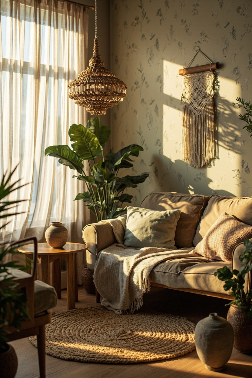
4. Driftwood Taupe for Coastal Boho
Driftwood taupe pairs sandy beige with a hint of gray to evoke weathered boards and sun-bleached textiles. Use it as a dominant wall color and layer in woven rattan, jute rugs, and sun-bleached wood to reinforce the coastal-boho mood without feeling thematic.
Introduce accents in soft sage or sun-baked clay to add warmth and subtle contrast; these hues reference shore vegetation and clay pots for a lived-in, natural palette.
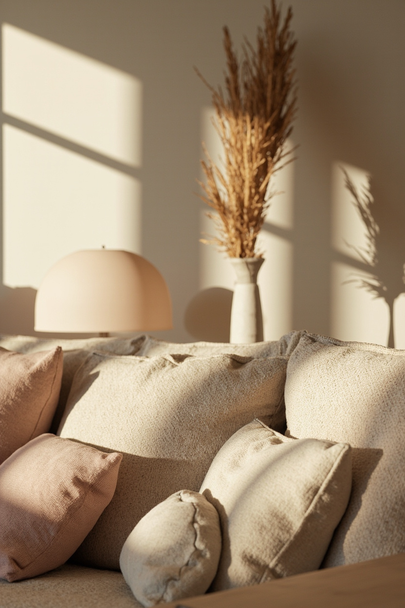
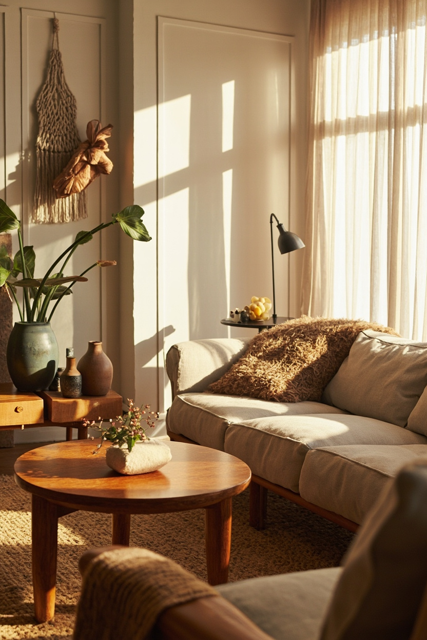
5. Warm White Palettes with Depth
Warm whites—think ivory, cream, and antique white create a light, breathable backdrop while avoiding the sterility of true white. Layer tonal variations on trim, textiles, and plastered walls to build depth; this gives a boho living room an airy feel that still reads cozy and curated.
Anchor the scheme with wood finishes in natural or oiled tones and add tactile elements like macramé, boucle cushions, and terracotta accessories to prevent the look from feeling flat.
For minimalist-forward approaches to light and texture in bright spaces, consider ideas from minimalist bathroom lighting that emphasize warm, thoughtful illumination.
6. Mixing Muted Pastels with Neutrals
Muted pastels, dusty rose, washed lavender, and powdery blue can soften a neutral-heavy boho scheme without becoming saccharine. Keep saturation low and introduce pastels through upholstery, throw pillows, or a single painted accent wall so they feel like natural extensions of a neutral base.
Balance these hues with textural neutrals like linen, raw cotton, and stone to maintain the earthy, collected vibe central to boho design.
For a cohesive result, repeat one pastel across multiple elements at different intensities so the palette reads intentional rather than accidental.
7. Sunset-Inspired Accent Wall Options
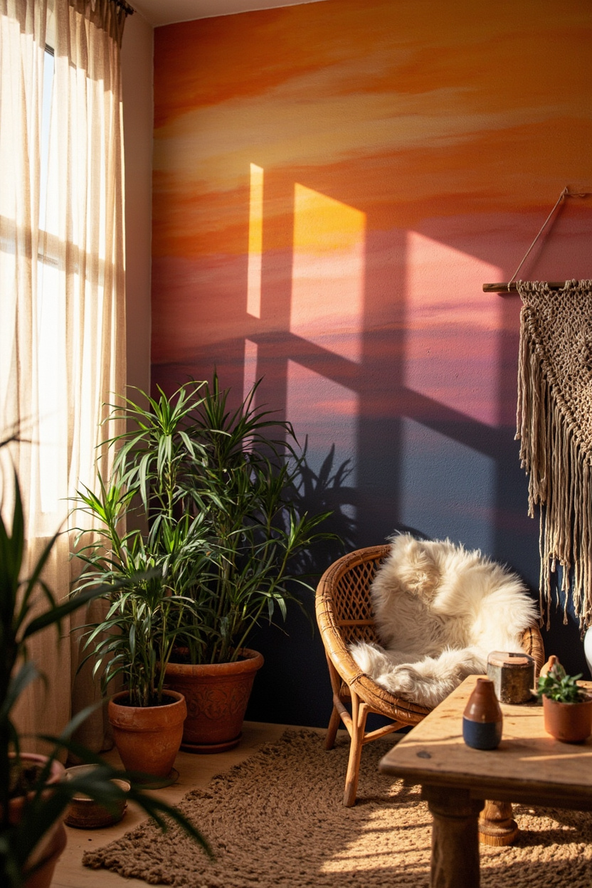
Choose a gradient or block-painted accent wall in sun-baked clay, terracotta, and soft ochre to anchor a boho scheme. These warm hues read like a natural focal point and pair beautifully with rattan furniture and woven wall hangings without overpowering the room.
Introduce contrast with cushions or a rug in driftwood taupe or muted sage to balance the warmth and keep sightlines calm.
For a curated look, repeat one of the accent pigments in smaller decor pieces so the palette feels intentional rather than accidental.
8. Earthy Jewel Tones for Texture
Mix deep emerald, muted sapphire, and burnt garnet across tactile elements, velvet cushions, handwoven throws, and a low-pile kilim to create richness without shine. The contrast between plush fabrics and natural fibers like jute or seagrass intensifies depth while remaining grounded.
Keep walls in warmer neutral whites or sand-warmed neutrals so the jewel tones pop without making the room feel heavy.
A single statement plant or terracotta pot can tie these colors back to the organic, boho-coastal palette.
9. Layered Neutral Textures Strategy
Build interest by layering similar neutrals—creamy warm whites, driftwood taupes, and soft sage undertones—across rugs, upholstery, and curtains rather than relying on strong color contrasts. Vary scale and texture with chunky knits, distressed wood,s and braided baskets to create a lived-in, cozy atmosphere.
Use focused accents like a matte black lamp or a small clay sculpture to provide punctuation and prevent the look from slipping into blandness.
10. Bold Patterned Rugs as Color Anchors
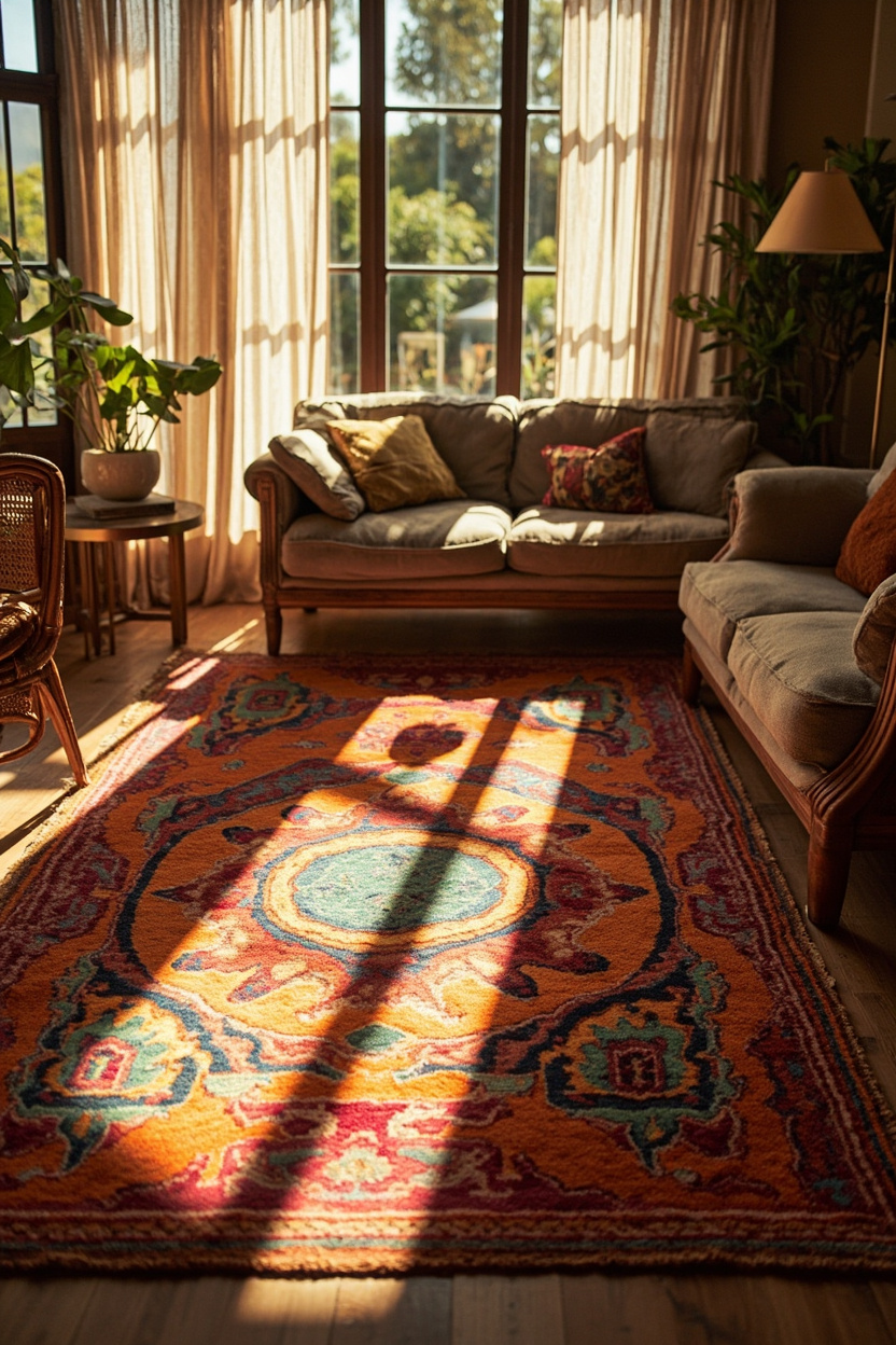
A vibrant, patterned rug can ground an otherwise eclectic boho palette by repeating two or three key hues across the floor. Use the rug’s dominant colors to pull together throw pillows, a lampshade, or an accent chair.
This creates cohesion without feeling matchy-matchy.
Place the rug where it anchors the seating area so smaller pieces pick up its tones; rugs with worn or faded motifs work especially well because they read as lived-in and layer beautifully with natural textures.
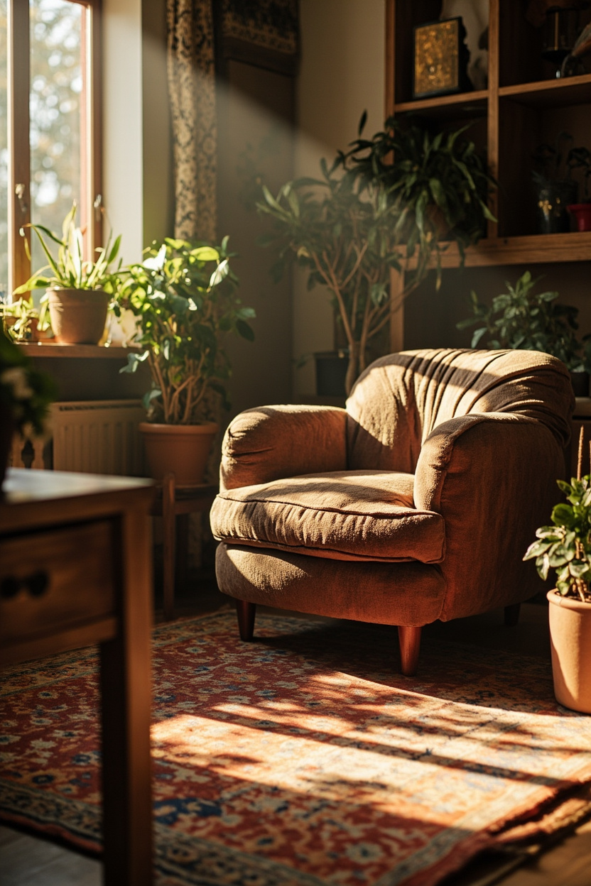
11. Natural Wood Finishes and Hues
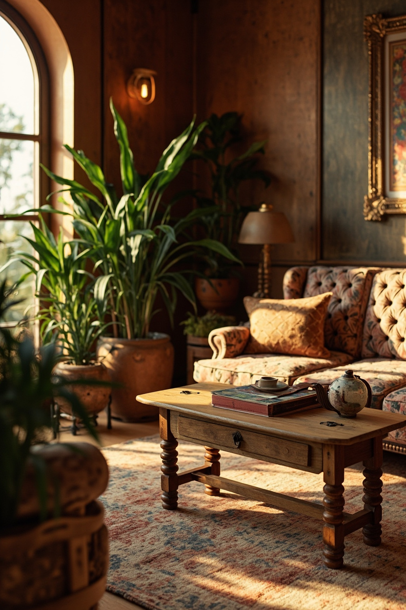
Mixing wood tones, warm honey, weathered oak, and deep walnut, adds depth to a boho room while keeping the color story grounded in nature. Balance varied finishes by repeating a single wood hue in larger pieces (like a console or coffee table) and using others for smaller accents and frames.
Complement wood with soft neutrals or muted greens to emphasize the organic feel; this approach reads intentional and avoids the room looking like an unplanned collection.
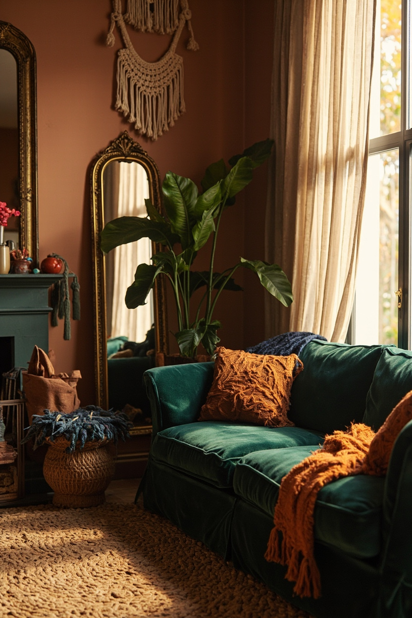
12. Moody Boho: Deep Accent Choices
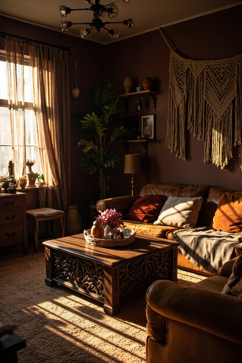
Introducing a broad, saturated accent—think charcoal plum, midnight teal, or oxblood—adds drama without overwhelming a boho scheme when used sparingly. Apply that hue to a single wall, a velvet sofa, or large artwork, then soften it with rattan, macramé, and warm metallics.
Pair moody accents with sand-warmed neutrals and soft sage to keep the look grounded; these calmer tones prevent the deep colors from feeling heavy and echo the 2026 coastal-influenced palette.
13. Soft Metallic Touches for Glow
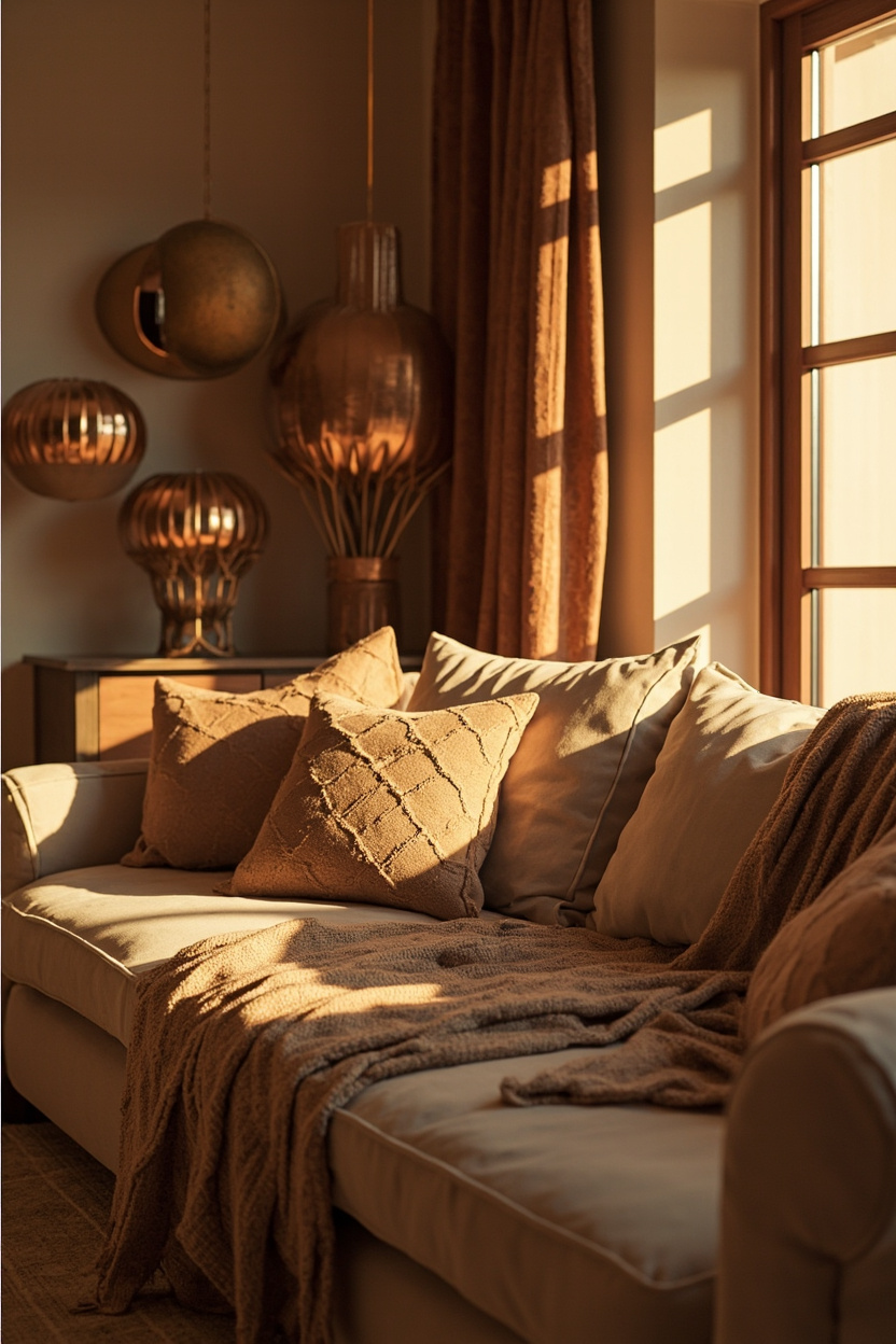
Introduce soft metallics, brushed gold, warm copper, or antique brass as delicate highlights rather than dominant finishes. A metallic side table or thin-framed mirror reflects light and elevates woven textures without competing with the room’s earthy palette.
Combine metallic accents with sand-warmed neutrals and sun-baked clays to keep the glow grounded; the metals add polish while woven rugs and rattan anchor the boho feel.
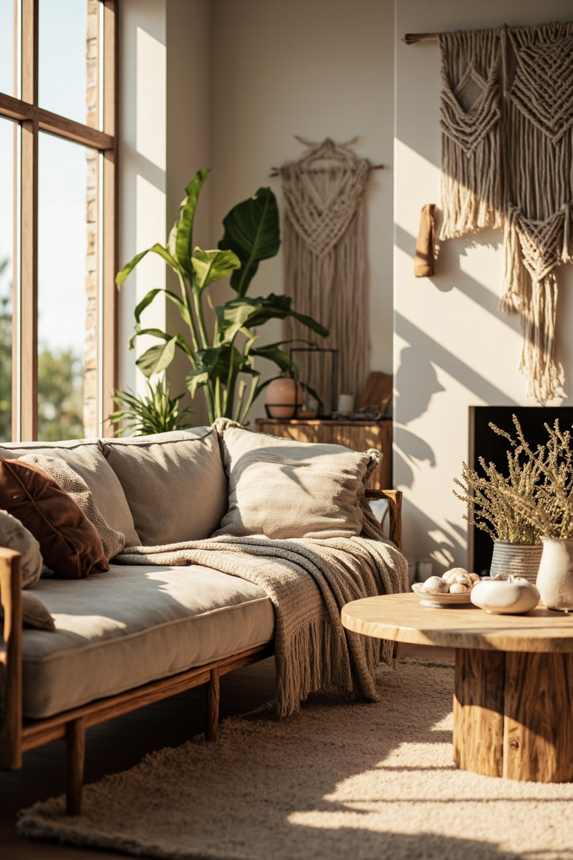
14. Balancing Color with Cozy Furniture
Let furniture shape the color story: oversized sofas in muted terracotta or warm ivory act as calm fields for layered cushions and patterned throws. A plush, low-profile sofa softens vibrant wall colors and keeps the room inviting, while wooden sidepieces in driftwood taupe add depth without overwhelming.
Choose slipcovers and modular pieces that allow seasonal swaps—switch cushion covers in sage or clay to shift the scheme effortlessly.
This practical approach mirrors principles from minimalist home decor, where comfort and restraint work together to maintain a lived-in, styled look.
15. Plant-Driven Green Color Schemes
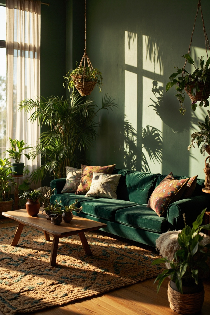
Anchor a boho palette with plants and botanical tones: soft sage walls, olive accents, and mossy textiles mirror foliage and create a serene backdrop for natural textures. Group plants at varying heights and pair them with terracotta pots or woven baskets to layer color and form organically.
Contrast glossy leaves with matte paint finishes and sun-baked clay accessories to prevent the greens from feeling too literal; this keeps the palette fresh and coastal-tinged, echoing boho coastal trends that favor driftwood taupes and warm neutrals.
16. Color Pairings for Boho Minimalism
Start with a warm off-white base—think cream or sand-warmed neutrals—and layer in muted sage and driftwood taupe to keep the palette soft but grounded.
This trio creates airy minimalism with an earthy boho edge, letting textured rugs and woven accents read as focal pieces rather than busy color contrasts.
Introduce a single accent of sun-baked clay or terracotta to add depth without overwhelming the calm canvas. Use it sparingly in throw pillows, a single art piece, or a terracotta planter to make the space feel intentional; the restrained use preserves minimalist principles while delivering the eclectic warmth characteristic of boho interiors.
A useful follow-up is 15 Boho Wallpaper Ideas That Transform a Room Instantly.
FAQ
Successful boho pairings balance contrast with a unifying element—temperature (warm vs. cool), saturation level, or a repeated neutral. When disparate hues share a common undertone or are anchored by natural textures, they feel cohesive rather than chaotic.
Yes. Keep walls and large furniture in the lightest neutral, then introduce deeper boho tones through textiles and decor. This maintains visual openness while still achieving layered color interest.
Matte paint, unfinished wood, and woven natural fibers amplify the relaxed, curated feel. Subtle brass or aged metal accents can add warmth without disrupting the minimalist mood—consider them for lighting or small hardware.
Edit in stages: remove duplicate patterns, consolidate colors into the chosen palette, and replace busy pieces with single-texture alternatives. Focus on the quality of texture over quantity of items to preserve the boho spirit in a pared-back way.
Final Thoughts
Boho minimalism succeeds by marrying restraint with tactile richness—sand-warmed neutrals, soft sages, and a restrained terracotta accent create surprising harmony. Use texture and intentional accents to keep the room warm and layered without reverting to cluttered maximalism.
Read Next: 15 Most Instagrammable Boho Cafe Interior Trends for 2026