

Whimsy home decor is not about clutter; it is about character. On Pinterest, joy-sparking rooms are trending toward artful mischief, where color, scale, and storytelling converge in spaces that still function beautifully day to day.
The best examples balance delightful surprise with design discipline, folding in artisan craft, vintage finds, and one bold focal move per room.
Designers agree this wave is more personal than prescriptive, rooted in pieces that feel made by a human hand and arranged with intention.
As 2026’s reports spotlight whimsy and craftsmanship on the rise, think pattern play, narrative murals, and eccentric art displays that read curated, not chaotic.
My Pick: Quirky Gallery Clusters — I love how they turn a leftover corner into a conversation, letting family snapshots, flea‑market sketches, and kids’ art mingle with restraint and wit.
- 1. Playful Pattern Mixes
- 2. Storybook Statement Walls
- 3. Quirky Gallery Clusters
- 4. Oversized Sculptural Lighting
- 5. Color-Drenched Corners
- 6. Wavy, Wiggly Mirrors
- 7. Vintage Toy Vignettes
- 8. Hand-Painted Furniture
- 9. Unexpected Animal Motifs
- 10. Whimsical Wallpaper Ceilings
- 11. Artisanal Oddities Shelf
- 12. Mismatched Dining Chairs
- FAQ
1. Playful Pattern Mixes
- Effort Level: Weekend DIY.
- Estimated Budget: 200-800.
- Maintenance Level: Low (Vacuum and spot clean).
- Best For: Living rooms and bedrooms needing personality.
A confident pattern mix looks intentional when you vary scale, not just print. Pair a large floral with a mid-scale check and a tiny stripe to keep the eye moving without noise.
Choose a tight color story first, ideally three hues plus one neutral. Repeat each hue at least twice across textiles, lampshades, or art so the room feels cohesive, not random.
Ground the scheme with a solid anchor, like a jute rug or oatmeal linen sofa. Then layer prints on pillows, drapery, or an accent chair, leaving visual breathing room on walls.
Mind material contrast to avoid theme-park vibes. Matte linen, glazed ceramic, and woven grasses temper high-energy prints and add that collected, human texture.
Avoid matching sets. Mix vintage ticking with new chintz, and let a single oddball cushion carry a risky color that echoes in a book spine or frame elsewhere.
Stylist’s Note
When patterns argue, scale is usually the culprit. If it feels busy, swap one mid-scale for either a larger hero print or a slimmer pinstripe, and watch the whole scheme calm down.
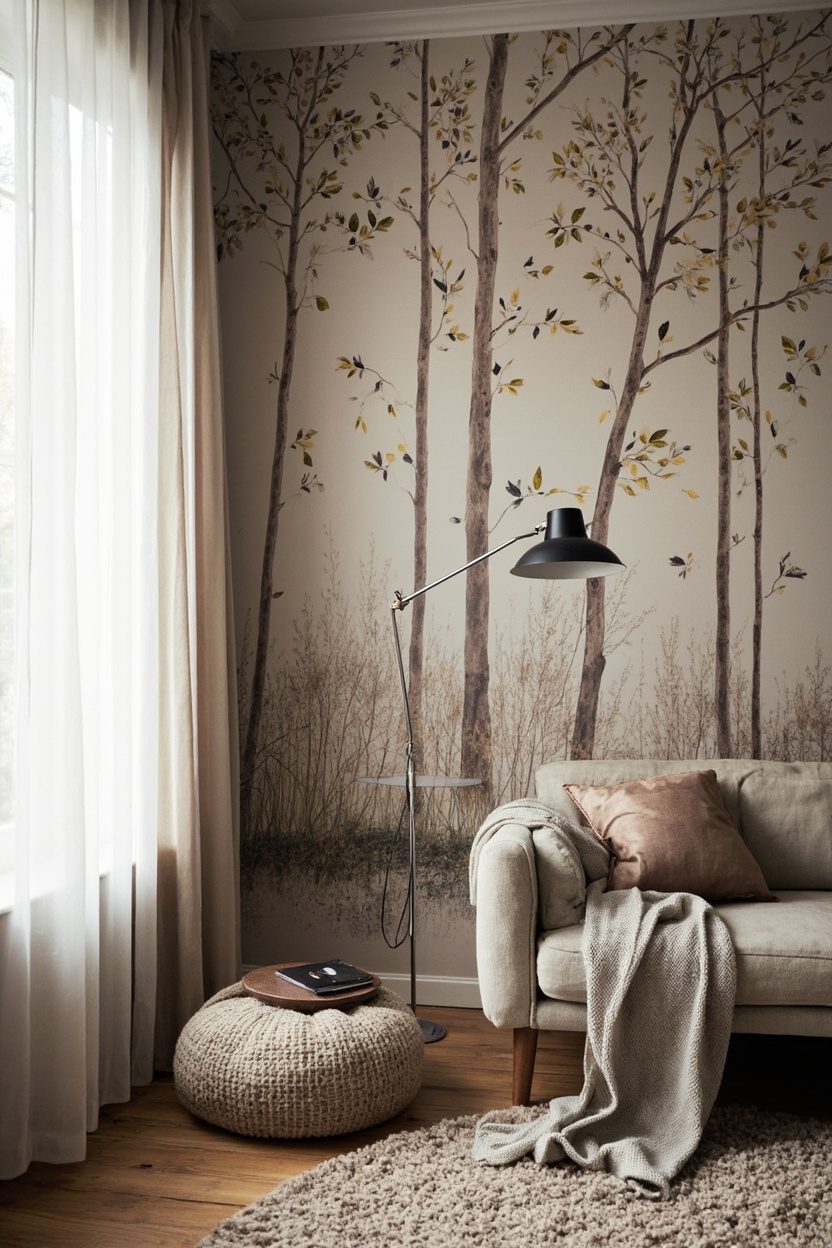
2. Storybook Statement Walls
- Effort Level: Moderate DIY or pro install.
- Estimated Budget: 150-2,500.
- Maintenance Level: Medium (Dust, occasional touch-ups).
- Best For: Dining nooks, hallways, kids’ rooms.
Think hand-illustrated murals, woodland scenes, or celestial maps that read like a page from a favorite book. A single narrative wall sets the mood for the entire space.
Choose a washable, lightfast finish if the wall faces sunlight. For murals, ask for scrubbable varnish or pick vinyl-coated paper in high-traffic corridors.
Scale your motif to the wall width. A panoramic design suits long hallways, while a vignette behind a bed frames the headboard like a canopy.
Keep adjacent walls calm, ideally in the palest tone lifted from the mural. Trim in the same color, one step glossier, sharpens the edges and feels bespoke.
Lighting is crucial. Aim picture lights or sconces with 2700–3000K bulbs to warm the illustration, avoiding cool light that can flatten hand-drawn detail.
The Golden Rule Here
Edit furniture in front of the wall to silhouettes only, not heavy patterns. A rush-seat bench, a slim console, or a linen headboard lets the story sing.
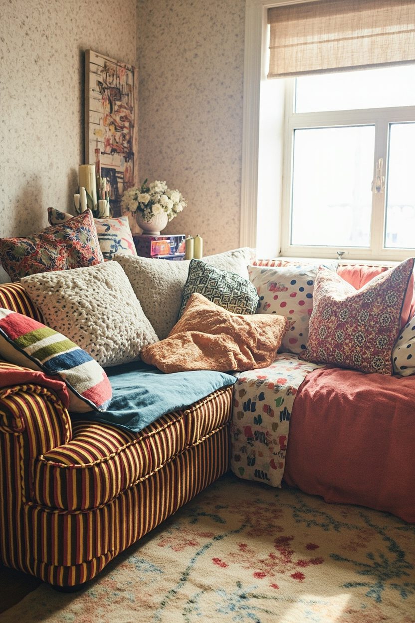
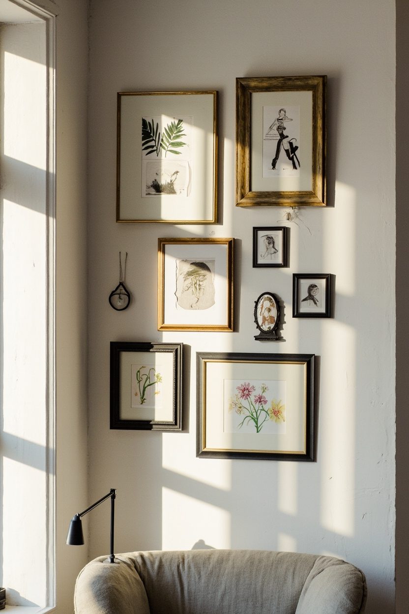
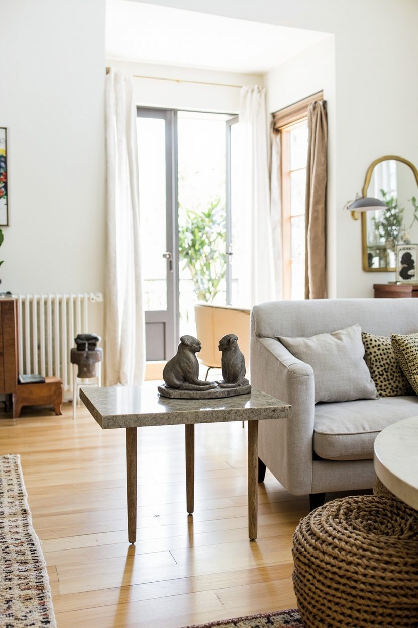
3. Quirky Gallery Clusters
- Effort Level: Weekend DIY.
- Estimated Budget: 100-600.
- Maintenance Level: Low (Dust frames).
- Best For: Stairwells, entryways, awkward corners.
Think clusters, not grids. Mix oil portraits with botanical plates, kids’ crayon masterpieces, and a tiny convex mirror to create rhythm and pause.
Unify the medley with two consistent details, like all black mats and varied wood frames, or all brass frames with no mats. That single throughline keeps whimsy elegant.
Plan on the floor first. Start with a visual anchor, roughly 18 by 24 inches, then orbit smaller works around it, keeping two inches between frames for air.
Mind heights. The average center should hit 57 inches, especially in hallways. In stairwells, maintain the same centerline that rises with the handrail.
Budget tip: thrift frames and replace glass with UV acrylic to lighten the weight. Mix original art with high-quality prints for texture and price balance.
Make It Your Own
Curate by theme without being literal, think circles, sea motifs, or a family palette. Swap one piece seasonally, and it keeps the wall alive without rehanging.
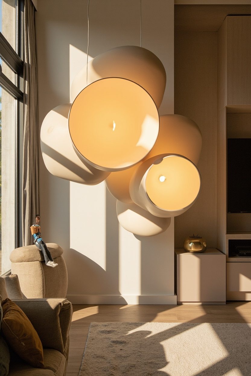
4. Oversized Sculptural Lighting
- Effort Level: Weekend DIY.
- Estimated Budget: 200-1,200.
- Maintenance Level: Low (Dust weekly).
- Best For: Rooms needing a focal point.
What You’ll Need:
- Statement pendant or floor lamp, dimmable smart bulbs, ceiling canopy kit, or weighted base, fabric cord or cord cover.
- Stud finder and anchors, wire cutters, a voltage tester, microfiber cloth for shade care.
- Painter’s tape for scale mockups, measuring tape, ladder, or step stool.
Oversized lighting is the fastest way to telegraph whimsy. Choose one piece with a sculptural silhouette and give it breathing room. Think cloud-like rice paper, rippled resin, or pleated oversized linen shades.
Scale matters; aim for a diameter that is roughly one-third to one-half the table width for pendants, or a floor lamp that rises to 70 to 80 inches with a dramatic arc. Anything smaller reads timid.
Warmth keeps it livable, use 2700K dimmable bulbs for glow, then layer a discreet sconce or candle for depth. Avoid ultra-cool bulbs; they flatten texture and kill the magic.
Placement is choreography, center a large pendant over a round table, or offset a floor lamp to graze artwork. Keep 30 to 36 inches between a pendant and a tabletop to avoid glare.
Material makes the mood, paper diffuses softly for cottage charm, lacquered fiberglass skews modern, pleated fabric nods to playful tradition. If ceilings are low, a wide, shallow shade maintains drama without head bumps.
Stylist’s Note
Mock the footprint before you buy. Tape the diameter on the table or floor, then live with it for a day to confirm sight lines and door clearances. Oversized should feel generous, not obstructive.
If your room leans coastal or cottage, a cloud pendant pairs beautifully with the textures seen in Coastal Farmhouse Homes. For modernists, choose a glossy, amoeba-like floor lamp to counter straight-lined furniture.
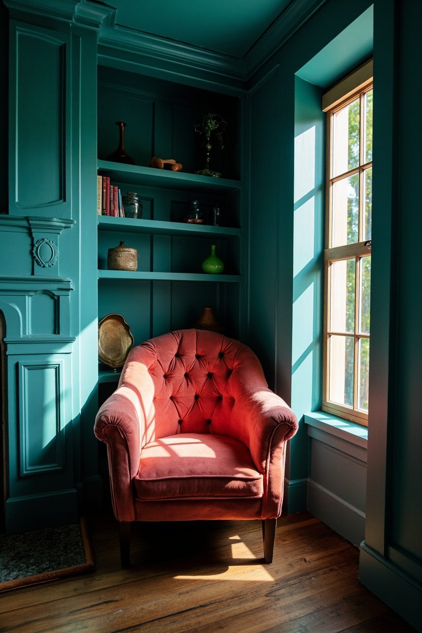
5. Color-Drenched Corners
- Effort Level: Weekend DIY.
- Estimated Budget: 80-400.
- Maintenance Level: Low (Touch-ups as needed).
- Best For: Reading nooks and entry niches.
Saturating a single corner from baseboard to ceiling creates a jewel-box moment without repainting the whole room. Carry the color onto trim, switch plates, and even the inside of a bookshelf for full immersion.
Choose a hue two to three steps bolder than your comfort zone, deep teal, tomato red, aubergine, or chartreuse. In low light, opt for mid-tone satin to bounce glow; in bright rooms, matte keeps it sophisticated.
Anchor the vignette with one grounding piece, a vintage chair, slim pedestal, or petite cabinet, then echo the color in a lampshade or pillow. A small wool rug or checkerboard mat holds the eye.
Add contrast with a wavy sconce, brass picture light, or a stack of graphic books. If you love restraint, hang a tight edit of frames following Minimalist Gallery Walls guidelines to avoid visual clutter.
When I tried this in my own living room, I pushed the color onto the ceiling plane above the chair, and instantly the corner felt taller. I made the mistake of leaving the outlet cover white; it shouted, so I painted it to match.
Make It Your Own
Test three swatches vertically, from baseboard up, and watch them morning through evening. Corners collect shadows, so what looks moody at noon can go murky by night. Bump the Light Reflectance Value a notch if needed.
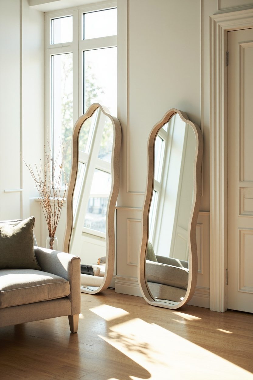
6. Wavy, Wiggly Mirrors
- Effort Level: Easy install.
- Estimated Budget: 60-600.
- Maintenance Level: Low (Glass cleaner).
- Best For: Hallways and small bedrooms.
Curvy-framed mirrors add a hit of humor while softening hard edges in boxy rooms. Look for undulating resin frames, upholstered squiggles, or scalloped wood that reads playful, not juvenile.
Size and placement decide the vibe; a 24-by-36-inch squiggle leans casual above consoles, while a full-length wavy mirror expands a narrow hallway. Center it at 57 inches to eye for art adjacency.
Color is your lever, creamy off-white frames keep things elegant, candy pastels skew pop, lacquered black turns sculptural. If walls are busy, choose a tone-on-tone frame to avoid chaos.
Mind the distortion, funhouse glass is charming for powder rooms, less so for outfit checks. Ask for standard silvered glass, 5 millimeter thickness, and avoid overly beveled edges that compete with the frame.
Pair with crisp lighting so the curves read clean, a petite globe sconce flanking a wavy rectangle adds rhythm. On wood paneling, use French cleats; on drywall, toggle anchors rated 50 pounds for safety.
The Golden Rule Here
Let one wiggle lead, then keep neighbors quiet. If the mirror is squiggly, choose straight-leg consoles and simple lamps so the linework can sing without a chorus drowning it out.
For a boho lean, echo the curve once more in a rug border or wavy candle, but stop there. Two curves feel intentional, three start to shout.
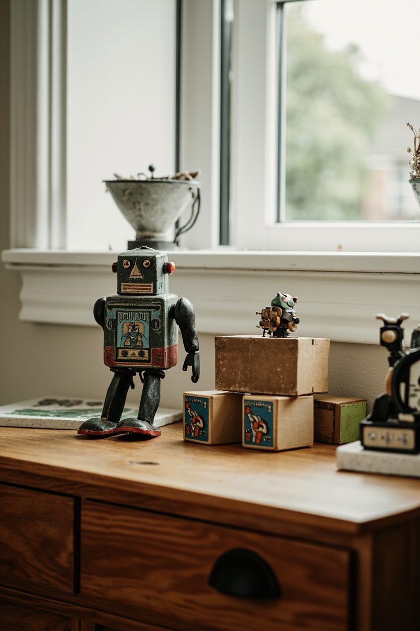
7. Vintage Toy Vignettes
- Effort Level: Weekend DIY.
- Estimated Budget: 50-300.
- Maintenance Level: Low (Dust occasionally).
- Best For: Shelves, consoles, kids’ nooks.
Curate tiny scenes with tin cars, wooden pull toys, and chalk horses grouped by era or color. Keep scale consistent, think 3 to 5 pieces per vignette, so it reads collected, not cluttered.
Use simple risers, like stacked design books or acrylic blocks, to create height. A neutral tray anchors the story, while a linen backdrop softens bright lacquered finishes.
Limit the palette to two dominant tones, for example, red and cream, then let patina do the rest. Chips and worn edges add authenticity, which feels charming rather than shabby.
Avoid mixing too many materials in one scene. Pair painted metal with raw wood or celluloid with glossy ceramic, not all at once, to keep the eye focused.
Slip in one unexpected scale shift, like a single oversized spinning top beside mini figurines. That playful tension is the whimsy, and it photographs beautifully for shelves or mantels.
Stylist’s Note
If you have toys from family attics, prioritize pieces with movement, wheels, or pull strings; they animate the vignette even when still. For flea market finds, check for flaking paint and sharp edges, then seal with a matte archival varnish.
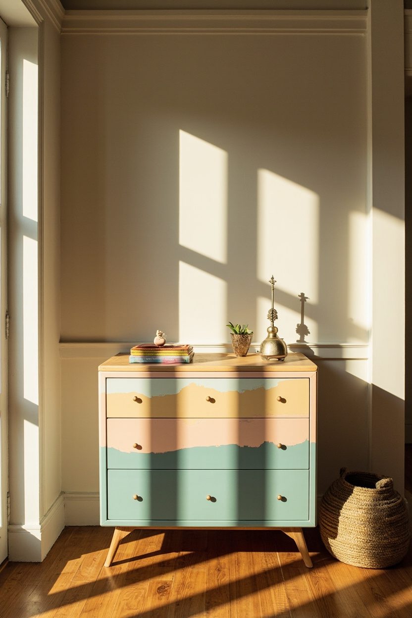
8. Hand-Painted Furniture
- Effort Level: Weekend DIY.
- Estimated Budget: 120-1,200.
- Maintenance Level: Moderate (Spot clean, gentle top-up wax).
- Best For: Entry consoles, nightstands, accent chairs.
A simple dresser becomes art with scalloped borders, naive florals, or imperfect stripes. Choose a chalk or mineral paint for a velvety, erasable base that welcomes hand detail.
Work in a limited motif family, like trailing vines, moons, and stars, repeated in different scales across drawers. Repeat colors from nearby textiles for cohesion, not confusion.
Sketch lightly with a white watercolor pencil, then paint with artist brushes in synthetic bristle, sizes 2 to 8. Seal with a matte water-based polyurethane to avoid plasticky shine.
Go tonal if you fear color chaos, like pale blue body, ink blue birds, and off-white dots. A monochrome story reads sophisticated and still delightfully offbeat.
Mind placement, keep heavy detail on drawer faces and rails, leave top surfaces mostly calm. That balance protects wear zones and keeps the piece visually grounded.
Before You Buy
Save by hunting solid-wood, flat-front pieces on classifieds or at estate sales, then invest in quality primer, two paint colors, and a durable topcoat. A weekend, good lighting, and painter’s tape are your best tools.
Splurge on a local decorative painter for complex marbling or chinoiserie, or commission a motif that mirrors your architecture. Pro prep, grain filling, and sprayed topcoats yield heirloom quality that resists daily scuffs.
9. Unexpected Animal Motifs
- Effort Level: Easy afternoon.
- Estimated Budget: 40-600.
- Maintenance Level: Low (Vacuum, spot clean).
- Best For: Powder rooms, bars, and reading corners.
Swap predictable birds for snails, moths, or beetles, creatures that feel curious, not kitsch. One statement element, like a lampshade with prancing hares, can shift an entire corner’s tone.
Choose a consistent rendering style, silhouette, line drawing, or painterly, so mixed species still feel related. Black ink illustrations play nicely with both modern and cottage rooms.
Keep scale intentional, large-scale motifs on wallpaper, small-scale on textiles, never both large at once. That ratio avoids visual shouting while keeping the moment whimsical.
Ground novelty with heritage materials, linen, brass, and walnut, to steer clear of nursery vibes. A tortoise box on a brass bar cart is chic, not childish.
Place animal accents where guests pause, powder rooms, entry walls, or the bar niche, for a delightful reveal.
The Golden Rule Here
Two animal types per space is ample, then repeat them once or twice in smaller hits. If you love them more, cluster them in a single zone, like a reading nook, instead of sprinkling them everywhere.
If commitment scares you, start with a throw pillow or a petite art print. When you are ready for bolder, a half-wall of wallpaper above beadboard delivers impact, and it is easier to change later.
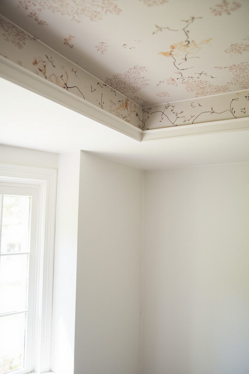
10. Whimsical Wallpaper Ceilings
- Effort Level: Weekend DIY.
- Estimated Budget: 200-800.
- Maintenance Level: Low (Occasional dusting).
- Best For: Small rooms or powder baths.
What You’ll Need:
- Pre-pasted or peel-and-stick wallpaper rolls.
- Wallpaper smoother, snap-off blade, and seam roller.
- Plumb line, step ladder, and drop cloths.
- Primer or lining paper for textured ceilings.
Pattern on the fifth wall pulls the eye up, making squat rooms feel taller and instantly more spirited. Choose a small to medium repeat for compact spaces, large-scale botanicals for lofty ceilings.
Peel-and-stick is forgiving for first-timers, but pre-pasted vinyl holds best in steamy baths. If your ceiling has texture, float it smooth or apply lining paper to avoid telegraphing.
Color matters. Pull a dominant hue into trim or a lampshade for cohesion, then let the rest of the room stay quiet. White walls with a riotous ceiling keep the look buoyant, not busy.
Lighting is your amplifier. A low-profile drum shade or milk-glass flush mount softens shadows, preventing the pattern from reading harshly. Avoid multi-arm fixtures that visually fight the motif.
Mind the edges. A painted picture rail or a two-inch painted border can mask micro-misalignment at the corners, saving your sanity and looking intentional.
Designer Secret
If lining up repeats overhead sounds daunting, run the wallpaper in the shorter room dimension, not the long one, to minimize visible seams.
Start on the wall opposite the room’s primary view so your last seam sits where it is least noticeable.
When in doubt, sample a single strip and live with it for a week, watching it in morning and evening light before you commit to the full cover.
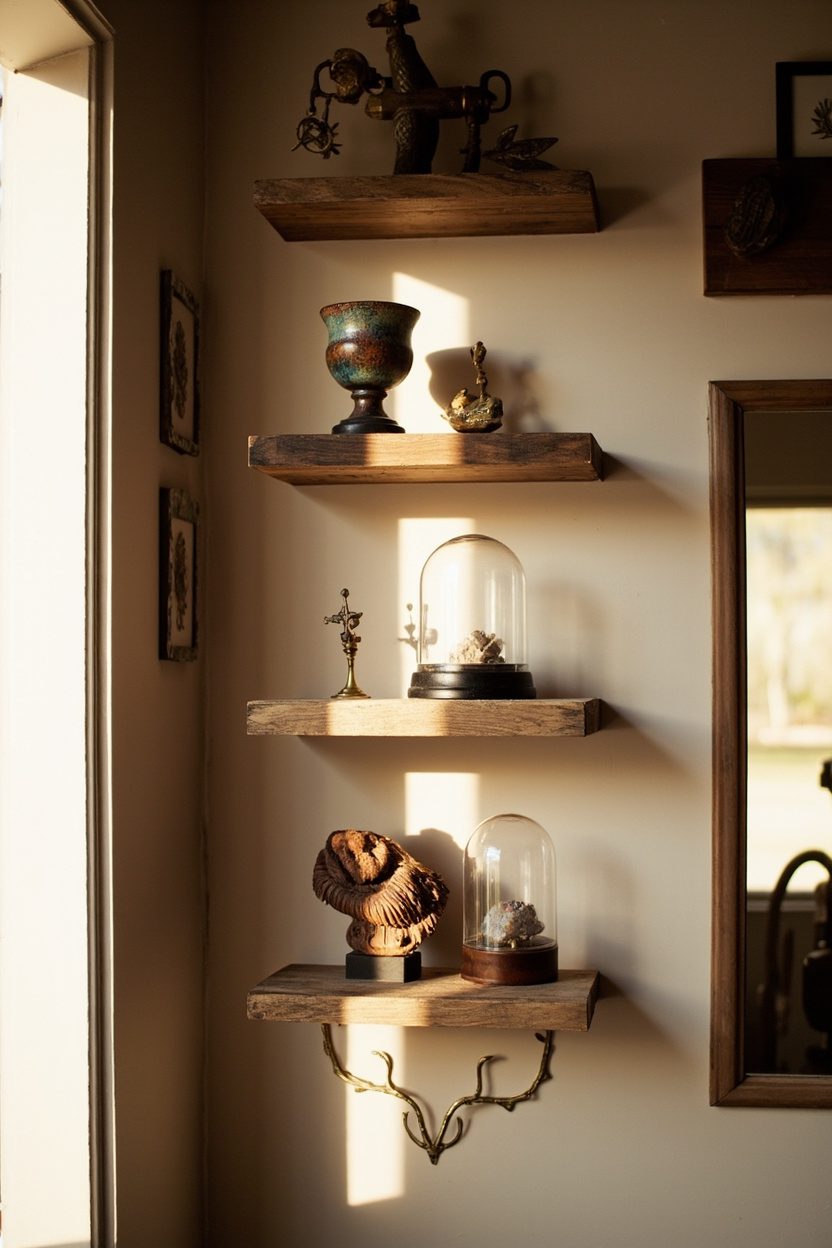
11. Artisanal Oddities Shelf
- Effort Level: Easy afternoon.
- Estimated Budget: 150-600.
- Maintenance Level: Low (Dust monthly).
- Best For: Hallways, living rooms, home offices.
A single ledge dedicated to handmade curios, thrifted finds, and small-scale art turns personality into a focal point. Think carved spoons, studio ceramics, tiny landscapes, and one irreverent piece.
Vary height and silhouette. Mix a squat raku vase with a slender brass candlestick, then anchor the arrangement with a framed 8×10 leaning against the back. Aim for odd numbers per cluster.
Materials steal the show. Rough terracotta beside lacquer, raw wood next to glazed porcelain, matte paper against a mother-of-pearl box, all add a tactile charge that photographs beautifully.
Keep color intentional. Choose a three-color story, for example, moss, indigo, and bone, and let metallics count as neutrals. This keeps whimsy curated, not cluttered.
Edit ruthlessly. Leave two inches between pieces so each object can breathe, and cap the shelf depth at 6 to 8 inches to prevent drift into knick-knack land.
Make It Your Own
Tell a micro story with each arrangement, travel, family, or a single craft technique. Rotate seasonally, swapping textiles or pressed botanicals, and you will rediscover your objects anew.
For display hardware, a slim picture ledge in oiled walnut feels elevated, while painted MDF keeps costs friendly and color-cohesive with wall trim.
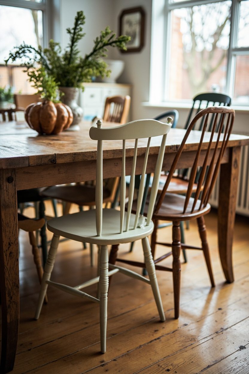
12. Mismatched Dining Chairs
- Effort Level: Weekend sourcing and setup.
- Estimated Budget: 300-1500.
- Maintenance Level: Medium (Tighten screws).
- Best For: Eclectic dining and breakfast nooks.
Mixing silhouettes around the table reads collected, not chaotic, when you control at least one common thread. Repeat either material, seat height, or finish to keep the dialogue coherent.
Aim for a 1.5 to 2-inch variance in seat height max so knees align comfortably. If you inherit a shorter vintage, a slim cushion levels the field without compromising style.
Anchor the mix with head chairs that share either arm shape or upholstery color, then let side chairs vary more freely. Six sides plus two captains is a foolproof formula.
Color strategy matters. Unify with a single upholstery fabric across different frames, or go tonal, all blues or all woods within one stain family, for instant polish.
When I tried this in my own dining room, I got greedy with scale and ended up with a throne beside a café perch. The fix was simple: a bench on one side to reset visual weight and comfort.
Real-World Styling Tip
Lay blue painter’s tape on the floor to map chair footprints before you buy, then test pull-back clearance, ideally 36 inches from the table edge to the wall or credenza.
FAQ
Curate with a consistent thread, color, material, or a repeating shape, and leave negative space around each moment. Limit active patterns to one hero plus a supporting print, then keep the rest textural and quiet.
Start with a powder room, a hallway, or a petite bedroom where a strong gesture reads like a jewel box. Smaller footprints let bold patterns feel intentional, and the cost to cover is far more manageable.
Let one or two handcrafted anchors set the tone, then fill in with thrifted or big-box items that echo their material or color. The eye reads the hierarchy, and the whole display feels elevated.
Look to trusted design reporting that tracks macro shifts, such as this overview on joy-first styling and artisan influence in 2026, which validates the move toward playful, personal spaces. House Beautiful