

Cottage eclectic isn’t about stuffing every antique and pattern into a room; it’s about deliberate pairings that read calm, composed, and lived-in.
Start with a restrained palette, then let texture, scale, and a few well-chosen vintage pieces do the talking. The goal: a home that feels aged-in and intentional rather than haphazardly assembled.
Think like a stylist: set rules before you shop. Limit major surfaces to two warm neutrals (sandy beige + soft taupe or cream + warm gray), choose one accent color (muted sage or faded blue), and pick a single metal finish, aged brass or oxidized nickel for fixtures.
That framework keeps eclectic mixes harmonious and prevents visual chaos.
- 1. Warm Neutral Layers
- 2. Granny Chic Finds
- 3. Collected Bookcase Styling
- 4. Woven Texture Mix
- 5. Muted Sea Glass Accents
- 6. Distressed Painted Furniture
- 7. Cottagecore Florals
- 8. Pottery & Earthenware
- 9. Mixed-Metal Hardware
- 10. Cozy Nook Seating
- 11. Handcrafted Textiles
- 12. Soft Plaid Throws
- 13. Sunwashed Wood Finishes
- 14. Vintage Pattern Mashups
- Final Thoughts
- FAQ
1. Warm Neutral Layers
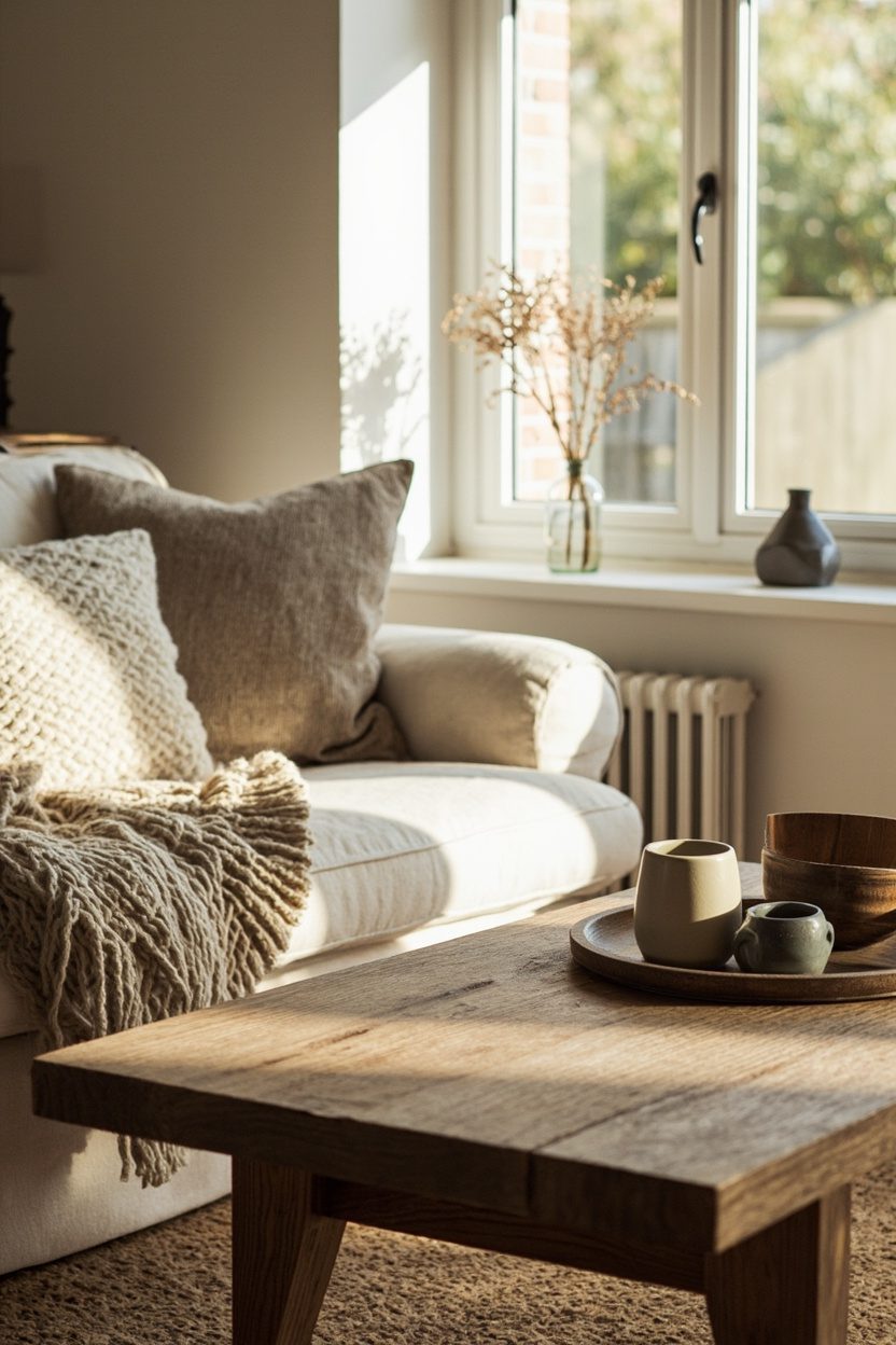
Start with foundations, paint, flooring, and a sofa in warm neutrals rather than stark white. Use a sandy-beige paint on walls and a matte oak floor to add depth; this combo reads softer under natural light and tethers pattern choices so florals or stripes feel intentional instead of competing with the room’s base tone.
Layer textiles in varying weights: a chunky wool throw in camel, linen curtains in ecru, and a low-pile jute rug.
Scale is crucial to balance a large neutral sofa with medium-patterned cushions (one small-scale floral, one wide stripe) to avoid visual muddle and keep the eye moving calmly across the room.
Styling Blueprint
- Limit primary surfaces to two neutrals (walls + upholstery) to maintain cohesion.
- Choose one accent hue for cushions and small decor to unify eclectic pieces.
- Select one metal finish for lighting and hardware to streamline the look.
- Use three textile weights (sheer, linen, chunky knit) for tactile layering.
2. Granny Chic Finds
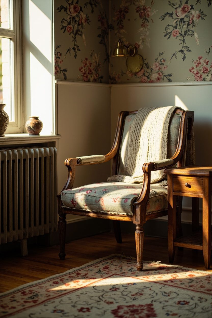
Introduce one or two genuine vintage pieces think an upholstered slipper chair with turned wooden legs or a painted farmhouse sideboard, to give the room an authentic sense of history.
Prioritize quality of line and proportion over age; a small, ornate piece can anchor a vignette, but it will read cluttered if repeated endlessly.
Use restoration selectively: keep original patina on metals and paint where possible, and only reupholster if fabric is irreparably worn.
Mix these vintage anchors with modern, streamlined items (a simple pendant or contemporary art) to create a curated contrast that reads intentional rather than costume-y.
What to Focus On?
- Choose one vintage anchor piece per room to avoid overpopulating the space.
- Retain original patina on hardware to preserve authenticity and charm.
- Match vintage scale to room size—avoid large, heavy antiques in small rooms.
- Budget: allocate 20–30% of the spend to quality vintage rather than multiples of cheap reproductions.
3. Collected Bookcase Styling
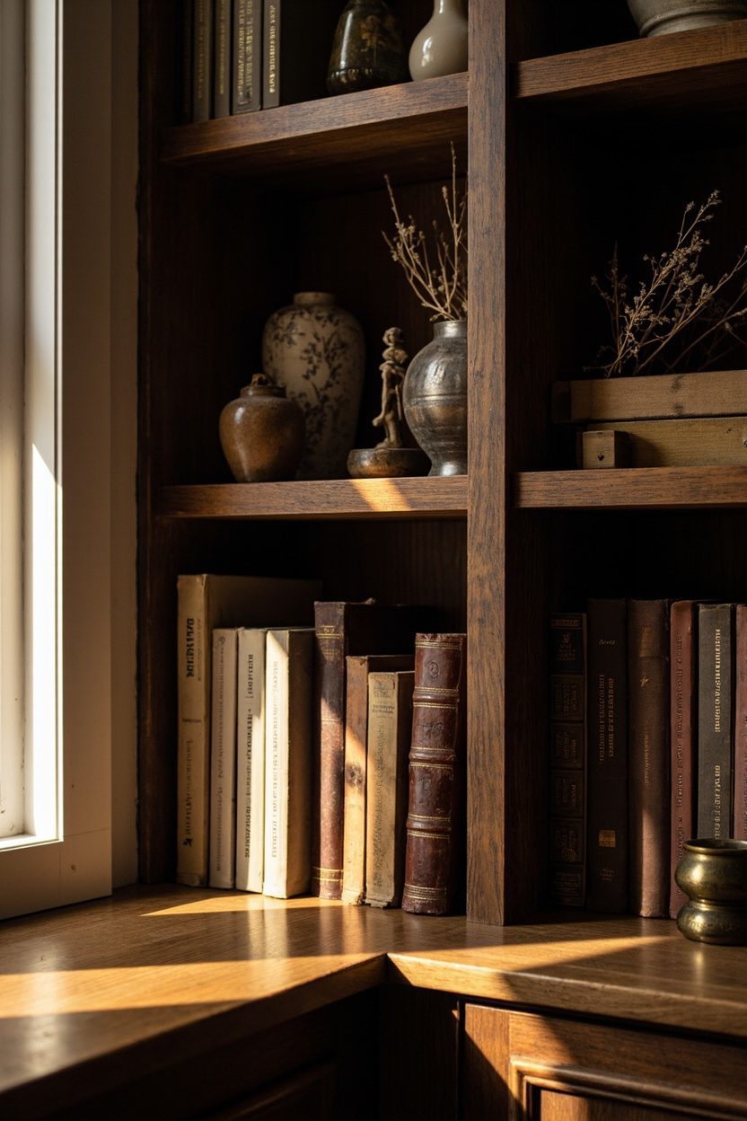
Style bookcases like a layered still life: alternate horizontal stacks of books with vertical rows, intersperse pottery and framed photos, and leave negative space to let objects breathe.
Use books as color blocks—grouping neutral spines or laying two piles with a small ceramic bowl on top to create rhythm without clutter.
Scale matters: place larger objects (a sizable ceramic vase or a sculptural lamp) on lower shelves and delicate curios on higher ones.
Resist the temptation to fill every shelf; aim for about 60–70% fill so the display feels curated instead of overcrowded.
Essential Elements
- Alternate book orientation (stacked + upright) to create visual rhythm.
- Group similar colors or materials for small vignettes that feel intentional.
- Reserve one shelf per unit as negative space to prevent a cluttered appearance.
- Place heavier, larger items on lower shelves for balance and safety.
4. Woven Texture Mix
Layering natural weaves rattan chairs, seagrass rugs, and chunky cotton throws gives a cottage room tactile warmth without looking fussy.
Choose a dominant weave (for example, a large jute rug) and introduce two supporting textures at smaller scales (a rattan side table and a knitted pouf) so the eye reads intentional repetition rather than clutter; avoid more than three different weave types in a single seating area to keep cohesion.
Balance color by selecting neutral weaves in varying tones: warm honey, bleached straw, and chalky white. For scale, pair larger, flatter pieces (rug, bench) with tighter, higher-relief textures (basketry, lampshades).
A practical decision: seal seagrass rugs in high-traffic zones and use felt pads under rattan legs to prevent scratching on hardwood floors.
Styling Blueprint
- Pick one dominant weave for the floor or main seating piece (jute or seagrass) and commit to it as the anchor.
- Add two complementary textures at a smaller scale (rattan tray, knitted throw) to avoid visual competition.
- Use a cohesive tonal trio—warm beige, soft white, muted tan to unify different fibers.
- Protect surfaces: rug sealant for seagrass and felt pads under woven furniture legs.
5. Muted Sea Glass Accents
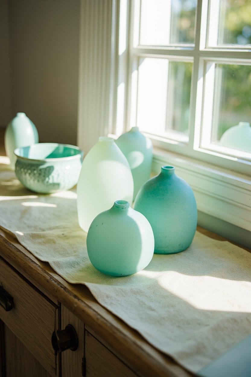
Introduce sea glass hues, muted aqua, soft celadon, and stormy blue-green through small accessories to bring a gentle coastal whisper to cottage interiors. Limit these tones to 3–6 accents per room: think a ceramic vase on the mantel, a pair of glass candlesticks on the dining table, and a framed botanical print. Keeping the palette restrained stops the scheme from tipping into literal beach-house décor.
Material choices matter: choose mouth-blown or hand-finished glass with slightly frosted surfaces rather than glossy, mass-produced pieces to read authentic and aged.
For a decisive color move, pair sea glass accents with warm neutrals (sandy beige walls or a taupe linen sofa) so the cool hues feel curated rather than isolated.
What to Focus On?
- Use 3–6 sea glass accents max per room to maintain a curated look.
- Select frosted or mouth-blown glass over glossy factory pieces for authenticity.
- Pair cool sea glass tones with warm neutrals—beige, soft taupe—for balance.
- Place accents in groups of odd numbers (3 or 5) for natural visual rhythm.
6. Distressed Painted Furniture
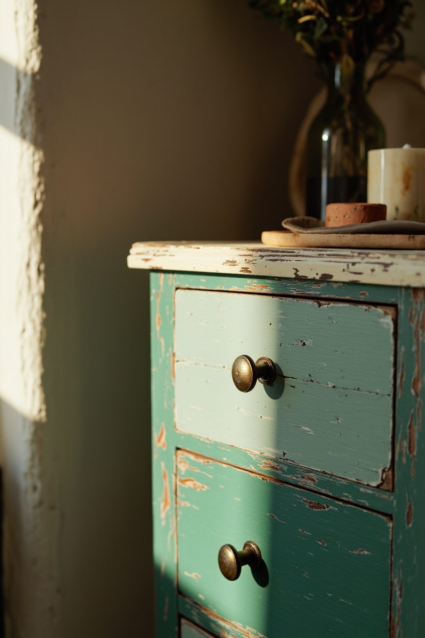
A hand-distressed painted dresser or sideboard is the backbone of granny-chic cottage styling. Choose solid wood pieces (pine, poplar) to withstand distressing and refinishing.
When deciding on color, favor softened pastels (sage, chalk blue, antique white) with a flat, milk-paint finish; avoid glossy lacquers, which read too new and defeat the aged intention.
For budget tiers: thrifted pine can be transformed affordably, while salvaged heirloom pieces warrant a higher spend for restoration.
Distressing should be strategic: focus wear on edges, drawer fronts, and areas of typical human contact to mimic natural aging.
Seal with a matte wax to protect the paint without adding sheen. A practical mistake to avoid is over-sanding preserved corner profiles and joinery details so the piece retains structural integrity and visual character.
Essential Elements
- Choose solid wood (pine or poplar) for longevity and authentic distressing results.
- Select milk paint or chalk-based paint in muted pastels or antique white for the finish.
- Distress sparingly edges and contact points only to mimic natural wear.
- Finish with a matte wax or shellac to protect without adding shine.
7. Cottagecore Florals
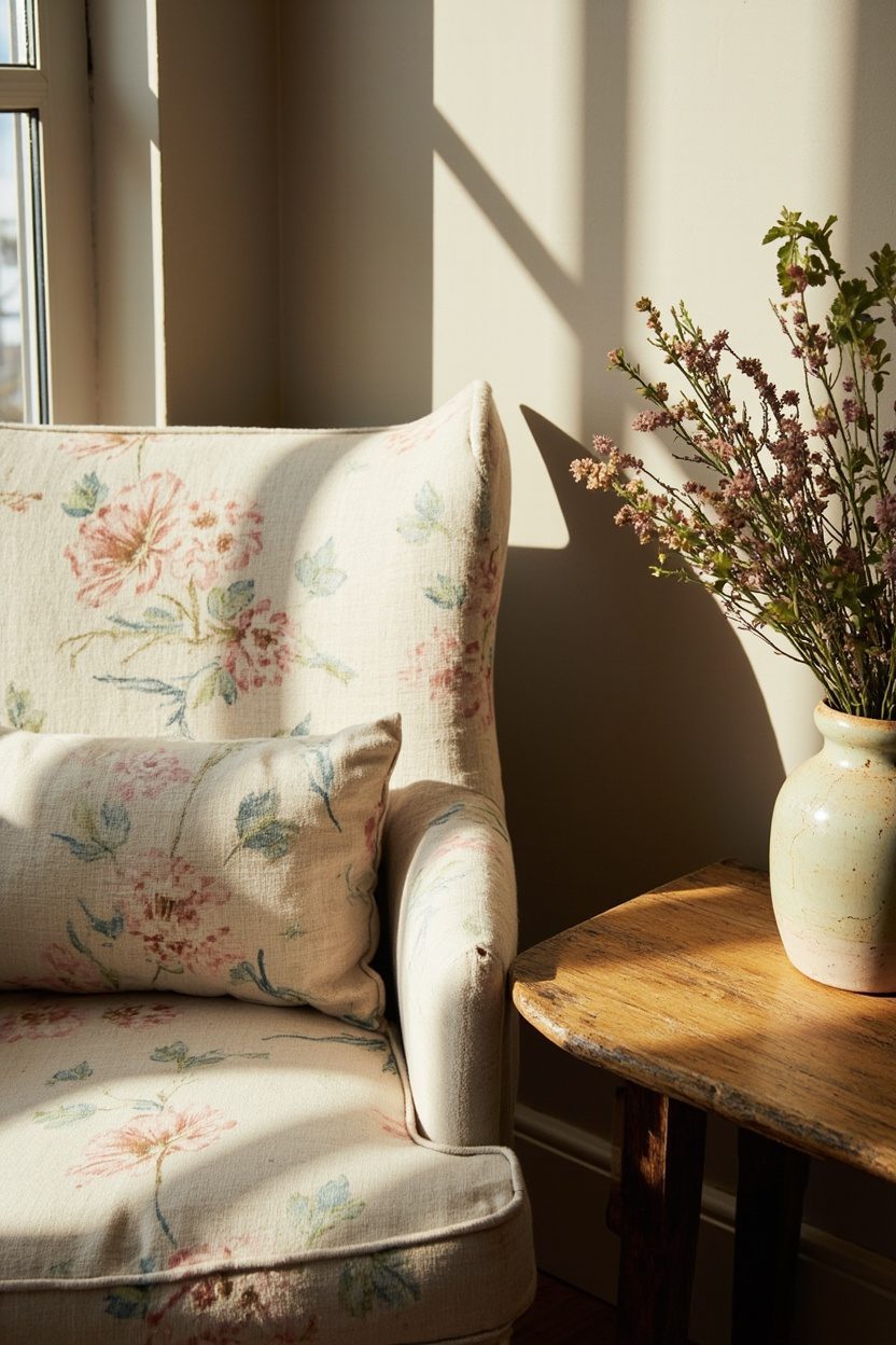
Layer florals sparingly: choose one dominant floral pattern (curtains or an upholstered chair) and pair it with a smaller-scale floral or a solid in the same color family to avoid visual competition.
Opt for muted palettes, sage, dusty rose, and warm beige rather than saturated prints; this keeps the look curated, not kitschy, and fits the revival-house trend toward warmth noted in recent forecasts.
Include at least one vintage-piece decision: a faded linen armchair or heirloom-printed throw pillow in cotton-linen blend keeps scale and texture balanced and survives daily wear.
Avoid matching every surface; let florals have breathing room next to basketry or painted wood surfaces to feel intentional rather than cluttered.
Styling Blueprint
- One dominant floral upholstery paired with a small-scale secondary print in the same hue family.
- Limit floral usage to 2–3 surfaces per room to maintain a calm scale.
- Choose soft, natural fibers (linen/cotton blends) for longevity and texture.
- Anchor florals with neutral painted trim or a simple oak side table for contrast.
8. Pottery & Earthenware

Curate a small collection of hand-thrown pottery in complementary glazes rather than a jumble of styles; pick two glaze tones (for example, ivory matte and speckled sage) and 3–5 vessels that vary in height and mouth width for shelf rhythm.
Use pottery to add tactile warmth, stoneware on open shelving, a large floor vase by a console, or clustered jars on a kitchen island—prioritizing proportion so pieces read as deliberate.
Specify practical placement and care: unglazed or matte finishes are beautiful, but porous use liners for fresh flowers and felt pads under heavier pieces to protect surfaces.
Keep budget tiers in mind: mix one statement artisan vessel (splurge) with several affordable, factory-made earthenware pieces to achieve a layered, curated look without overspending.
9. Mixed-Metal Hardware

Introduce mixed metals intentionally: choose a dominant finish (brushed brass or aged nickel) for large surfaces like kitchen cabinet pulls or bathroom faucets, and pepper in a secondary metal (matte black or warm iron) on light fixtures or smaller drawer knobs.
The key decision is scale and repeat: use the dominant metal on at least 60% of visible hardware so the secondary metal reads as a purposeful accent, not a mismatch.
Avoid the “everything different” mistake by coordinating warm metals with warm woods, cool metals with painted cabinetry, or cool-grain oak.
For a cost-effective update, swap only visible hardware (drawer fronts and door levers) and keep existing hinge finishes; this maintains harmony while delivering that edited, eclectic edge.
What to Focus On?
- Pick one dominant metal for 60% of hardware and one accent metal for the rest.
- Match metal undertones to surrounding materials (warm-to-warm, cool-to-cool).
- Update high-visibility pieces first (island pulls, entry door hardware) for impact.
- Standardize screw hole spacing when swapping knobs to avoid refacing cabinets.
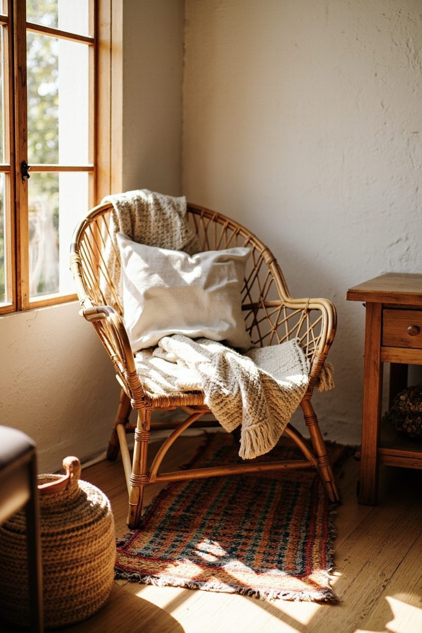
10. Cozy Nook Seating
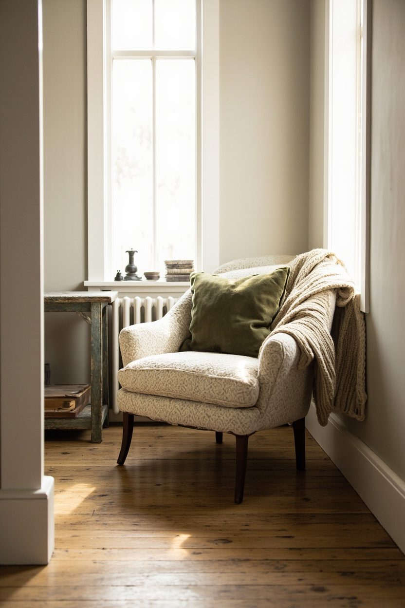
Create a small seating area that reads intentional, not temporary: pair a low-scale slipper chair in a warm linen (sandy beige or muted sage) with a compact spindle-back side chair to introduce contrast of scale and era.
Place the seating in a corner by a window or beside a bookcase, anchoring it with a round jute rug (32–48 inches) so the arrangement feels deliberate rather than floating in space.
Add a slim side table no larger than 16 inches in diameter for coffee and a single table lamp with a soft fabric shade; this keeps the vignette usable and cozy without crowding.
Avoid oversized sofas here, choose pieces with 18–20 inch seat height to match vintage finds and keep sightlines open for a curated cottage feel.
Styling Blueprint
- Choose two chairs with different silhouettes but complementary upholstery fabric (linen + distressed leather)..
- Use a small natural-fiber rug scaled to the chair’s footprint (32–48 in.).
- Limit tables to one compact surface with a lamp (no more than 16 in. diameter)..
- Add a single tall plant to balance the vertical scale and soften corners.
11. Handcrafted Textiles
Layer artisanal textiles—think hand-loomed throws, embroidered cushions, and small hooked rugs to give rooms depth and authenticity without looking cluttered.
Stick to a restrained palette (soft creams, warm taupe, muted indigo) and repeat one accent color across three pieces to create cohesion rather than an array of competing patterns.
Prioritize tactile materials: cotton, wool, and linen will age gracefully and photograph like a lived-in collection rather than a flea-market heap.
For a clear decision rule, limit pattern scale per seating area to one large motif, one medium, and one small to avoid visual chaos.
Essential Elements
- Select natural fibers (wool, linen, cotton) for longevity and texture contrast.
- Repeat one accent color in at least three textile pieces for unity.
- Mix pattern scales: one large, one medium, one small, within a vignette.
- Invest in one handcrafted anchor piece (e.g., embroidered blanket) as a focal point.
12. Soft Plaid Throws
Use soft plaid throws as the finishing touch that signals curated cottage style: drape a single throw over the arm of a sofa or fold it across the foot of a bed rather than piling several.
Choose plaids in muted tones, cream with faded navy or warm camel with dusty rose to keep the look cozy without veering into rustic kitsch.
Pay attention to size and weight: a 50×70-inch wool-blend throw reads classic on a chair, while a heavier 60×80-inch cashmere or alpaca throw is better for bedside layering.
Avoid loud, high-contrast tartans; the goal is relaxed, lived-in charm that complements handcrafted and neutral elements already in the room.
What to Focus On?
- Pick plaids in muted hues that harmonize with the room’s dominant neutrals.
- Use one throw per seating or sleeping area to maintain restraint.
- Match throw scale to furniture (50×70 in. for chairs, 60×80 in. for beds).
- Avoid high-contrast tartans; prefer faded or brushed textures for softness.
13. Sunwashed Wood Finishes
Pale, sun-kissed wood is the backbone of contemporary cottage styling, think bleached oak floors and honeyed pine open shelving rather than high-contrast dark stains.
Use finishes that read warm but subdued: limed oak or white-washed pine will keep a room bright while showing grain, and pair them with brass hardware to avoid a washed-out look; a matte brass knob at 2–3 inches diameter balances scale on kitchen cabinets without feeling precious.
Keep scale honest: choose wide-plank flooring (6–8 inches) for living areas to anchor furnishings, and reserve tighter-grain, painted cabinetry in mudrooms or bathrooms.
Avoid over-sanding reclaimed pieces that retain knots and small blemishes as character, but seal with a clear matte oil to protect against yellowing and humidity.
Styling Blueprint
- Pick finishes within one warm family, don’t mix cool gray bleaches with honeyed limed oak finishes in the same room.
- Use brass or black hardware for contrast and to define edges on pale wood.
- Layer rugs (natural fiber on top of sisal) to protect wide-plank floors and add texture.
Budget tip: refinish existing wood rather than replacing—sanding and liming costs less than new flooring by 40–60%.
14. Vintage Pattern Mashups
Curated pattern mixing reads collected not chaotic: limit yourself to three patterns and anchor them with a shared color, say, faded rosemary, cream, and terracotta, and vary scale from large florals to narrow stripes to tiny ditsy prints.
Use one dominant pattern (upholstery or wallpaper), a secondary medium-scale print (throw pillows or curtains), and a small-scale accent (trim, lampshade, or runner) to guide the eye.
Center the pattern story on one room element to avoid sensory overload. An armchair in a boldly patterned chintz works because the surrounding walls are neutral lime plaster.
Avoid pairing two floral prints of the same scale; instead, offset a botanical with a geometric or stripe to give each pattern breathing room.
What to Focus On?
- Choose a unifying color across patterns to make disparate prints feel intentional.
- Mix scales: large upholstery, medium curtain, small accessory for visual hierarchy.
- Test swatches in natural light—patterns can shift dramatically from morning to evening.
- Keep at least 50% of the room neutral (paint or large furniture) so patterns remain accents.
For a related idea, see Cottage Entry Table Styling.
Final Thoughts
Cottage decor that reads curated relies on restraint: consistent finishes, a clear pattern hierarchy, and a palette that ties vintage finds together.
Make one decisive material or color choice per room, then layer thoughtfully so each object feels like a chosen memory, not an accidental pile.
FAQ
Start small: add a patterned pillow or lamp shade to a neutral sofa, then introduce one medium pattern once the first feels settled.
Yes, choose a durable matte oil or polyurethane with UV inhibitors, and add rugs in high-traffic zones to protect wide-plank floors.
Layered warm neutrals, sandy beige, soft taupe, and muted sea glass create a cozy backdrop that lets vintage pieces sing.
Cottage elements can be adapted anywhere, but high-humidity rooms need sealed woods and mildew-resistant fabrics; otherwise, the look works across cottages, farms, or modern plans like two-story homes linked to architectural flow.