

Quirk should feel collected, not chaotic. With these quirky decor tips, we will sidestep the traps that make playful rooms look haphazard, and instead channel character with smart scale, color discipline, and tactile balance. Think of it as editing with heart.
Designers agree that 2026 embraces whimsy, yet craft and curation matter more than ever. From textured wallpapers to the revival of lace and ruffles, trends reward intention.
Consider this your friendly red pen, refining bold choices so they land beautifully in real homes.
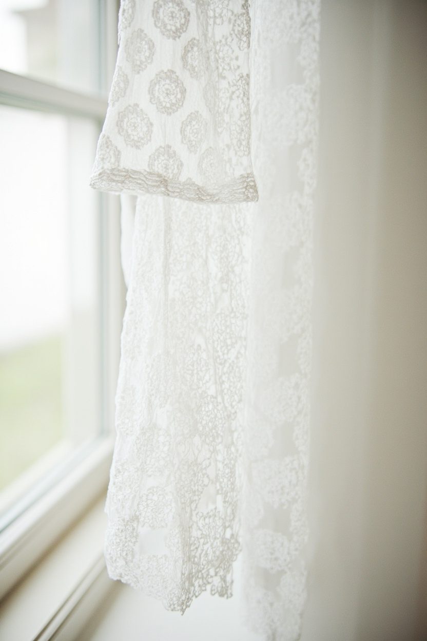
My Pick: Lace and Eyelet Layers — I love this one because a single tailored lace panel or crisp eyelet pillow can pivot a room from kitsch to charming, especially when paired with rugged textures like linen or oak.
1. Maximalist Pattern Mashups
- Effort Level: Weekend DIY.
- Estimated Budget: 100-500.
- Maintenance Level: Low (Wipe clean).
- Best For: Small, low-light spaces.
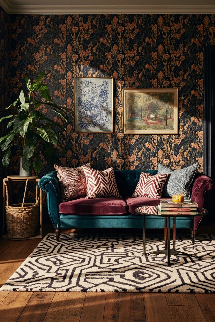
Go big on pattern, but anchor it with one dominant motif and a restrained palette of three core colors. Without a lead pattern, the room reads frenetic instead of collected.
Mind scale. Pair one large repeat, like a 12 to 18 inch floral, with medium geometrics and a tiny pinstripe for rest. Equal scale everywhere makes the eye ping around uncomfortably.
Limit mixed pattern surfaces to three per sightline. Sofa, drapery, and rug can converse, but adding bold cushions and a busy throw often tips into noise.
Use texture as a pause. A chunky jute rug, matte limewash, or slubby linen gives the eye somewhere to breathe between energetic prints.
Tie patterns with a common undertone, like warm cream or inky navy, so disparate designs still feel related. Sample swatches together in daylight to confirm harmony.
Why This Works?
Patterns are like voices at a dinner party, and every room needs a great moderator. A dominant print sets the tone, while scale shifts and texture breaks keep enthusiasm charming, not overwhelming.
If you love curated whimsy, a restrained palette lets your boldest piece shine. For art lovers, a single gallery moment, such as a tight edit inspired by Minimalist Gallery Walls, can calm a loud textile story without losing personality.
2. Lace and Eyelet Layers
- Effort Level: Weekend DIY.
- Estimated Budget: 50-300.
- Maintenance Level: Medium (Gentle wash).
- Best For: Bedrooms and sunrooms.
Lace is back, but sugary overload dates fast. Choose tailored silhouettes, like a knife pleat bed skirt or straight café curtain, to balance the sweetness with structure.
Keep to one lace star per zone. If your windows wear eyelet, skip ruffled pillow shams and opt for a crisp percale duvet in a complementary white or ecru.
Mind opacity and light. Layer sheer lace over a solid roller shade for privacy at night, then lift the shade in daylight to enjoy the pattern play.
Blend textures that contrast politely. Rough oak, Belgian linen, or hand-thrown ceramics keep lace from reading costume, especially in kitchens or entryways.
Test whites under your actual bulbs. Cool LED can turn ecru dingy, while warm 2700K lamps flatter antique ivories and vintage crochet.
Designer Secret
Save: Vintage tablecloths and runners are an affordable source for custom pillow fronts or café panels. A simple cotton lining adds drape, prevents sagging, and protects delicate threads, so they last.
Splurge: Commission a workroom to craft tailored lace Roman shades with blackout lining for bedrooms. The clean silhouette modernizes the motif, and quality hardware ensures smooth, daily use without tugging.
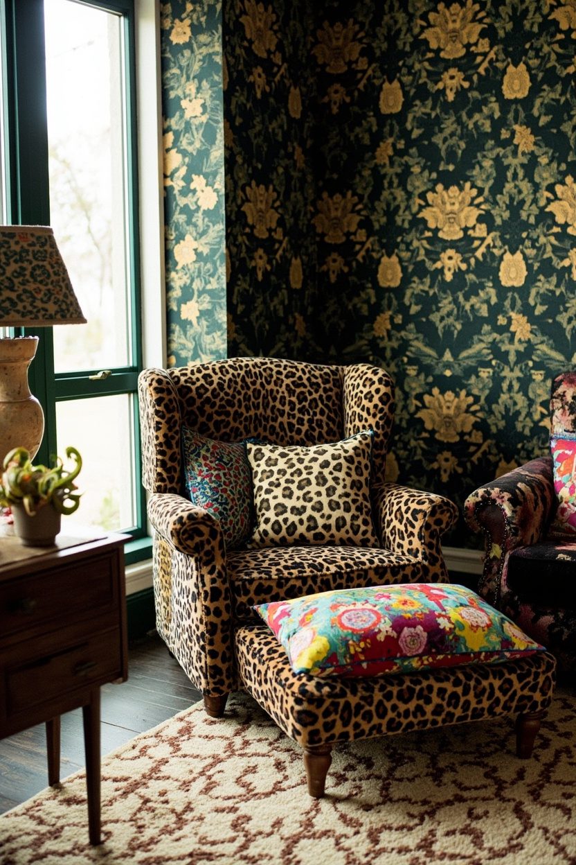
3. Grandma-Chic Florals
- Effort Level: Weekend DIY.
- Estimated Budget: 150-800.
- Maintenance Level: Low (Vacuum and spot clean).
- Best For: Living rooms and guest rooms.
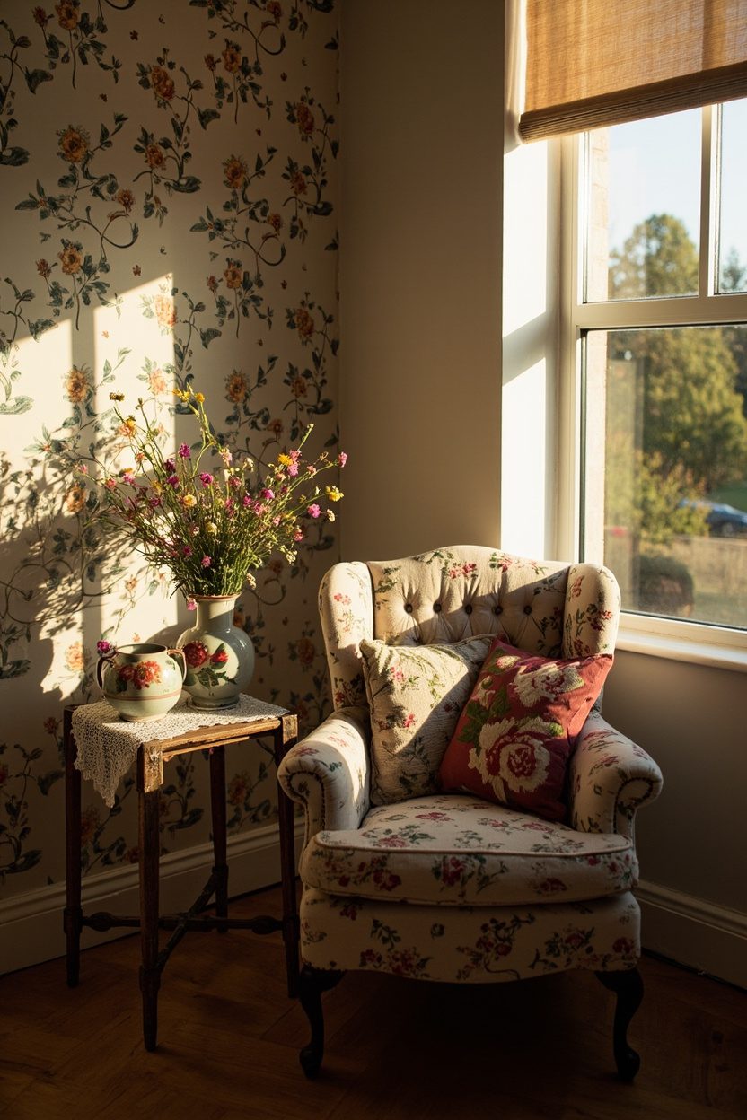
Florals thrive with contrast. Pair a chintz sofa with modern iron side tables or a streamlined lamp to dodge tea-room cosplay and land in fresh, layered territory.
Choose a floral era and stick to it. A 1930s cabbage rose reads differently from a 1970s ditsy. Mixing decades loosely is fine, but committing to one helps prints feel intentional.
Mind proportion to room size. Large botanicals can visually shrink a tiny space, so try medium repeats on pillows and art, leaving the rug or walls solid.
Curate color temperature. Warm reds and peaches love brass and oak, while cool blues and greens pair beautifully with nickel and pale ash. Keep metals consistent for polish.
Avoid fake bouquets that collect dust. Try seasonal stems, or go graphic with botanical prints. If you crave three-dimensional texture, a restrained, natural arrangement inspired by Boho Easter Floral captures the vibe without clutter.
Make It Your Own
If bold florals feel risky, start with a single vintage chair reupholstered in your hero print. Pull a neutral from the fabric for walls, then echo a secondary color in a throw or two, stopping before the matchy spiral begins.
4. Textured Statement Wallpapers
- Effort Level: Weekend DIY.
- Estimated Budget: 200-800.
- Maintenance Level: Low, occasional dusting.
- Best For: Feature walls and powder rooms.
What You’ll Need:
- Pre-pasted or peel-and-stick textured wallpaper rolls.
- Smoothing tool and sharp snap-off utility blade.
- Level, tape measure, and pencil for plumb lines.
- Seam roller and lightweight filler for wall prep.
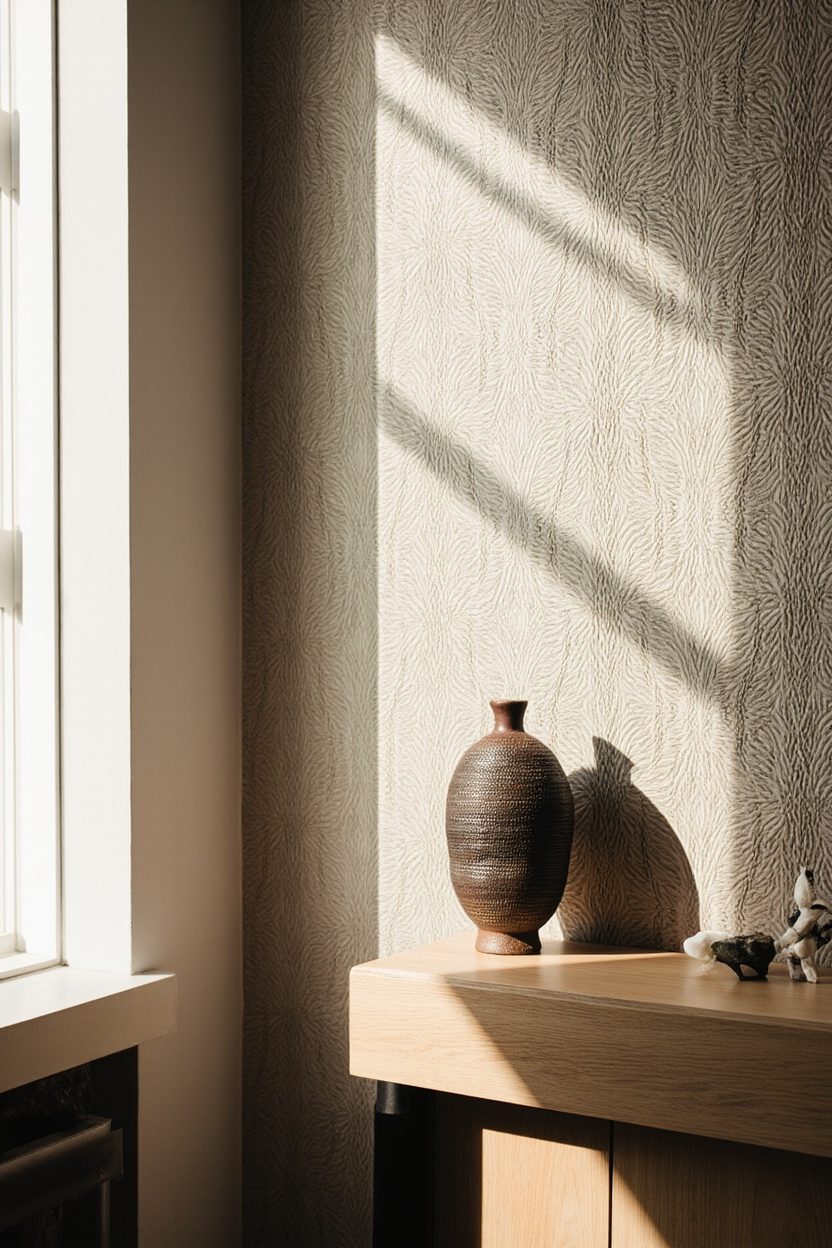
Tactile papers are trending, yet the mistake is going wall-to-wall in heavy grasscloth or faux plaster without testing light. Deep textures can read blotchy in shadowy corners, turning cozy into cave-like quickly.
Pick one focal wall opposite your main light source, then color sample adjacent paint to match undertones. Cool gray plaster next to warm beige trim creates a restless mismatch that feels unintentionally dirty.
Avoid micro-scale textures in large rooms and mega textures in tiny rooms. Scale the embossing to the space, about quarter inch depth for medium rooms, slightly flatter for narrow halls to prevent visual drag.
In bathrooms, seal seams near splash zones and avoid unvented showers. Natural grasscloth stains, so choose vinyl-backed lookalikes where moisture is high, reserving the real fibers for bedrooms and dining rooms.
Stylist’s Note
If you are craving dimension without commitment, run textured wallpaper as a wainscot, about 36 to 42 inches high, with a simple painted rail. It gives architecture to plain drywall and saves budget on full-height coverage.
Lean into 2026’s love of materiality, but pair it with quiet art. A textured wall plus a restrained arrangement from Minimalist Gallery Walls keeps the room balanced without visual shouting.
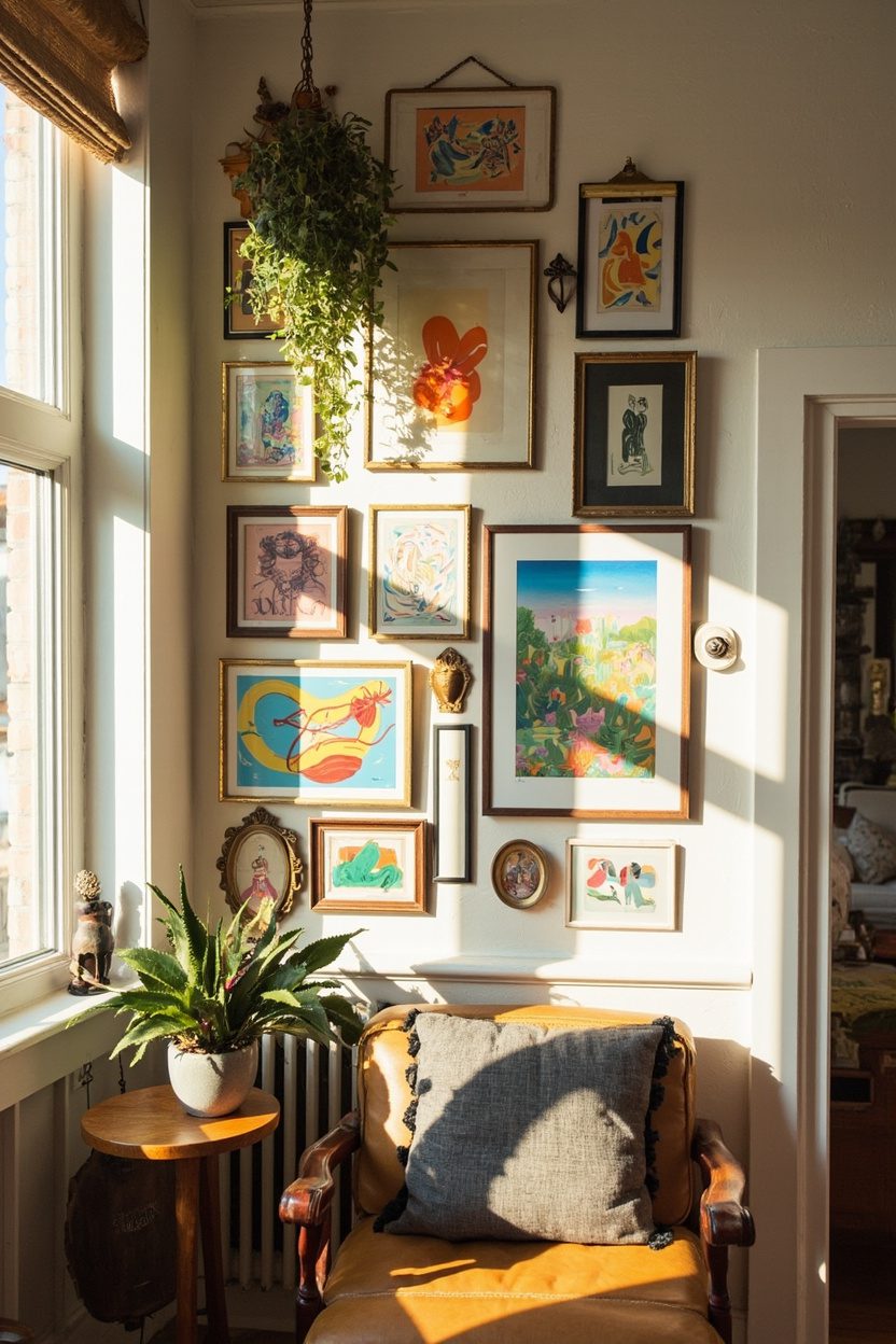
5. Whimsical Gallery Walls
- Effort Level: Afternoon refresh.
- Estimated Budget: 100-600.
- Maintenance Level: Low, occasional dust and re-leveling.
- Best For: Stairwells, hallways, and over sofas.
When playfulness meets curation, the pitfall is chaos. Too many sizes, mismatched frames in clashing finishes, and no breathing room can make even great art feel like clutter.
Choose a unifying thread, either frame color, mat width, or subject tone. Black wood frames with two-inch white mats will happily host vintage postcards, kids’ sketches, and flea-market oils without arguing.
Map your layout on the floor, then transfer with painter’s tape templates. Keep two inches between frames for small sets, three to four inches for larger pieces, and maintain a steady bottom or center line.
Mix one oddball, like a textile swatch or tiny sculptural sconce, but stop at one or two. The whimsy works when it is edited, not when every piece is shouting to be the star.
When I tried this in my own living room, I made the mistake of hanging onto the tops of the frames, not the visual center. Everything drifted unevenly until I re-hung using the center line at 57 to 60 inches.
Make It Your Own
Start with a tight grid above the sofa, then let the arrangement loosen as it climbs a stair. It reads intentionally at eye level, and delightfully collected as it rises, especially paired with a seasonal moment like Holiday Staircase Decor.
If you love color, echo one accent from your rug across three pieces, even if the subjects differ. That single hue will stitch the story so your wall feels curated, not chaotic.
6. Bold Color Blocking
- Effort Level: Weekend paint project.
- Estimated Budget: 80-400.
- Maintenance Level: Low, scuff touch-ups.
- Best For: Entryways, home offices, and kids’ rooms.
Color blocking adds energy, but hard lines placed at awkward heights can visually shorten ceilings or bisect windows oddly. Avoid stripes that cut across trim or skim crown by less than two inches.
Choose a harmonious triad, one dominant, one support, one accent. Matte finish hides roller marks on large planes, while satin is smarter near doors and banisters where fingerprints happen.
Use a laser level and good painter’s tape, then burnish edges with a credit card. For ultra crisp lines on textured walls, seal the tape edge with the wall color first, then apply your block shade.
Mind furniture alignment. Blocks should relate to a headboard width, desk length, or a reading nook corner, not float randomly. A 60-inch wide headboard pairs nicely with a 66 to 72-inch wide block.
The Golden Rule Here
Let architecture lead. Start and stop blocks at real breaks, like casing edges, alcove corners, and built-ins. It will look custom rather than costume, and it keeps the room from feeling sliced up.
If you are pairing with bolder accents, echo one paint color outdoors with a compact feature like a Plunge Pool Surround tile or planter tone. The dialogue between inside and out makes the palette feel considered rather than impulsive.
7. Fringe and Ruffles
- Effort Level: Weekend DIY.
- Estimated Budget: 100-500.
- Maintenance Level: Low (Wipe clean).
- Best For: Small, low-light spaces.
Fringe and ruffles can be charming, but too many layers feel costume-y fast. Keep trims to one statement piece per room, like a skirted side table or a single ruffled pillow, to avoid fuss overload.
Choose tactile, quality materials over synthetic shine. Cotton tape fringe or linen ruffles read refined, while overly glossy polyester trims can skew novelty and attract dust in the wrong ways.
Mind scale so the detail does not swallow the silhouette. A deep bullion fringe belongs on a generous sofa, while petite brush fringe suits lamp shades or ottoman edges without stealing the show.
Limit color contrast when using busy trims. Tone on tone, like ivory fringe on a cream chair, looks elevated and keeps the eye from ping-ponging around the room.
Place trims away from high-traffic pet zones and sticky hands. Skirts near dining chairs or kids’ play corners invite snags and stains, which quickly turn charming into shabby in the wrong sense.
Stylist’s Note
If you love the whimsy trend peeking into 2026, treat fringe like jewelry, not clothing. Sample a swatch at home first, watch it in daylight and lamplight, then commit to where the texture adds gentle movement rather than clutter.
For more pared-back balance on the walls, a quiet art arrangement like this takes on Minimalist Gallery Walls, which can steady the room without competing.
8. Vintage Trinket Vignettes
- Effort Level: Weekend DIY.
- Estimated Budget: 100-500.
- Maintenance Level: Low (Wipe clean).
- Best For: Small, low-light spaces.
Curios deserve breathing room. Crowd control is key, so edit to odd numbers, three or five per surface, and vary height with a book stack, a petite frame, and one sculptural piece.
Unify unrelated finds with a single throughline. Choose a material, like pewter or milk glass, or a color family, like moss and tobacco, so the vignette reads collected, not cluttered.
Scale your surfaces wisely. A slim console wants delicate items, while a deep credenza can handle a lidded box, a low bowl, and a small lamp without tipping into flea-market chaos.
Avoid competing themes on one shelf. Mixing nautical, midcentury plastics, and Victorian lace in a single cube confuses the story, so tell one narrative per zone for clarity.
Commit to dusting rhythm. Open displays gather film quickly, so relocate extras to a labeled storage bin and rotate seasonally, refreshing the story while easing maintenance.
The Golden Rule Here
Photograph your arrangement, then edit from the image, not the surface. The camera reveals visual noise you stop seeing in person.
If a piece does not earn its spot in two seconds, pull it and let the tableau breathe. For a cozy holiday moment, one focused scene on a stair landing draws the eye beautifully, as in this thoughtful Holiday Staircase Decor inspiration.
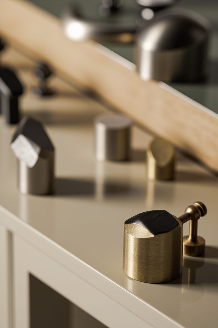
9. Playful Mixed Metals
- Effort Level: Weekend DIY.
- Estimated Budget: 100-500.
- Maintenance Level: Low (Wipe clean).
- Best For: Small, low-light spaces.
Mixing metals can sparkle, but an anything-goes approach dulls the impact. Choose one lead finish at roughly 60 percent, one supporting at 30, and a spice accent at 10 for harmony.
Watch undertones so neighbors play nicely. Warm brass pairs well with oil-rubbed bronze, while cool chrome prefers nickel or blackened steel, keeping clashes at bay on faucets, frames, and pulls.
Cluster metals intentionally. Repeat a finish at least twice within sight lines, like a brass mirror echoed by a tray, so choices feel cohesive rather than accidental.
Mind sheen as much as color. Antique or satin finishes hide fingerprints and feel richer, while a single high-polish moment, like a pendant, provides the glimmer without broadcasting smudges.
Avoid metal overload on small fixtures. In compact kitchens, keep hinges and knobs consistent, then let lighting or barstool bases deliver the contrast without turning the room into a hardware catalog.
Before You Buy
Bring home finish chips or sample pulls, then look at them beside countertop swatches and flooring. Lighting shifts undertones dramatically, and a brass that glows at noon can go green by evening.
10. Clashing Prints Done Right
- Effort Level: Weekend DIY.
- Estimated Budget: 100-500.
- Maintenance Level: Low (Wipe clean).
- Best For: Small, low-light spaces.
What You’ll Need:
- 2 to 3 patterned textiles in a shared color family.
- Solid anchor piece, like a sofa or rug, in a neutral or desaturated hue.
- Painter’s tape and measuring tape for balanced placement.
- Sample swatches or peel-and-stick testers before full commitments.
Pair bold patterns by repeating one color across all prints, such as emerald, rust, or ink blue. This single thread keeps the look intentional, not chaotic, even when scales and motifs differ dramatically.
Balance scale so one large, one medium, and one small pattern share the room. Think oversized botanical drapery, a mid-scale stripe on cushions, and a petite dot or check on a throw.
Ground the mix with one generous solid, like a camel wool rug or oat linen sofa. The eye needs a visual pause, especially in tight rooms where prints can feel crowded.
Limit shiny finishes when mixing loud motifs. Matte cotton, linen, and bouclé read calmer, while gloss can overhype already energetic prints and create visual noise.
Make It Your Own
Start on a bench or accent chair to test your trio before you upholster a whole sofa. Tape up swatches on the wall beside existing pieces, then step back twelve feet to judge harmony in natural light. If it vibrates, swap either the scale or the undertone, not both.
For a minimalist take, borrow ideas from a curated approach like Minimalist Gallery Walls, echoing color without piling on pattern count.
FAQ
Two to three is the sweet spot for most spaces, especially if one is large-scale, one medium, and one small. Beyond three, add solids and textures to let the pattern breathe and maintain visual rhythm.
Yes, stripes act like a neutral pattern, especially in narrow or pinstripe formats. Keep a shared color, align undertones, and distribute them across the room so no single surface carries all the contrast.
Not if you ground the palette with one dominant neutral and keep prints to movable pieces like cushions and a throw. Hang drapery in the wall color to stretch height, then layer patterns at the seating level.
Designers are embracing whimsy and layered looks, as noted by Country Living’s 2026 trend coverage on why whimsical decor is surging. Use that spirit as permission to test scales, then refine with swatches before committing yardage.