

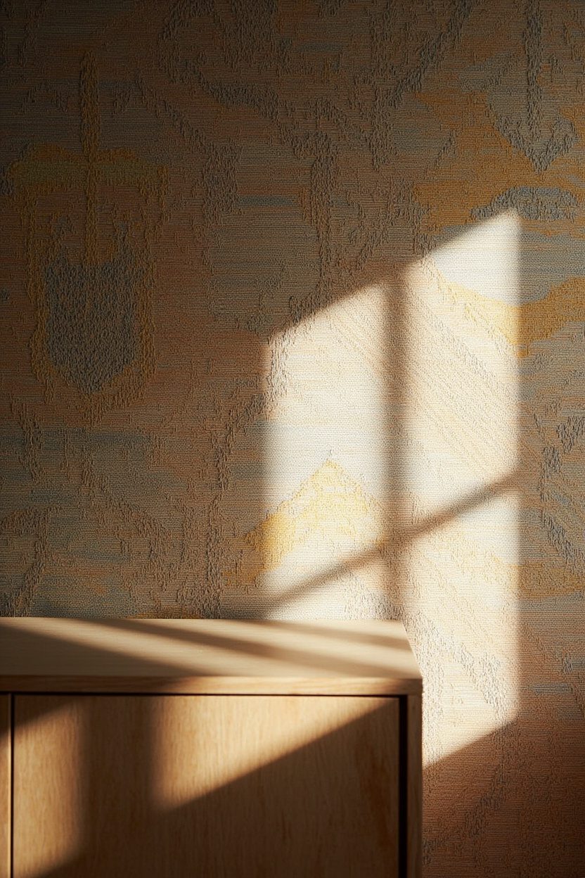
Boho wallpaper is about texture, color depth and the kind of relaxed sophistication that reads as effortless—but only when you choose with intention. Think beyond small-repeat florals: large-scale murals, painterly textures and sun-faded palettes make a room feel curated rather than crowded. In 2026 the most compelling boho directions lean into earthy pigments—burnt terracotta, warm ochre, moss and patina blues—so pick a dominant tone and limit competing accents to keep the look grounded.
Start with a clear architectural play: pick one focal wall and commit to scale. Boho works best when wallpaper acts like a textile on the wall—layer it with rattan, a woven throw, or a simple gallery of macramé to echo texture rather than compete with pattern.
- 1. Earthy Terracotta Murals
- 2. Ochre Accent Walls
- 3. Moss Green Textures
- 4. Sage Botanical Prints
- 5. Patina Blue Patterns
- 6. Dusty Teal Geometrics
- 7. Warm Cream Backdrops
- 8. Handprinted Ikat Designs
- 9. Woven Tapestry Motifs
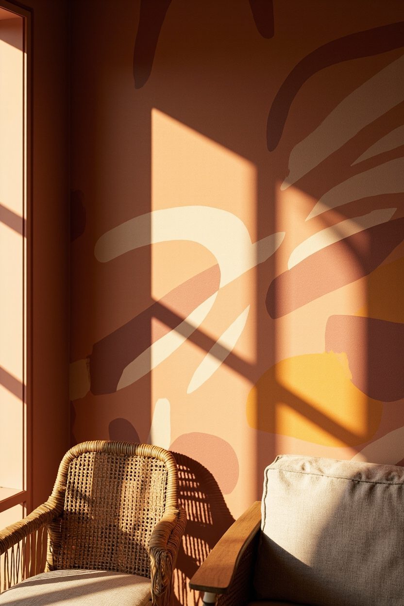
- 10. Abstract Boho Shapes
- 11. Global Tribal Prints
- 12. Large-Scale Florals
- 13. Macramé-Inspired Prints
- 14. Sunburst Motifs
- 15. Muted Sunset Gradients
- FAQ
- Final Thoughts
1. Earthy Terracotta Murals
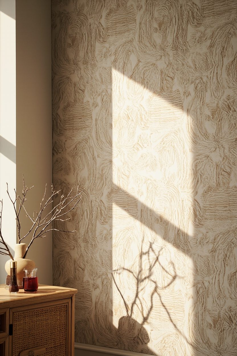
Large-scale terracotta murals read like a sun-warmed backdrop that immediately anchors a living room or bedroom. Choose a mural printed on a matte, textile-feel paper to avoid glare; the tactile finish mimics plaster and keeps colors—burnt sienna, warm clay—from looking flat, and pairs beautifully with natural oak or walnut furniture at a 1:3 scale ratio (large mural, medium furniture, small decor).
This is not the moment for busy patterned upholstery; instead pick upholstery in a neutral warm cream or tobacco leather. Budget tip: opt for a peel-and-stick mural for renters or a canvas-backed pasted mural for longevity—expect to spend $250–$1,200 depending on size and print quality.
Styling Blueprint
- Finish: matte, textile-feel wallpaper for depth and low glare.
- Complementary materials: oak or walnut, woven jute rugs, and terracotta pottery.
- Color accents: warm cream, muted mustard, and deep olive green.
- Placement: large focal wall behind bed or sofa at full height.
2. Ochre Accent Walls
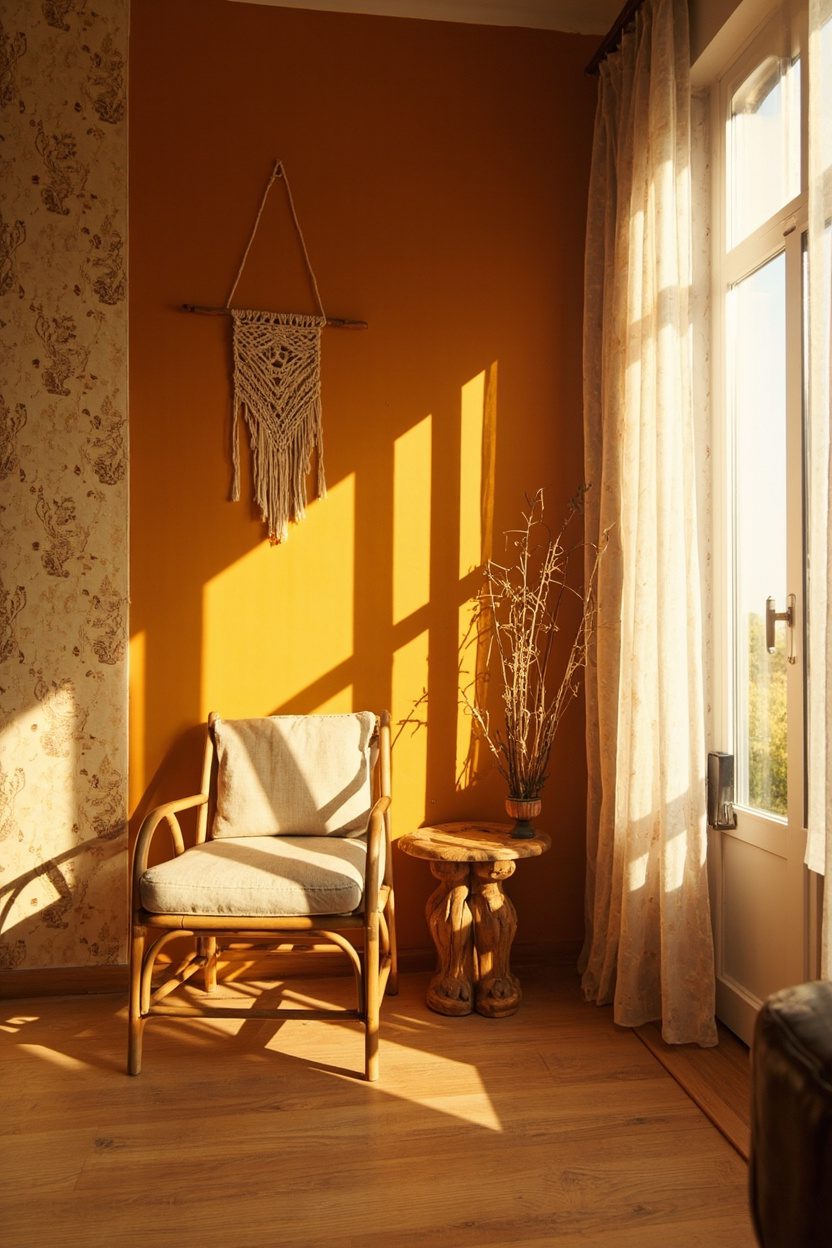
Ochre is the boho neutral that reads as sunshine-washed rather than neon; use it as a single accent wall in a kitchen or dining area to lift the light and pair with matte black hardware for contrast. Choose a wallpaper with painterly brushstrokes or a subtle linen texture so the ochre reads layered—avoid glossy finishes that make ochre feel cheap and artificial.
Scale matters: keep the rest of the room in warm creams and natural woods, and introduce one patterned textile—like a kilim seat cushion—to echo ochre tones. For a budget-conscious install, buy a mid-range paste-the-wall roll and reserve splurge funds for statement lighting in a dark metal finish.
What to Focus On
- Texture: choose brushstroke or linen-effect prints to add dimensionality.
- Contrast: matte black fixtures or shelving for crisp edges against warm ochre.
- Textiles: one patterned rug or cushion to tie ochre into the palette.
- Placement: single feature wall behind dining table or stove for instant warmth.
3. Moss Green Textures
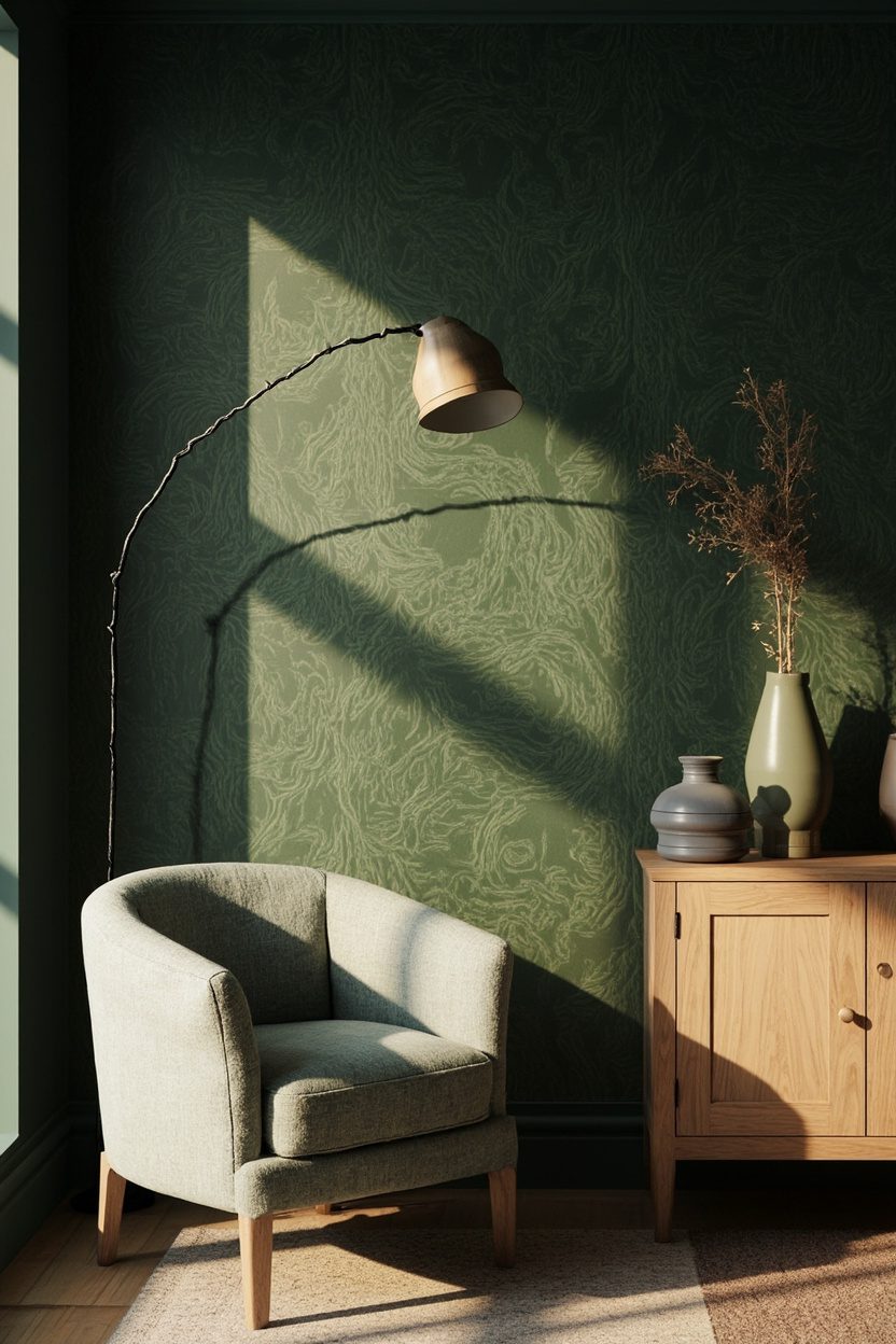
Moss green wallpapers add an organic, grounding presence that works well in bedrooms, home offices, and cozy reading nooks; select a subtle textured pattern—think fine strie, grasscloth effect, or watercolor washes in sage to deep moss—to avoid visual heaviness in smaller rooms. Opt for low-VOC papers if you’re enclosing a small space, and choose a lighter moss for north-facing rooms to retain warmth.
Pair with brass or aged gold accents and natural fibers—wool throws, linen curtains—to introduce contrast and a layer of shine. A critical decision: match the wallpaper’s undertone (warm vs cool) to your flooring tone—warm moss with warm wood, cooler moss with bleached or gray floors—to prevent discordant color clashes.
Essential Elements
- Pattern: fine strie or grasscloth texture for tactile depth without busyness.
- Undertone match: warm moss with warm wood; cool moss with gray or bleached floors.
- Accents: brass hardware and natural fiber textiles for balance.
- Room choice: bedroom, office, or reading nook for restful green presence.
4. Sage Botanical Prints
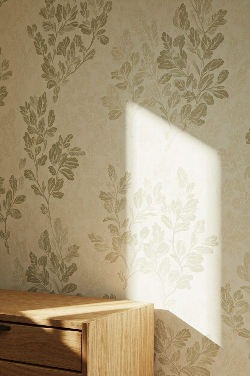
Sage botanical wallpapers bring the outdoors in without overwhelming the room—think scale: choose large-leaf motifs for a feature wall and smaller sprigs for a full-room application. The color sits squarely in 2026’s boho palette (sage green with warm cream highlights), so pair it with raw wood furniture and woven textures to keep the look grounded rather than fussy.
These prints work especially well in north-facing spaces because the green reflects cool light warmly; avoid glossy vinyl papers here and opt for a matte paste-the-wall paper for richer color depth and easier hanging. A practical decision: use a 10–12-inch border of plain cream paint at the ceiling to prevent pattern fatigue in compact rooms.
What to Focus On
- Match scale: large motifs for accent walls, small repeat for all-over coverage.
- Material: choose matte, non-reflective paper for true sage tones.
- Furniture pairing: warm oak or rattan to complement the green undertones.
- Budget tip: buy a single roll extra to allow pattern matching and repairs.
5. Patina Blue Patterns
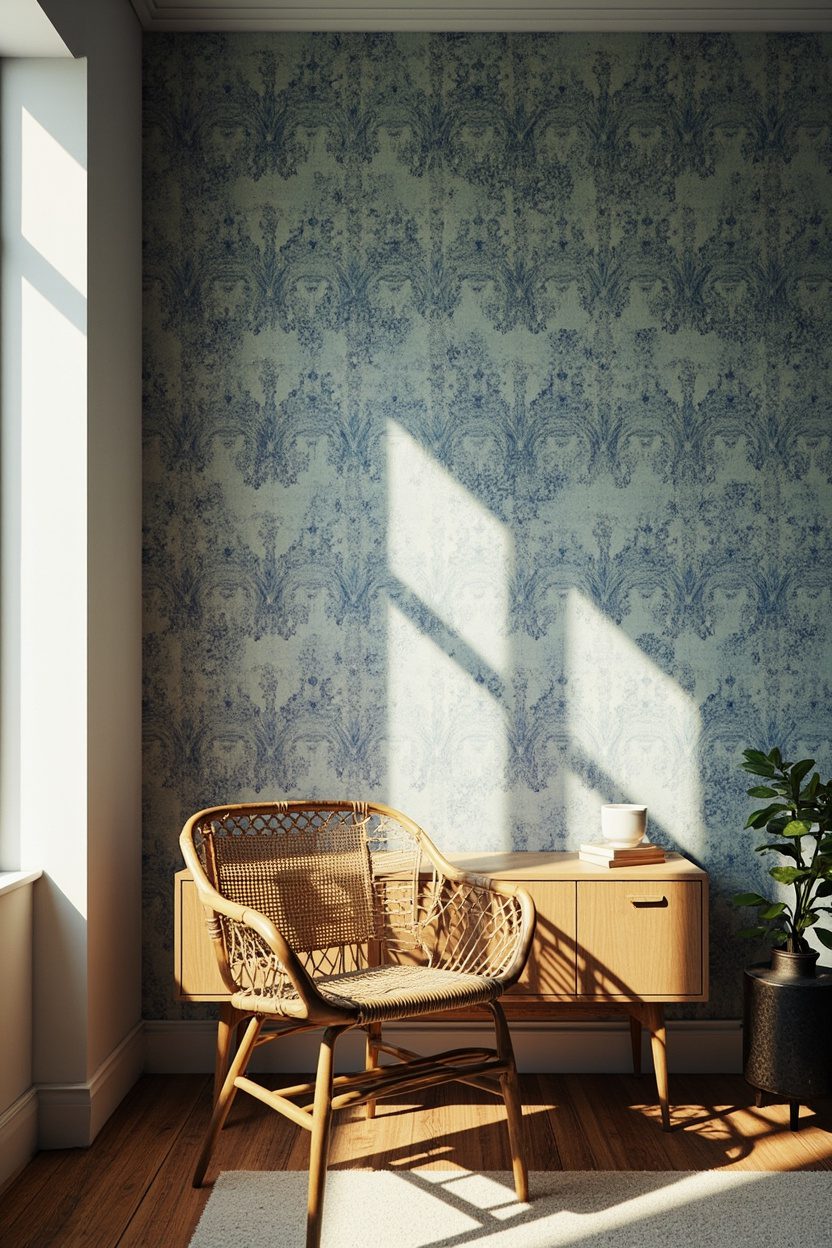
Patina blue brings a soft, vintage coastal note into boho rooms—think faded teal and dusty blue with irregular washes that mimic aged metal or weathered tiles. Use it in living rooms or bedrooms where you want a calm backdrop; for high-impact, run the wallpaper behind a low-profile headboard and pick up the blue in two accent pillows for cohesion.
Opt for washable, scrubbable paper in family zones because patina finishes often look intentionally distressed, making them forgiving of subtle wear; however, avoid high-gloss finishes which flatten the layered color. If you’re layering prints, keep secondary patterns small and geometric to let the patina texture read clearly.
Essential Elements
- Color note: choose patina with warm undertones to pair with ochre and terracotta accents.
- Finish: select a slightly textured, washable paper for durability.
- Scale strategy: use all-over patina in larger rooms, panel it in small rooms.
- Styling tip: add brass or aged metal fixtures to echo the patina look.
6. Dusty Teal Geometrics
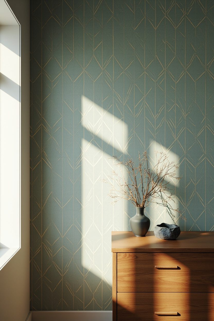
Dusty teal geometrics give boho a modern backbone—structured repeats in softened teal create rhythm without feeling cold when paired with warm neutrals. For proportion, use a medium-scale geometric (2–6 inch repeat) on an entryway or behind open shelving so the pattern reads from multiple angles rather than becoming a busy blur.
Choose a paper with slight texture to absorb light and prevent the teal from appearing neon; painted trim in warm cream rather than stark white keeps the overall palette cohesive. A common pitfall: matching too many other bold patterns—limit complementary prints to one small-scale pattern and one solid textured upholstery piece.
Styling Blueprint
- Repeat size: medium repeats (2–6 inches) work best for visibility and balance.
- Finish: textured matte to soften the teal and hide imperfections.
- Pairing: combine with warm creams and natural fibers to avoid a cold look.
- Avoid: overloading with other large-scale patterns in the same room.
7. Warm Cream Backdrops
Warm cream wallpapers act like a soft spotlight—they lift a room without shouting. Choose a warm-cream base with subtle texture (linen, grasscloth, or a matte plaster print) to reflect the boho palette of burnt terracotta, sage green, and dusty teal; avoid anything with cool undertones that will read grey and flatten the look. For scale, use larger rolls in rooms with high ceilings and finer textures in compact spaces to keep the surface from overpowering the furniture placement.
Warm cream is an ideal neutral for layering: paint trim a slightly deeper cream or pale ochre and pick upholstery in moss green or warm terracotta for contrast. A common mistake is pairing warm cream with ultra-bright white trim—opt for softened trims or natural wood to maintain that lived-in boho warmth and a cohesive color story.
Styling Blueprint
- Use grasscloth or linen-effect panels for tactile depth and natural fiber feel.
- Pair with wood tones (oak or teak) and woven rattan accents for authenticity.
- Choose textiles in burnt terracotta or sage as accent colors to anchor the room.
- Avoid pure cool whites on trim; use warm off-white or stained wood instead.
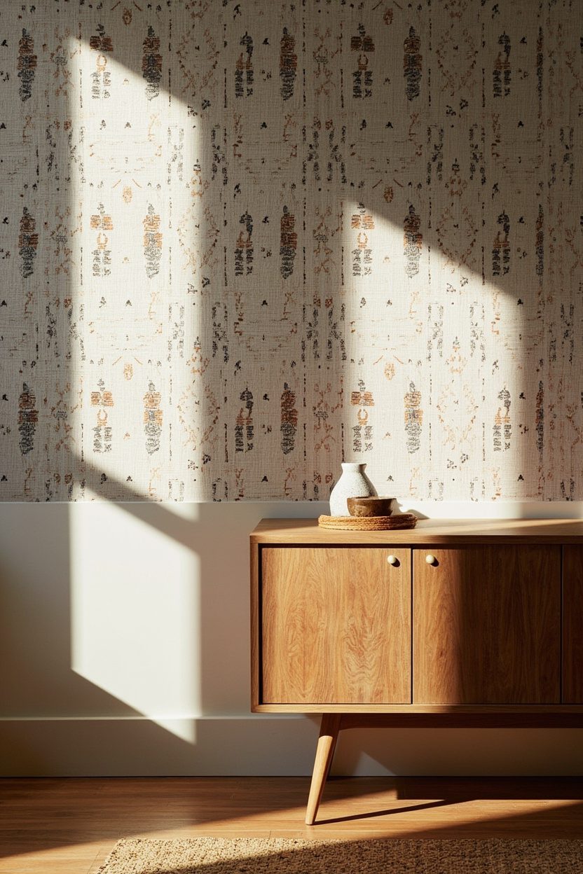
8. Handprinted Ikat Designs
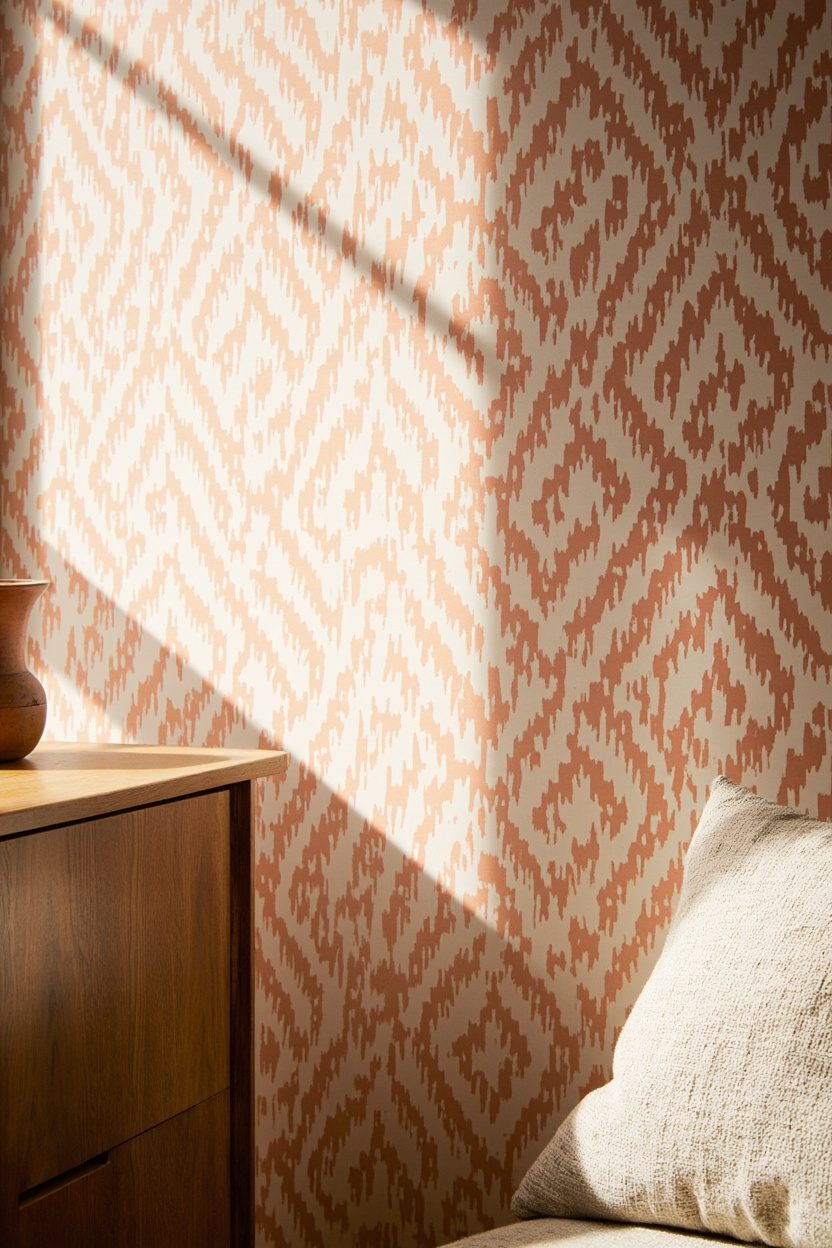
Handprinted ikat wallpapers bring that delightful, slightly imperfect patterning central to boho aesthetics—look for designs where the dye-blur is visible, not digitally crisp. Scale matters: large ikat repeats read modern and bold in open-plan living rooms, while narrow repeats are better for entryways or powder rooms; when in doubt, sample a 1m strip to test the visual rhythm against your furniture scale. Material choice is key—textured vinyl or heavyweight paper will hold dye-like edges better than ultra-smooth substrates.
Ikat pairs brilliantly with leather, warm metals, and woven textiles; limit competing patterns by keeping one other strong texture (like a jute rug) and two solids in the palette. For budget-conscious updates, install ikat as an accent wall behind a bed or sofa rather than papering every wall—this gives maximum impact with minimal cost and avoids pattern fatigue.
What to Focus On
- Choose a handprinted look with visible dye edges for authentic boho character.
- Match pattern scale to room size—big repeat for large rooms, narrow for small spaces.
- Combine with leather and brass accents to complement the warm, artisanal vibe.
- Use as an accent wall to control cost and visual busyness in the room.
9. Woven Tapestry Motifs
Wallpaper that mimics woven tapestries lends instant textural richness without the maintenance of real fiber art—pick designs that replicate macramé knots, kilim diamonds, or braided fringe in warm ochre, moss green, or patina blue to stay on-trend. For authenticity, favor matte finishes and tactile embossing; glossy prints will betray the illusion. When placing tapestry-motif paper, center the pattern over a focal point (mantel, bedhead, or console) to create a gallery-like anchor rather than a continuous field that can feel heavy.
Balance is essential: keep surrounding decor minimal and tactile—rattan lighting, a soft wool throw, and sculptural pottery—to let the woven motif breathe. If you want to layer actual textiles, select a single complementary print (such as a solid kilim cushion) to avoid clashing patterns; for fireplace styling tips that work with tapestry wallpapers, see Minimalist Mantle Decor.
Essential Elements
- Opt for embossed, matte papers to mimic true textile texture.
- Center the pattern on a focal wall for maximum visual impact.
- Keep furnishings simple and tactile—natural fibers and sculptural ceramics.
- Layer only one complementary textile pattern to prevent visual clutter.
10. Abstract Boho Shapes
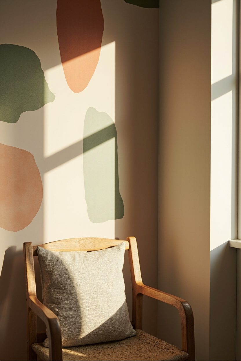
Abstract boho shapes bring playful energy without the fuss—think oversized, hand-drawn ovals, irregular arches and swooping lines in burnt terracotta, dusty teal and warm cream. Use this wallpaper on a single accent wall behind a low bedhead or a mid-century credenza; the scale of the shapes should be large enough to read from across the room (aim for motifs 18–36 inches across) so the pattern reads as a graphic, not busy texture.
Keep finish and material pragmatic: choose a matte, washable vinyl if the wall sees traffic or sunlight, and pick a non-woven paste-the-wall paper for smoother installation in rental scenarios. Avoid tiny, repetitive prints that compete with the abstract shapes—contrast is the point here, not clutter.
Styling Blueprint
- Place on one focal wall only to maintain balance and prevent visual fatigue.
- Pair with solid, natural-fiber upholstery in sage or warm cream for calm contrast.
- Coordinate metal accents in aged brass to warm up the color mix.
- Choose a large-scale motif (18–36″ repeat) so shapes remain readable from a distance.
11. Global Tribal Prints
Global tribal prints give a boho space a curated, collected-over-time look—textural ikats, mud cloth-inspired geometrics and elongated diamond motifs in moss green, ochre and patina blue. Use these patterns in a reading nook or hallway where their rhythmic repeat can lead the eye; select a mid-scale repeat (8–14 inches) so the cultural references stay legible without feeling miniaturized.
For authenticity and longevity, pick wallpaper that mimics woven texture rather than flat, printed motifs—embossed or grasscloth-effect vinyl reads as textile from across the room. Avoid copying sacred or highly specific tribal symbols; instead, choose stylized, inspired versions to respect origins while capturing the aesthetic.
What to Focus On
- Match scale to space: mid-scale repeats for narrow hallways, larger repeats for feature walls.
- Favor textured or embossed papers to evoke handwoven fabrics.
- Anchor with natural wood furniture and layered rugs in warm ochre or moss green.
- Steer clear of overly literal cultural motifs—opt for inspired geometrics for broader appeal.
12. Large-Scale Florals
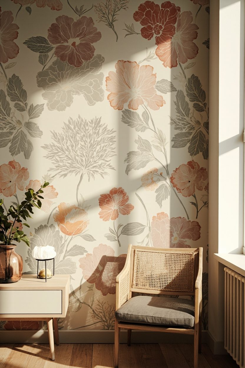
Large-scale florals in boho schemes are about relaxed, painterly blooms rather than tight, formal bouquets—think oversized poppies or abstract blossoms in warm terracotta, dusty teal and soft cream. Install this wallpaper on a bedroom feature wall or behind an open shelving run; choose a repeat where single blooms are 24 inches plus so the pattern reads like an art piece and not a cottage print.
Material choice matters: a non-woven or paste-the-wall vinyl with a slight texture will hide seams on large motifs and withstand light cleaning. Keep accompanying textiles simple—linen or slub cotton in solid colors—so the florals remain the room’s focal point and don’t compete with patterned cushions.
Essential Elements
- Opt for blooms 24″ or larger for impact and readability.
- Use matte paper with subtle texture to hide seams on big motifs.
- Balance with solids in linen or cotton to avoid pattern overload.
- Limit to one wall to keep the room feeling serene, not overwhelming.
13. Macramé-Inspired Prints
Macramé-inspired wallpaper translates the tactile, knotted look of fiber art into a low-maintenance wallcovering that reads cozy at a distance and detailed up close. Choose a larger-scale pattern in natural beige and warm cream to keep the room feeling airy; for a bolder statement pick a charcoal-on-cream motif to anchor a reading nook. A key decision: match the wallpaper’s knot scale to room size — small knots in compact bedrooms, oversized ropes in double-height living rooms to avoid visual fussy-ness.
This pattern pairs exceptionally well with raw wood furniture and woven rugs; avoid mixing it with competing busy prints to preserve the handmade aesthetic. If you want texture without the upkeep, use the wallpaper on a single focal wall behind a bed or couch rather than all four walls to keep production costs in the mid tier and maintain balance.
Styling Blueprint
- Place the print on a single focal wall behind seating or a bed to maximize impact without overwhelming the room interior.
- Complement with carved wood or rattan furniture to amplify the artisanal vibe.
- Keep accent colors in warm neutrals and a single pop color like terracotta for coherence.
- Avoid small-scale patterned upholstery to prevent visual competition with the macramé motif.
14. Sunburst Motifs
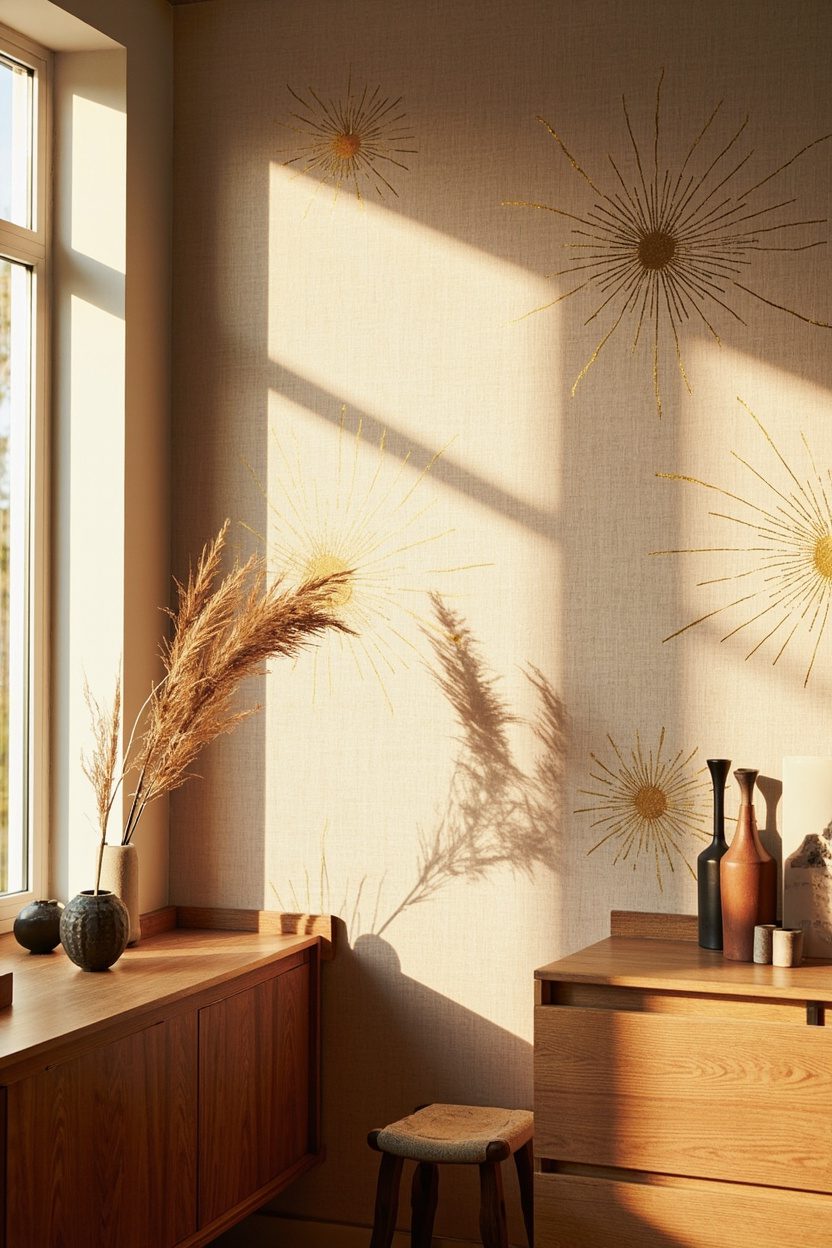
Sunburst wallpapers give instant optimism—ideal for entryways, kitchens, or a cheerful accent wall in a home office. Pick a warm palette of ochre, patina blue, or dusty teal to lean into 2026’s boho color directions; for a classic look choose a gilt-lined sunburst on deep navy. Important practical choice: pick a repeat size that complements architectural features — small repeats for narrow halls, large sunbursts for wide living rooms so the pattern breathes.
Sunburst motifs work as a directional design tool, drawing the eye upward when placed behind a console or above a mantel. Keep metallics limited to one element (light fixture or mirror) to avoid a gaudy finish and pair the pattern with simple geometric rugs for layered contrast.
What to Focus On
- Scale the repeat to the wall — larger motifs for big walls, smaller repeats for tight spaces.
- Select warm ochre or patina blue to stay current with boho color trends.
- Limit metallic accents to one piece to preserve the wallpaper’s optimism without excess.
- Use as an accent behind key furniture to visually elevate the ceiling line.
15. Muted Sunset Gradients
Muted sunset gradient wallpapers move beyond flat color to produce a soothing, painterly backdrop—think dusty teal bleeding into warm cream and a hint of burnt terracotta. Opt for a horizontally oriented gradient behind a bed or sofa to mimic natural light and create a calm focal plane; vertically oriented gradients work well in narrow rooms to emphasize height. Concrete decision tip: choose mid-priced, washable vinyl substrates for durability in high-traffic zones while retaining soft color transitions.
This wallpaper type is forgiving with décor: solid furniture and minimal art let the gradient sing, while textured throws and natural-fiber rugs add depth. If you aim for a subtle boho statement, pair the gradient with handcrafted accents and one strong anchor piece, such as a woven headboard or a sculptural floor lamp.
Essential Elements
- Install horizontally behind seating or sleeping areas to evoke evening light and calm the space.
- Choose washable vinyl for living rooms or kid-friendly zones to balance softness with practicality.
- Coordinate with one accent color pulled from the gradient, such as terracotta or sage green.
- Limit art on the gradient wall to one or two minimal pieces to preserve the tonal flow.
FAQ
How do I choose the right boho wallpaper scale for a small room?
- Favor small- to medium-scale repeats and lighter colorways to keep the space feeling open and avoid visual crowding.
Can I install boho wallpaper in high-traffic areas like hallways?
- Yes; pick durable, washable vinyl or coated papers designed for heavy use and focus patterns on one wall if concerned about wear.
Which wall should I wallpaper first in an open-plan space?
- Start with the wall behind the main seating area or the wall that naturally anchors the room, such as the one facing the entry or the mantel wall.
How do I coordinate furniture with a bold boho wallpaper?
- Choose solid, low-profile furniture in neutral tones and introduce one or two accent colors drawn from the wallpaper to maintain cohesion.
Final Thoughts
Boho wallpaper is about mood and materiality—choose prints that read like crafted textiles, prioritize scale to the room, and pair with honest materials (wood, rattan, woven fibers) to achieve an instantly transformed, lived-in look. For pattern ideas that lean into farmhouse or western boho hybrids, consult resources like Western Farmhouse Living and refine mantel treatments with pieces inspired by Minimalist Mantle Decor.