

Soft, intentional changes can remake a space faster and cheaper than a gut renovation.
Focused interventions, lighting with warmer tones, texture where a wall lacks interest, or swapping a sofa for a scaled-down model recalibrate how a room feels and functions.
This list gathers field-tested tactics that deliver visible impact without structural work, budget shock, or long timelines.
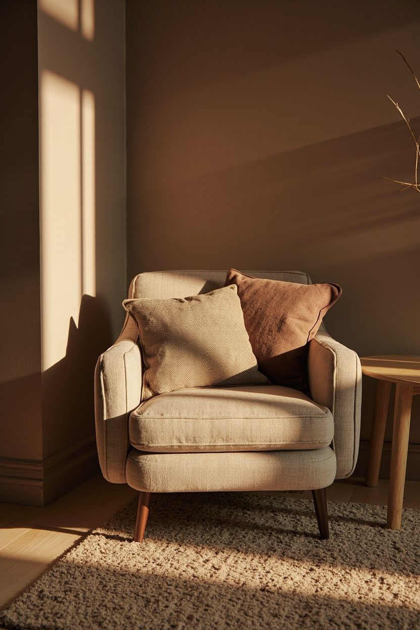
- 1. Warm-Glow Lighting
- 2. Textured Lamp Bases
- 3. End-of-Bed Benches
- 4. Silver Accents Revival
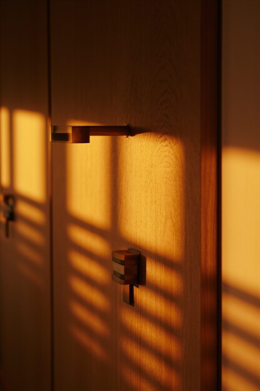
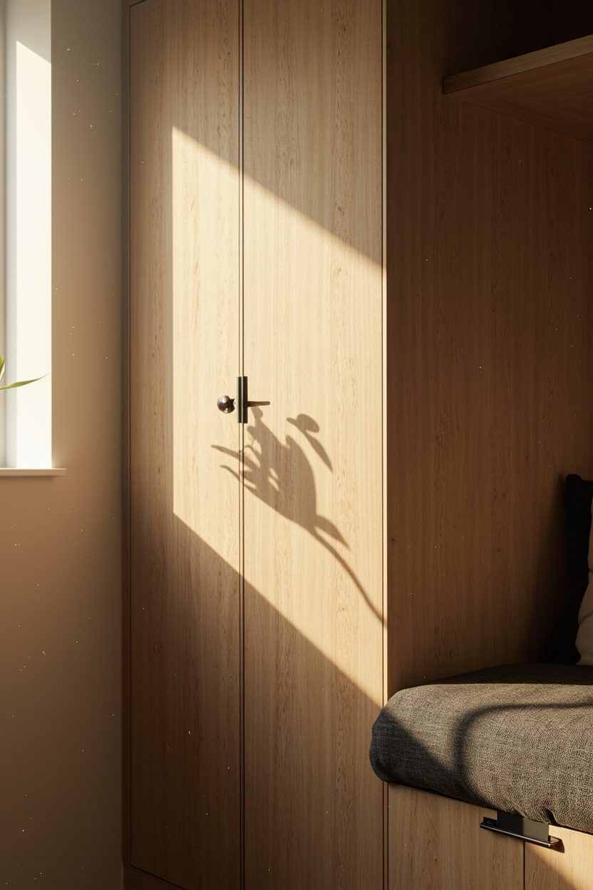
- 5. Wood Return
- 6. Terra-Cotta Backsplashes
- 7. Sage Cabinetry
- 8. Buttery Yellow Hues
- 9. Warm Taupe Layers
- 10. Olive Accents
- 11. Natural Material Layering
- 12. Terracotta Tile Floors
- 13. Ceramic Accessories
- 14. Stone-Look Finishes
- 15. Soft-White Bulbs
- 16. Muted Green Palettes
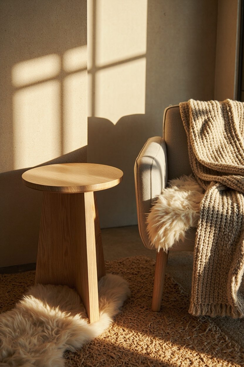
- 17. Multifunctional Furniture
- 18. Curved Sofa Silhouettes
- 19. Handcrafted Details
- 20. Organic Textures
- Final Thoughts
- FAQ
1. Warm-Glow Lighting
Switch out harsh, bright-white bulbs for warm-glow LEDs (2700K–3000K) to instantly soften a room. This is the single most effective mood change for living rooms and bedrooms; in kitchens and baths, aim for layered fixtures so task light remains crisp while ambient light stays warm. A small budget ($5–$20 per bulb) yields outsized returns in perceived comfort and hospitality.
Avoid mixing color temperatures in the same plane — a warm table lamp beside a cool recessed can feel disjointed. For open-plan spaces, zone your lighting: warm ambient plus cooler task lights over work surfaces. Consider dimmable bulbs (look for triac or ELV compatibility) to control intensity and extend lamp lifespan.
What to Focus On
- Choose LEDs labeled 2700K–3000K for living spaces and bedrooms.
- Use dimmers on ambient circuits for adjustable mood control.
- Keep color temperature consistent within each visual zone.
- Budget tier: quality warm LEDs ~ $8–$20 per bulb, depending on lumen output.
2. Textured Lamp Bases
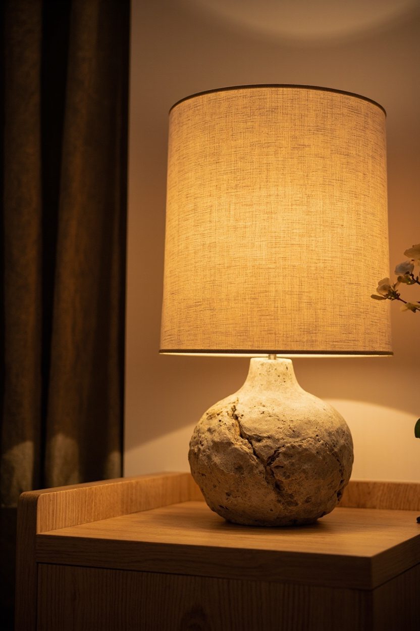
Swap plain metal or glossy bases for ceramic, terracotta, or stone-look lamps to add tactile warmth and sculptural weight to tabletop vignettes. Texture grounds a side table or console and layers immediately with minimal effort — choose matte glazes or unglazed terracotta for a modern-rustic feel, or hand-thrown ceramics for a boutique look. Scale matters: base diameter should be roughly one-third of the table’s depth to maintain balance.
Pair textured bases with simple shades — a neutral linen or paper shade keeps the focus on materiality without competing. When using multiple lamps, vary height by about 6–10 inches to avoid a static matchy-matchy feel. If budget is tight, shop thrift shops for vintage ceramic bases and rewire them to current safety standards.
Styling Blueprint
- Select ceramic or terracotta for tactile warmth and visual weight.
- Match base scale to table depth: base ≈ one-third of table depth.
- Use neutral linen shades to highlight texture rather than compete with it.
- Rewire vintage finds for unique, budget-friendly bases when possible.
3. End-of-Bed Benches
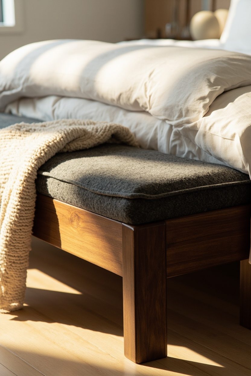
An end-of-bed bench creates instant polish and function — seating for dressing, a place to drop clothes, and a surface for layered textiles. Choose a bench length that sits within 2–4 inches of the bed frame width; too narrow looks flimsy, too long crowds the walkway. Upholstered benches in stain-resistant performance fabric work well in family homes; a leather or woven bench reads more grown-up and ages gracefully.
Place the bench 18–24 inches from the foot of the mattress to allow comfortable movement and airflow; in small rooms, opt for a narrow (14–16 inch) depth to keep circulation clear. If storage is needed, pick a lift-top or slatted shelf base rather than a deep drawer that complicates cleaning.
Essential Elements
- Bench length: within 2–4 inches of bed width for correct proportion.
- Depth: 14–16 inches for tight rooms, 18 inches for spacious bedrooms.
- Material: performance fabric for families, leather or woven for longevity.
- Choose lift-top or open-shelf storage to simplify access and cleaning.
Note: For boho color palettes or office styling cues that complement these touches, see related ideas like Boho Living Room Color and Boho Office Space Decor.
4. Silver Accents Revival
Silver has quietly shifted from dated to desirable when used as an accent rather than the dominant finish. Introduce silver through smaller, high-impact pieces—think a mirror frame in antiqued silver, a pair of silver-leafed side tables, or lamp bases with a brushed chrome patina—to add sophistication without coldness; pair with warm textiles (camel leather or wool throws) to avoid a sterile look. A practical decision: choose silver pieces in varying patinas (brushed, antiqued, polished) to create depth and prevent a flat, matchy ensemble rather than buying a single chrome finish across the room.
Use silver accents to lift existing furnishings on a modest budget: swap outdated drawer pulls for silver cup pulls in the kitchen, add a silver picture ledge in the hallway, or cluster silver votives on a mantel for seasonal sparkle. Avoid overuse—limit larger silver surfaces to one focal piece per room (for instance a silver-framed console) and keep the remainder in small doses to maintain balance and warmth.
Styling Blueprint
- Mix two silver patinas (antiqued + brushed) for layered interest and to mask fingerprints or wear patterns.
- Anchor silver with warm materials (oak, leather, wool) to avoid a cold palette.
- Replace 6–12 small hardware pieces (pulls/knobs) for under mid-tier budgets and big visual impact.
- Keep one silver focal point per room to prevent metallic overload.
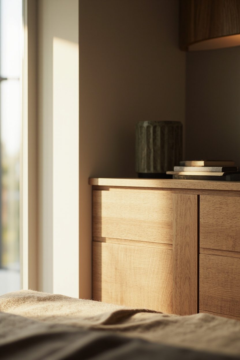
5. Wood Return
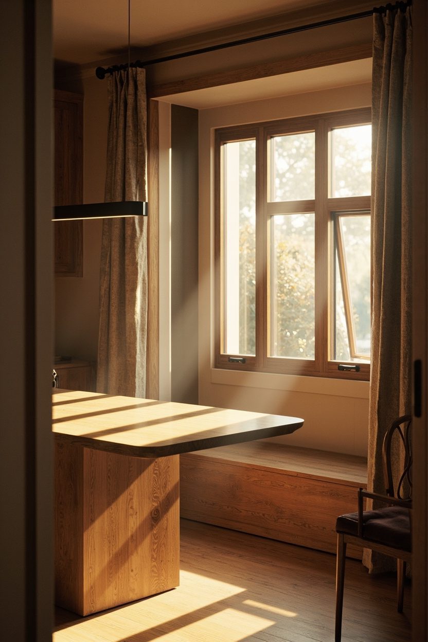
Wood is back as the neutral that grounds a room, but it’s not all about matching floors to furniture anymore—contrast is the point. Introduce mid–warm woods (walnut, honey oak, ash) in select pieces like a low credenza, floating shelves, or a bench; choose grain-forward finishes rather than painted veneers to keep the look authentic. A concrete choice: if you have light floors, choose medium-to-dark wood furniture (walnut or smoked oak) at a scale that doesn’t overpower the room—keep furniture heights under 30 inches in small living rooms to maintain sightlines.
Reintroducing wood can be a low-renovation win: swap a laminate tabletop for a live-edge walnut slab, or install three floating wood shelves for display and storage. Steer clear of mixing more than three wood tones in one room; instead, unify with a single undertone (warm or cool) and use metal or textile accents to bridge any leftover contrast.
Essential Elements
- Pick one dominant wood undertone (warm or cool) to avoid visual clash across pieces.
- Use live-edge or grain-forward pieces for authenticity on a mid-range budget (under $1,500 for a statement table).
- Limit furniture height in small rooms—keep key pieces at or below 30 inches for better flow.
- Pair wood with a neutral fabric (linen, bouclé) to modernize and soften the look.
6. Terra-Cotta Backsplashes
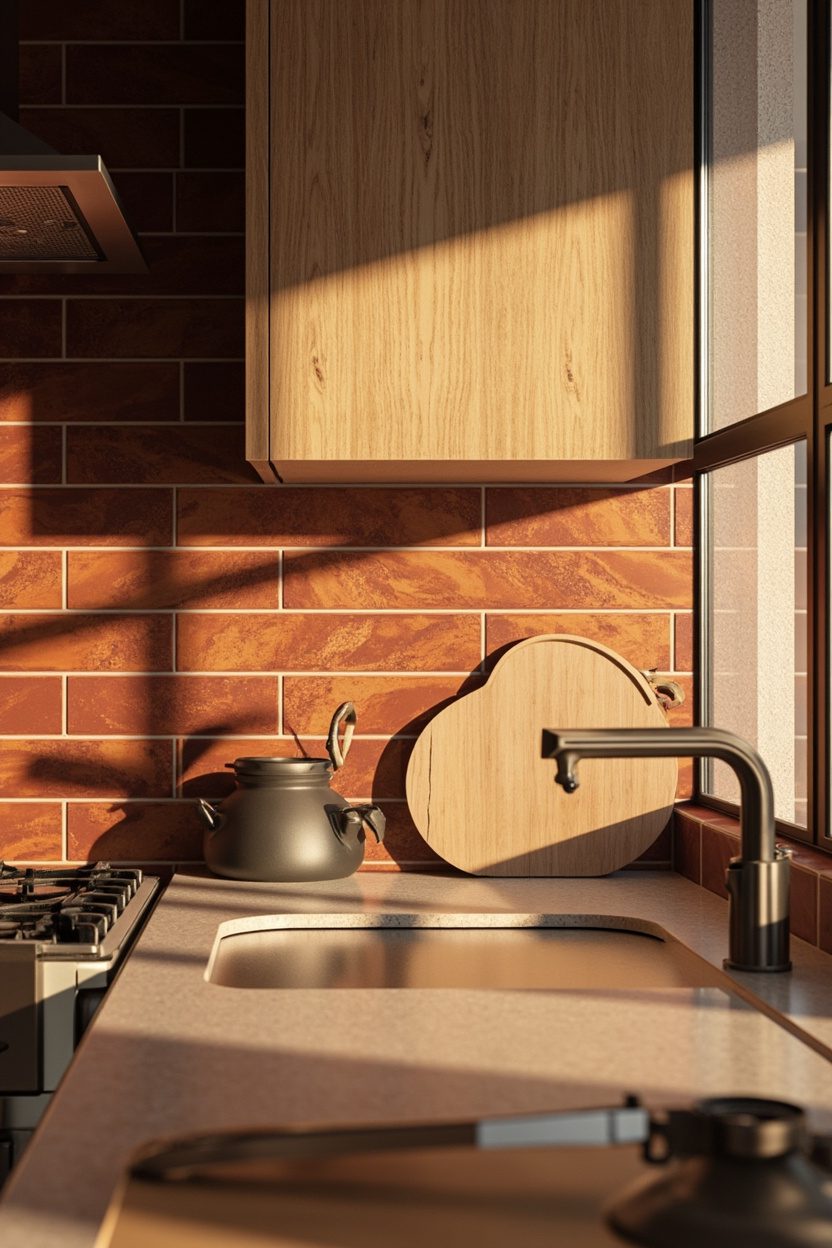
Terra-cotta tiles—matte or lightly glazed—bring instant warmth and texture to kitchens and powder rooms without tearing out cabinets. Opt for larger-format terra-cotta or handmade-style tiles with subtle color variation to avoid a “matchy” look; choose grout one shade darker than the tile for longevity and to hide cooking splatter. A practical material decision: pick tiles rated for kitchens (low absorption, sealed) if installing behind stoves or sinks to prevent long-term staining and maintenance headaches.
If full tiling feels like too much, try a targeted application: a 24–36 inch strip behind the range or a backsplash that stops at open shelves for impact with minimal cost. For color guidance, balance warm terracotta with sage or olive cabinetry and brass or matte-black hardware to create the layered, earthy palette trending in 2026.
What to Focus On
- Choose sealed, low-absorption terra-cotta tiles for kitchen use to prevent staining.
- Install larger tiles or staggered handmade tiles for fewer grout lines and easier cleaning.
- Use darker grout to hide marks and reduce maintenance in cooking zones.
- Pair with sage or olive cabinetry and matte finishes to hit the 2026 warm-natured palette.
7. Sage Cabinetry
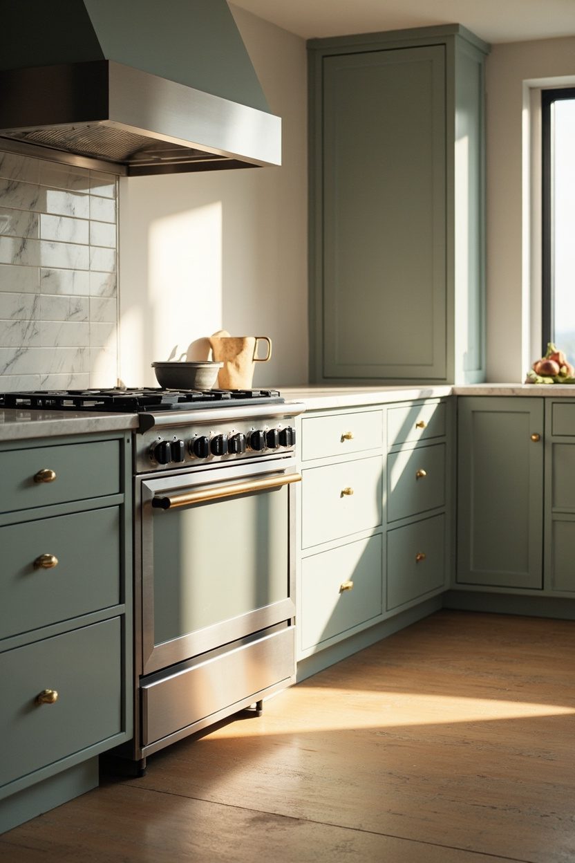
Sage cabinetry delivers a big character shift in kitchens and bathrooms without tearing anything out; painting existing cabinets in a muted, gray-green instantly modernizes while staying classic. Choose an eggshell or low-sheen finish to hide wear, and limit color to base or upper cabinets — painting all cabinetry in a narrow galley can feel heavy, so keep tall pantry units neutral for balance.
A practical hardware swap anchors the look: matte black cup pulls on lower doors and aged brass knobs on uppers create a layered, designed feel. For budget clarity, expect professional cabinet painting to run $1,200–$3,000 for a typical kitchen; DIY with a quality bonding primer and two coats of cabinet paint saves money but plan for a week of drying and finger-prints risk.
Essential Elements
- Finish: eggshell or satin cabinet paint to resist marks and read as high-end..
- Trim: keep crown and toe-kick in neutral off-white to prevent visual heaviness..
- Hardware: mix matte black and warm brass for contrast and longevity..
- Accent: add sage-painted floating shelf or backsplash tiles to tie the room together..
8. Buttery Yellow Hues
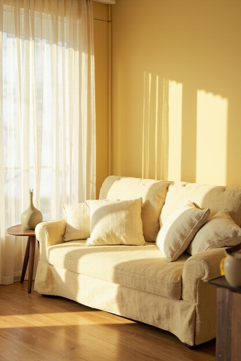
Buttery yellow lifts mood and makes compact rooms appear sunlit without overpowering; use it as an accent wall, a painted ceiling in a breakfast nook, or on cabinet interiors to peek warmth into open shelving. Stick to warm, slightly desaturated shades — think softened lemon or Dijon — to avoid a cartoonish look and to coordinate with wood tones and terracotta accents popular for 2026.
Balance is critical: pair buttery yellow with cool neutrals like dove gray or soft olive to ground the palette, and introduce texture — woven rugs or a ceramic lamp base — to prevent the color from feeling flat. For an affordable update, paint lower-cost furniture (sideboard, console) in the hue rather than repainting walls; this hits high visual impact for under $200 in materials.
Styling Blueprint
- Placement: use on a single focal wall or ceiling — avoid painting four walls in small rooms..
- Pairing: combine with warm taupe or sage to create a cohesive, modern palette..
- Material: matte wall paint, semi-gloss for trim or cabinetry for durability..
- Accent pieces: incorporate a terracotta vase and brass lamp to complete the scheme..
9. Warm Taupe Layers
Warm taupe is the versatile neutral of the moment — not quite beige, not quite gray — that provides a soothing backdrop for layered textiles and mixed metals across living rooms and bedrooms. Use it as the primary wall color and then build depth with varying tones: a darker taupe sofa, lighter taupe linen drapes, and a textured rug with warm undertones to create a calm, curated space.
Avoid monotony by introducing accents in olive, buttery yellow, or rust, and opt for natural materials like jute, terracotta, and stone-look lamp bases to add tactile contrast. A common mistake is using cold lighting; swap to warm-white bulbs (2700K–3000K) immediately to let taupe read as inviting rather than flat.
What to Focus On
- Layering: combine three taupe tones (walls, upholstery, textiles) for depth without clutter..
- Lighting: warm white bulbs and textured lamp bases to enrich the color’s warmth..
- Accents: introduce olive or rust in pillows and art to prevent the palette from feeling one-note..
- Material mix: add woven natural fibers and matte ceramics for tactile interest..
10. Olive Accents
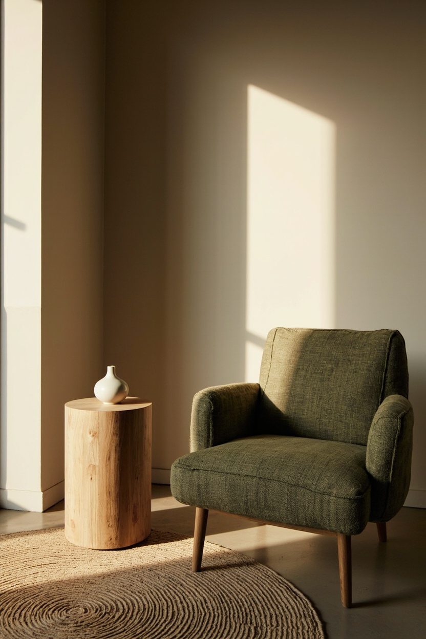
Olive green is the unsung neutral for 2026—muted, versatile, and kinder to warm palettes than stark emerald. Use olive on throw pillows, a single accent wall, or in cabinetry paint to introduce depth without overwhelming a room; choose a low-sheen, pigment-rich paint so the color reads grounded rather than bright. A common mistake: pairing olive with cool, clinical whites—opt instead for warm off-whites or buttery creams to keep the scheme cohesive and layered.
Introduce olive in odd-numbered groupings (3 cushions, 5 books, 1 framed print) to create natural rhythm and avoid feeling staged. For a budget-friendly impact, swap existing curtains or a rug for an olive option sized to scale—oversized rugs in a medium pile work best to anchor seating areas in living rooms and dens.
Styling Blueprint
- Pair olive with warm neutrals (cream, taupe) rather than bright white to avoid contrast fatigue.
- Add one olive-painted cabinet door or console backed by brass hardware for a high-end look on a midrange budget.
- Use olive-textured fabrics (linen blend or nubby cotton) to introduce tactility without heavy cost.
- Place olive elements in odd numbers for visual balance and natural grouping.
11. Natural Material Layering
Layering natural materials—rattan, oak, stone, and linen—instantly elevates a room without ripping anything out. Start by prioritizing one dominant material (for example oak floors or a limestone hearth) and then introduce complementary textures in smaller doses: a rattan pendant, linen cushions, and a stone-trimmed tray. Decision detail: match the undertone of woods (warm vs cool) so the room reads intentional rather than mismatched.
Avoid the all-same-material trap by keeping contrast in scale and finish: pair a smooth polished stone surface with raw-woven baskets and hammered metal accents. Small upgrades like swapping a glossy table lamp for a ceramic or terracotta base add texture and align with current trends toward handcrafted surfaces.
Essential Elements
- Choose a primary material (wood or stone) and work other materials around it to maintain cohesion.
- Mix finishes—matte linen with satin wood and rough stone—to avoid a flat look.
- Introduce at least one artisanal element (hand-thrown pottery, woven basket) for authenticity.
- Keep color temperatures consistent across materials to ensure visual unity.
12. Terracotta Tile Floors
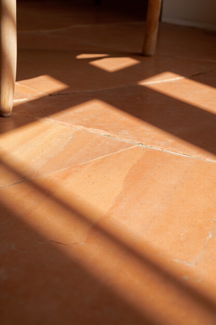
Terracotta tiles bring earthy warmth and pattern potential to kitchens, mudrooms, and sunrooms without a full overhaul. Opt for reclaimed or low-porosity glazed terracotta for high-traffic areas; choose larger-format tiles (8×8 or 12×12) if you want fewer grout lines and a contemporary feel. A practical note: warm, sand-colored grout will keep the floor looking seamless—white grout looks dated and highlights imperfections.
If full-floor replacement isn’t possible, install a bordered terracotta tile runner at entries or in front of kitchen sinks to get the look affordably. Pair terracotta with sage cabinetry or olive accents to follow the 2026 trend palette, or place a layer of sisal rug to protect the tile and soften the footprint.
What to Focus On
- Use larger tile sizes for fewer grout lines and a modernized terracotta effect.
- Choose sand-toned grout to blend and reduce maintenance visibility.
- Select glazed or sealed terracotta for wet or high-traffic locations to prevent staining.
- Frame terracotta installations with a simple wood or stone threshold for a tailored finish.
13. Ceramic Accessories
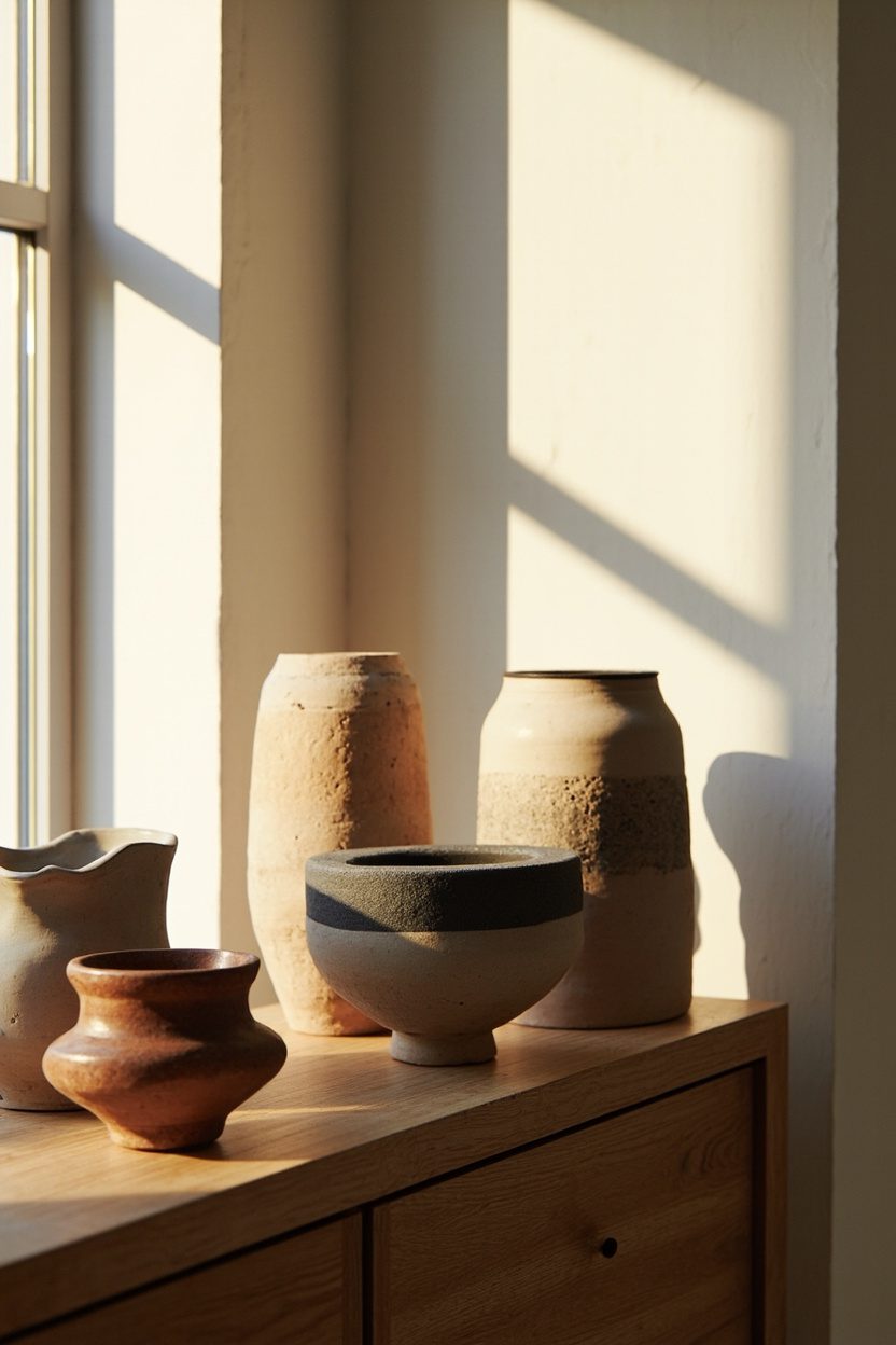
Ceramic accessories are the easiest sculptural upgrade you can make—swap out flimsy glass vases for weightier, hand-glazed pieces to anchor coffee tables and open shelves. Choose matte terracotta or speckled stoneware in two sizes (one tall vase around 12–16 inches, one squat planter 6–8 inches) to create a layered silhouette that reads intentional rather than cluttered.
A practical rule: limit glazing tones to two complementary hues (for example, warm cream and muted sage) so the collection reads cohesive. Avoid mixing ultra-glossy porcelain with raw clay pieces; pick either a refined, glossy look for modern rooms or textured, matte finishes for rustic and boho schemes.
Styling Blueprint
- Select two scale variations for balance (tall + low wide) and stick to them when shopping ceramics.
- Group in odd numbers (3 or 5) on surfaces for a curated, editorial feel.
- Use ceramics to introduce a color accent—preferably an earthy tone tied to existing textiles.
- Place heavier pieces near the back of shelves to create depth and avoid toppling lighter objects.
14. Stone-Look Finishes
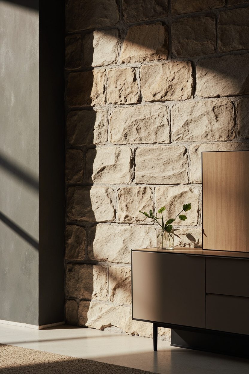
Stone-look finishes—think honed limestone-effect plasters or faux-marble decal panels—add luxury without the demolition or price tag of real stone. Apply a thin stone plaster to a feature wall, fireplace surround, or bathroom alcove; choose honed or leathered textures for low-sheen sophistication that hides finger marks better than glossy marble.
Make a decisive material call: use porcelain slabs with a natural vein pattern for high-traffic kitchens (durable, heat-resistant) and micro-cement or Venetian plaster for living areas where tactile warmth matters. Keep grout lines minimal and color-match trim to avoid a dated, faux appearance.
What to Focus On
- Pick finish type by room: porcelain for counters, plaster for walls, peel-and-stick for temporary updates.
- Match undertones (warm vs cool) of the stone finish to your room’s key fabric or wood tone to maintain harmony.
- Limit the stone-look to one focal surface per room to keep scale believable and budget-friendly.
- Hire a skilled applicator for plaster finishes—improper trowel technique is the fastest way to an amateur look.
15. Soft-White Bulbs
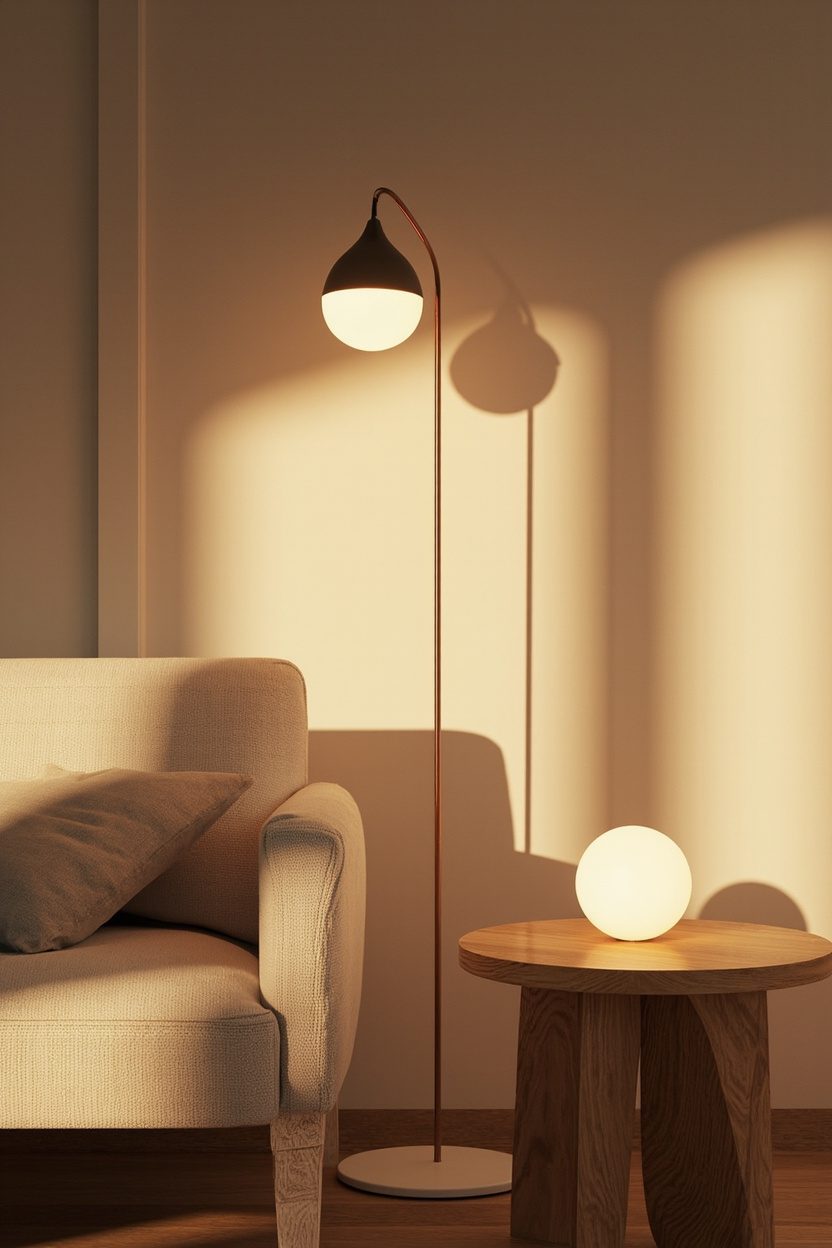
Swap harsh bright-white bulbs for soft-white (2700K–3000K) to instantly warm room ambiance and flatter skin tones and fabrics—this small change often reads like a professional styling decision. Combine this with textured lamp bases (ceramic, stone-look, or terracotta) on side tables and consoles to boost layered lighting without rewiring.
For task areas keep a warmer ambient light but add a targeted cooler task lamp (around 3500K) for reading or food prep; this two-temperature approach prevents the room from feeling flat while preserving functionality. Avoid mixing more than two color temperatures in a single sightline to prevent visual discord.
Essential Elements
- Choose LED soft-white bulbs labeled 2700K–3000K and 90+ CRI for accurate color rendition.
- Use dimmers on overhead circuits to adjust mood—dimming preserves warmth better than low-watt replacement bulbs alone.
- Pair soft-white ambient lights with textured lamp bases for visual weight and material contrast.
- Reserve cooler 3500K task lights for specific zones only (kitchen counters, reading nooks) to maintain overall warmth.
16. Muted Green Palettes
Muted green is the quiet update that reads fresh without shouting for attention; think sage, olive and desaturated moss rather than electric emerald. Use muted greens as a wall backdrop or on large upholstery pieces to anchor a room — choose a warm undertone if your wood floors are honey or a cooler tone with gray stone surfaces to keep the palette cohesive.
A practical decision: paint one long wall and repeat the same green in a textured throw or a ceramic lamp base to create rhythm; avoid painting ceilings unless the room gets ample natural light, because darker greens can make low ceilings feel heavy. For a budget-friendly swap, update cabinet doors or a single pantry wall in a muted green instead of replacing cabinetry.
What to Focus On
- Pair muted green with warm neutrals (buttery beige, warm taupe) for living areas to keep the space inviting and layered.
- Choose satin or eggshell paint for walls to reflect light gently without showing brush marks in large areas.
- Introduce green in three scales: paint, one large upholstered piece, and a small accent (lamp or vase) for cohesion.
- Avoid overly cool greens in south-facing rooms to prevent a washed-out look; add a warmed wood element to balance tones.
17. Multifunctional Furniture
Multifunctional pieces are the renovation-alternative that actually improves daily life — think storage ottomans, extendable dining tables, and sleeper sofas designed with separate seat and cushion depths. Choose furniture with dual purposes and clear dimensional criteria: an ottoman that doubles as a coffee table needs a flat, durable top and internal storage at least 12–18 inches deep to be useful.
When selecting multifunctional items, prioritize mechanical quality and ease of use over trendy looks; test slide mechanisms and check hinge sturdiness in-store or look for products with a two-year warranty. For renters or tight budgets, a well-made secondhand multifunctional piece (search measurement-first listings) is smarter than a cheap new item that won’t last.
Essential Elements
- Confirm measurements: ensure a sofa-bed mattress depth and folded length work with your room layout before purchase.
- Opt for hardwood frames and metal hardware for longevity in convertible furniture rather than particleboard construction.
- Pick neutral upholstery that hides wear (textured weave or performance fabric) for pieces used every day.
- Use multifunctional items as focal points: center an extendable table under a pendant light to signal purpose and scale.
18. Curved Sofa Silhouettes
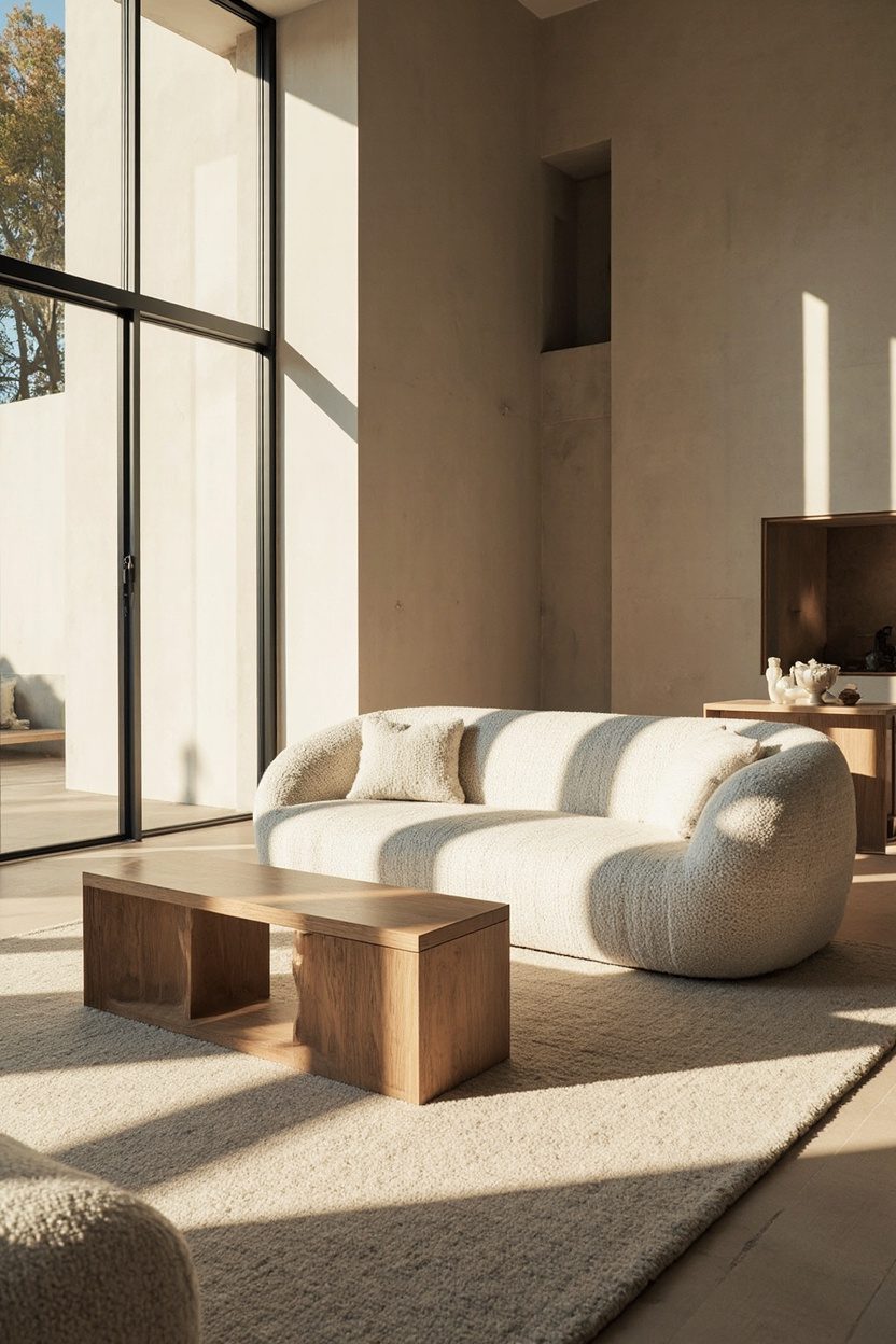
Curved sofas soften a room’s geometry and immediately read as stylish without reupholstery projects; they work particularly well in open plans where they delineate seating areas more gently than a straight-backed sofa. Select a curved sofa with a clear size recommendation: a 3–4 seat curve typically spans 84–110 inches — make sure your traffic path allows at least 30–36 inches between the sofa edge and other furniture.
Material and scale matter: go for a tighter back roll and low seat if you want a modern look, or a deeper, tufted seat for a more classic, lounge-y feel. If budget is a constraint, buy a smaller curved loveseat and anchor it with a large round rug and a single statement chair to mimic the enveloping effect without paying for the largest piece.
Styling Blueprint
- Place a curved sofa facing a round or oval coffee table to maintain visual harmony and optimize flow in seating arrangements.
- Choose mohair, boucle, or performance velvet for upholstery to balance tactile luxury with durability in high-use rooms.
- Scale lighting to the curve — single large pendant or dual floor lamps placed asymmetrically keeps the look intentional.
- Avoid pairing a curved sofa with too many angular elements; introduce one or two straight-lined pieces only to keep contrast measured.
19. Handcrafted Details
Handcrafted pieces inject personality at a small scale but read as intentional across a room. Swap a mass-produced vase for a hand-thrown ceramic vessel in an off-white or terracotta glaze; the tactile rim and slight asymmetry register immediately and anchor tabletop displays without a full restyle. Choose a maker whose finish suits your palette—matte stoneware for rustic rooms, high-gloss porcelain for contemporary spaces—to keep cohesion with existing finishes and avoid visual conflict.
These accents also allow deliberate contrasts: pair a woven wall basket with a modern metal mirror to create tension and depth. For budget-conscious upgrades, prioritize one statement handmade piece per room (price tier: $50–$250) rather than several small items that dilute impact. A common mistake is matching everything; instead, let one handcrafted item set the tone while the rest of the room plays supporting roles.
Styling Blueprint
- Choose one focal handmade piece per room and match one secondary texture to it (e.g., linen throw with a ceramic vase)..
- Prioritize scale—avoid tiny artisan items on large tables; aim for pieces at least 10–14 inches tall for visual weight in living rooms or entryways..
- Select a finish family (matte, satin, glossy) and keep 70% of surfaces within that family to maintain cohesion..
- Support local makers or artisans online and budget $50–$250 for a statement handcrafted investment piece..
20. Organic Textures
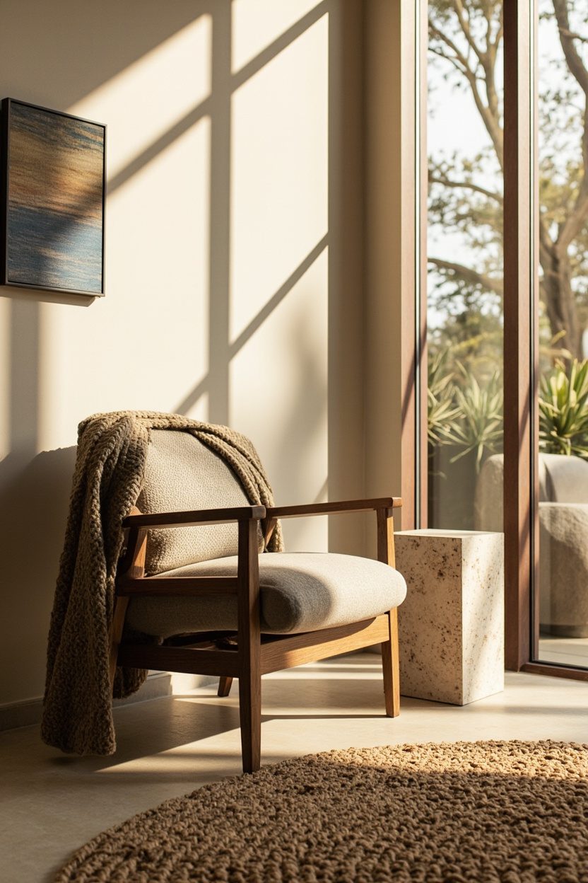
Introducing organic textures changes the sensory feel of a room without altering its layout. Layer jute or seagrass rugs under a coffee table to ground seating areas and add woven warmth that reads as intentional; opt for a low-pile loop for high-traffic rooms to avoid snagging. Switch one synthetic cushion for a linen or washed cotton cushion in a warm neutral to soften light reflections and make the space feel lived-in.
Bring in natural surfaces in small doses—a rattan pendant, a live-edge wood tray, or a leather pouf—to add variety without clutter. Pay attention to scale and placement: large woven rugs should extend at least 18 inches past the front legs of sofas to avoid the “floating rug” mistake, and a live-edge shelf works best on a smaller wall where its grain becomes the focal point rather than competing with oversized art.
What to Focus On
- Layer three textures per vignette (soft, rough, and smooth) to create depth without visual chaos..
- Choose natural-fiber rugs sized to anchor furniture—leave 18–24 inches bare around small rugs, 8–10 inches for larger rooms..
- Use moisture-resistant natural materials (sealed wood, treated rattan) in kitchens and bathrooms to avoid damage..
- Limit leather or bold natural pieces to one per room to keep balance and maintain a calm palette..
Final Thoughts
Handcrafted details and organic textures are cost-effective levers that change how a room feels and performs without demolition.
Prioritize one well-chosen artisanal piece and two natural-texture layers per room, focus on scale and finish, and you’ll transform spaces into homes that read as curated, tactile, and timeless.
If you want another practical angle, read 15 Plunge Pool Ideas for Small Backyards That Feel Luxurious.
FAQ
Expect $50–$250 for a meaningful handcrafted accent piece; smaller budget options start around $20 for artisan-made ceramics and baskets..
Yes, introduce one or two organic elements (linen cushions, a slim jute runner) in subdued tones to add warmth without undermining clean lines..
Many handcrafted pieces are built to last; choose glazed ceramics for durability, sealed wood for surfaces, and ask makers about firing or finishing to assess wear resistance.
Look at curated guidance like Boho Living Room Color and Mix Farmhouse and Modern In The Bedroom for practical palettes and combinations that incorporate handcrafted and organic textures effectively.