

Two things make a room read as “it’s always been here”: layers that look accidental and materials that age beautifully.
Vintage cottage decor borrows both temperament and texture from lived-in country homes, think sun-warmed wood, faded florals, and pieces with polite wear rather than showroom perfection.
The goal is to curate a space that feels inevitable, not staged.
This list focuses on the concrete decisions that create that inevitable quality: where to pick curves instead of hard modern lines, how to choose a clay-toned paint that won’t date, and which antique pieces are worth driving for.
Expect practical guidance on scale, material choices, and one critical mistake to avoid so your rooms read authentically vintage rather than kitschy.
- 1. Curved Wood Details
- 2. Warm Earthy Palette
- 3. Antique Wooden Finds
- 4. Grandma-Chic Textiles
- 5. Vintage Brass Accents
- 6. 1970s Color Pops
- 7. Mix-and-Match China
- 8. Quilted Throws
- 9. Patinaed Silverware
- 10. Cottage Cottagecore Rugs
- 11. Worn Leather Pieces
- 12. Floral Wallpaper Revival
- 13. Built-In Window Seats
- 14. Layered Lighting Schemes
- 15. Distressed Painted Furniture
- 16. Handmade Ceramics
- Final Thoughts
- FAQ
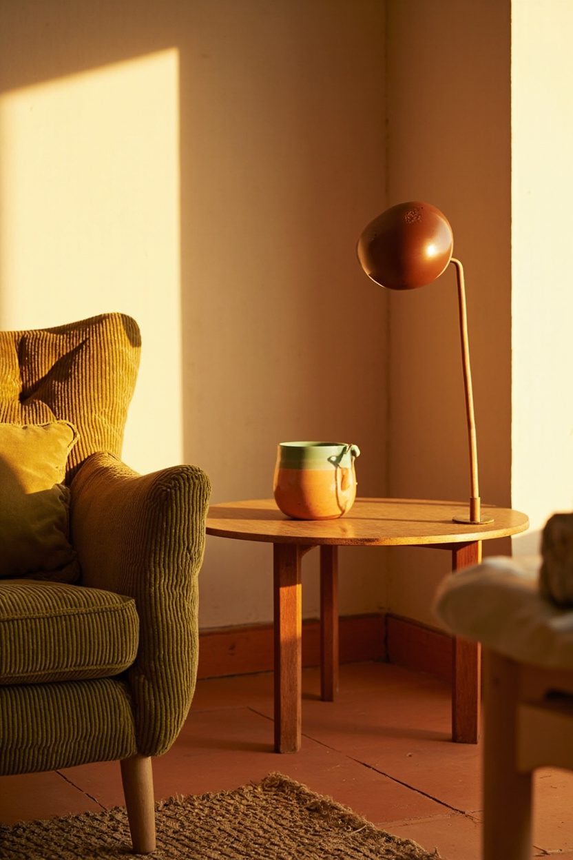
1. Curved Wood Details
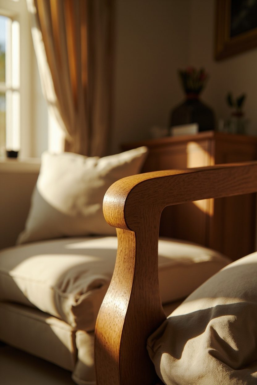
Curved wood softens a room in a way straight moldings never will; a rounded dresser cornice, arched chair backs, or a curved headboard reads like an heirloom because those details suggest bespoke joinery.
Choose solid wood (oak, maple, or reclaimed pine) with a hand-sanded finish rather than thick gloss; this keeps the surfaces tactile and ages gracefully. Avoid factory-stained plywood that darkens unevenly over time.
Place curved pieces strategically: a rounded console in an entry that mirrors the arch of a doorway, or an oval dining table to break a grid of chairs.
Scale matters; small rooms benefit from a single curved focal piece so the eye has a resting point without feeling cluttered, while larger rooms can layer two or three curved items for cohesion.
What to Focus On?
- Prioritize solid wood with visible grain for authentic aging and patina development.
- Match curve radius to room scale—gentle curves in small rooms, pronounced arches in larger spaces.
- Pair curved wood with soft textiles (linen, wool) to reinforce the cottage feel.
- Avoid high-gloss finishes; choose matte or hand-waxed surfaces for age-appropriate wear.
2. Warm Earthy Palette
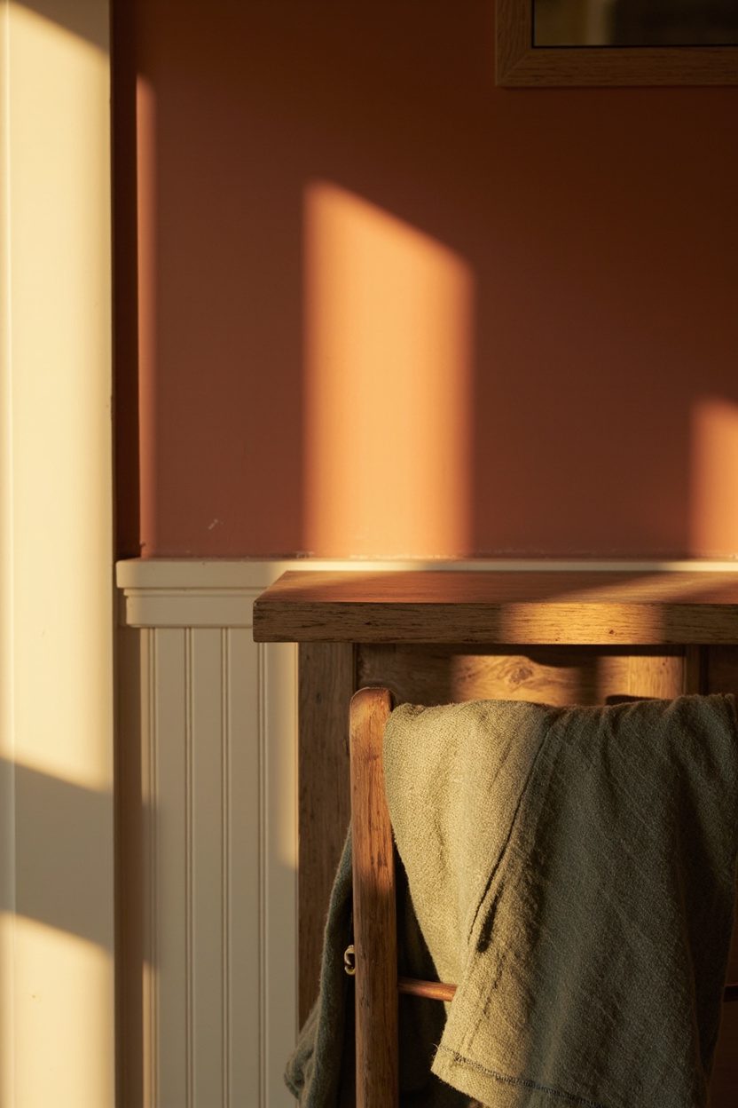
A vintage cottage should feel sun-worn and hospitable. Swap clinical grays for warm, earthy tones like clay, moss green, and muted terracotta inspired by 1970s palettes and contemporary thrifted trends.
Use a dominant neutral (soft oatmeal or warm cream) on trim and ceilings, then introduce saturated accents—moss or clay on a single wall, cupboard, or an alcove to create visual warmth without overwhelming the room.
Specify paint sheens for authenticity: eggshell on walls, satin on trim. For budget-conscious updates, paint the cabinet fronts in a deep olive or clay hue and leave the countertops neutral; this yields a high-impact vintage look for under $500. Avoid trendy cool grays as the base; they flatten texture and age poorly in a cottage scheme.
Essential Elements
- Start with a warm neutral base (oatmeal, cream) and add clay or moss as secondary hues.
- Use eggshell walls + satin trim to mimic period-appropriate finish contrast.
- Limit saturated colors to one or two focal areas to prevent visual clutter.
- Test paint swatches on multiple walls—natural light shifts warm tones significantly.
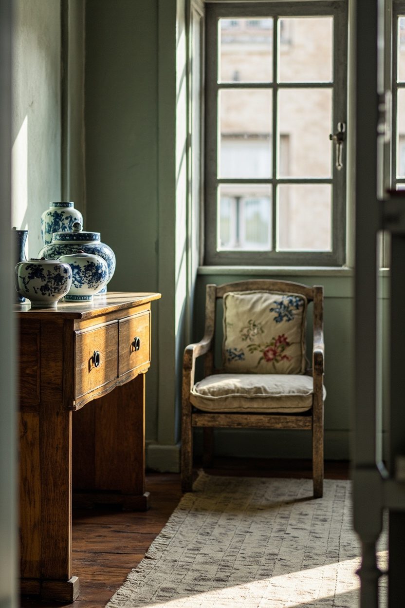
3. Antique Wooden Finds
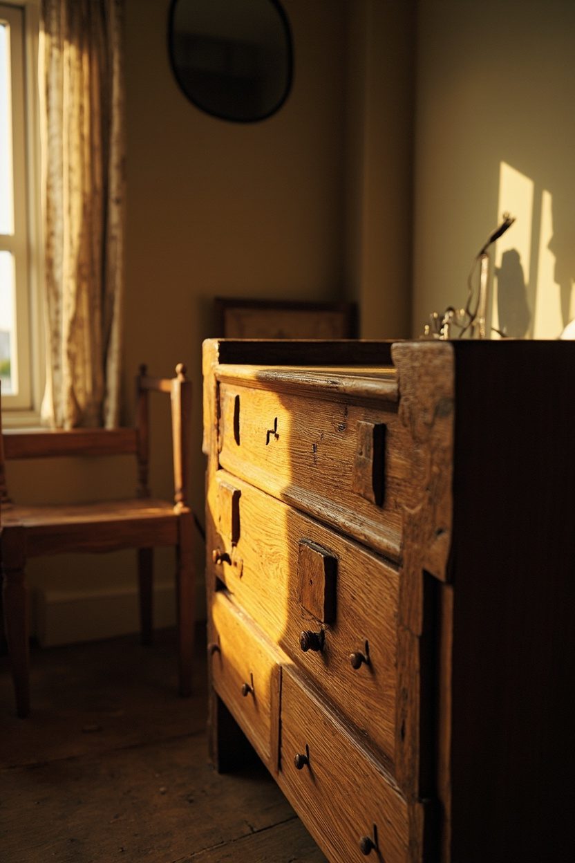
Antique wooden pieces, dressers, scrubbed pine tables, or a turned-leg sideboard—anchor a cottage interior because their imperfections tell a story.
Hunt for solid joints (dovetail drawers, mortise-and-tenon) rather than veneer pieces; these last decades and acquire character.
When shopping, budget for light restoration: $100–$300 to stabilize joints and remove grime is a smarter use of funds than refinish work that erases patina.
Placement is about context: an antique chest looks right at the foot of a bed or as a TV console when flanked by layered textiles and a soft lamp rather than isolated on a pristine wall.
Avoid over-restoring, leave small dents and worn edges to sell the “always been here” narrative.
Styling Blueprint
- Choose antiques with solid joinery; skip veneer-split pieces that won’t endure.
- Budget for stabilization (glue, re-screw joints) rather than full stripping to preserve patina.
- Scale antique pieces to the room; don’t let a massive armoire dominate a small cottage bedroom.
- Combine an antique with one modern element (lamp, mirror) to keep the look current.
4. Grandma-Chic Textiles
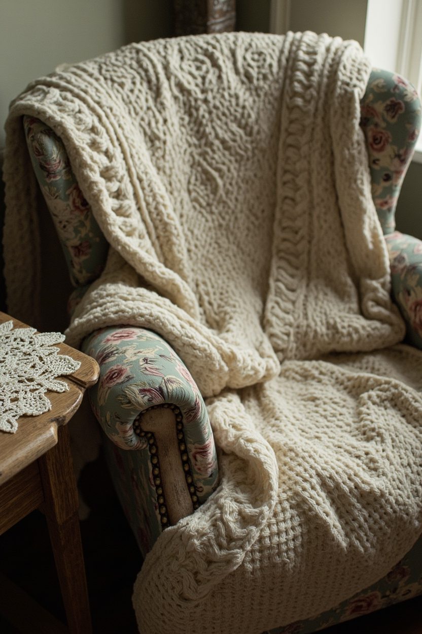
Quilted bedspreads, crocheted throws, and small- scale floral slipcovers instantly read as lived-in comfort; choose fabrics with visible handwork and slightly faded dyes to avoid a manufactured look.
Prioritize cotton and linen blends with a soft hand for everyday use, and limit heavy synthetics. An authentic crocheted afghan in natural cream will age better than a glossy acrylic throw for the same price point.
Layer textiles with restraint: one large patterned piece (quilt or rug) anchored by solid cushions and a single vintage lace runner keeps the room from feeling costumey.
Avoid exact-match sets; mix a 1930s floral with a 1950s geometric pillow to create the collected-over-time effect instead of a staged “theme” room.
Styling Blueprint
- Pick one dominant textile pattern and two supporting solids or textures (linen, wool, crochet).
- Choose natural fibers for main pieces; reserve synthetics for high-wear accent items.
- Layer with asymmetry—drape a throw over one corner, not centered on the sofa.
- Use muted, slightly sun-washed colors rather than saturated brights for authenticity.
5. Vintage Brass Accents

Brass hardware, candlesticks, and mirror frames warm a cottage palette and read as era-appropriate when slightly oxidized skip mirror-polished pieces and seeking a soft patina or having newer brass antiqued to match older metals.
Replace a single set of cabinet pulls (matte brass, 3–4″ centers) to immediately shift a kitchen or bathroom toward a vintage cottage without a full remodel.
Balance brass with cooler finishes: pair a brass lamp base with aged nickel or oil-rubbed bronze in nearby fixtures to avoid overwhelming the space.
Aim for small, visible details: drawer knobs, a towel bar, and a pair of sconces—rather than a scattered mishmash of metallic styles, which undermines a curated look.
What to Focus On?
- Select pieces with natural wear or buy new pieces and apply a light patina finish for cohesion.
- Limit brass to three coordinated elements per room to keep it intentional.
- Match the scale of brass hardware to the furniture: large cup pulls on oversized drawers, small round knobs on narrow drawers.
- Avoid mixing bright polished brass with aged brass in the same sightline unless deliberately layered for contrast.
6. 1970s Color Pops
Introduce saturated 1970s-inspired hues moss green, clay, mustard, and burnt orange as accents to enliven a soft cottage base without dominating it; use these colors in modest doses like a painted side table, a single upholstered chair, or framed botanical prints.
Opt for earthy, matte finishes rather than neon or high-gloss to keep the palette grounded and mood-right for vintage cottage sensibilities.
Place color deliberately: a moss-green built-in or a clay-colored throw pillow will read as intentional and curated, whereas splashes across many small items look haphazard.
If you’re uncertain about commitment, start with textiles and ceramics (budget tier: under $200) before committing to painted cabinetry or large upholstery pieces.
Essential Elements
- Choose one bold color and use two supporting neutral tones to maintain balance.
- Introduce color through removable items first, pillows, lampshades, and art prints.
- Prefer matte or softly textured finishes to avoid a dated glossy look.
- Combine with antiques and natural woods to integrate the 70s hue into a lived-in scheme.
7. Mix-and-Match China
Layering different china patterns reads collected, not chaotic, the goal is a deliberate hodgepodge that reads like generations of meals.
Choose one dominant hue (soft blue, faded rose, or celadon) to tie disparate patterns together, and keep plate sizes consistent so stacking and storage stay practical; avoid mixing fine bone with heavy stoneware on the same place setting to prevent breakage and a clashing look.
Mix-and-match china works best when displayed as much as used: open shelving or a low plate rack turns the collection into a vignette.
When sourcing, prioritize mid-century transferware or floral chintz for authenticity; budget buyers should check thrift stores for single plates to slowly build a cohesive set.
Styling Blueprint
- Pick one recurring color to unify patterns (e.g., blue/white motifs)..
- Limit shapes, standardize rim width or diameter for stacking ease.
- Display on open shelves with plate stands every 3–4 items to avoid visual clutter.
- Reserve delicate pieces for display, and everyday stoneware for service to reduce the risk of chips.
8. Quilted Throws
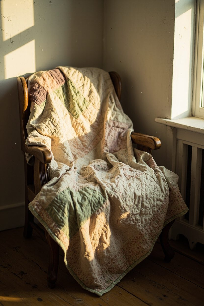
Quilted throws give rooms instant texture and history. Aim for quilts with visible hand-stitching and slightly faded dyes for that softly worn look.
Drape one over the back of a sofa or fold at the foot of a bed; choose a throw size that complements the furniture scale (50×60 in a small chair, 90×90 for a queen bed) to avoid looking like an afterthought.
When adding quilts, mix needlework with contemporary solids: a hand-stitched sampler paired with a linen cushion creates contrast without competing.
For upkeep, avoid machine-washing fragile antique quilts; instead, spot-clean and air them flat to preserve batting and seams.
What to Focus On?
- Prioritize visible hand-stitching and natural fiber batting for authenticity.
- Match quilt scale to furniture: larger throws for sofas, smaller for accent chairs.
- Protect antiques: spot-clean, gently vacuum through a screen, and store flat when not in use.
9. Patinaed Silverware
Patinaed silverware spoons with a soft grey sheen, forks with worn highlights anchors a vintage cottage table in lived-in charm.
Use a set with mixed makers and slightly different patterns to achieve that inherited look; avoid over-polishing: leaving a gentle patina signals age and authenticity, while heavy polishing erases character and can thin plating.
Display silver in utilitarian ways: a copper mug holding utensils on a prep counter, or a small tray of mismatched teaspoons beside a teapot.
When you do clean, use a non-abrasive paste or professional re-plating for truly valuable pieces rather than aggressive household polishes that remove metal.
Essential Elements
- Choose mixed makers and slight pattern variation for a curated-by-time aesthetic.
- Keep a light patina polish only to remove tarnish, not to make pieces glossy.
- Store wrapped in acid-free cloth to prevent over-tarnishing and scratches.
- Use decorative groupings (tray, jar, bowl) to turn functional items into tabletop displays.
10. Cottage Cottagecore Rugs
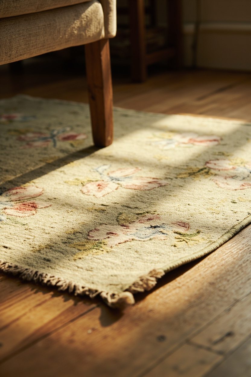
Woven rugs with faded florals, muted stripes, or hand-loomed textures ground a cottage room and read as collected, not purchased all at once.
Choose natural fibers, wool, or jute for longevity; hand-knotted wool in a low-pile finish tolerates entryway traffic while still feeling soft underfoot, and a 5×8 or 8×10 scale anchors most living rooms without swallowing the space.
Layer a smaller vintage runner (2×6) over a neutral sisal in high-traffic zones to create that “always there” patina quickly.
Avoid ultra-bright synthetics; opt for sun-washed colors, sage, ochre, and a dusty rose to pair with antique pine or painted furniture and echo 1970s-inspired palettes showing up in current vintage trends.
11. Worn Leather Pieces
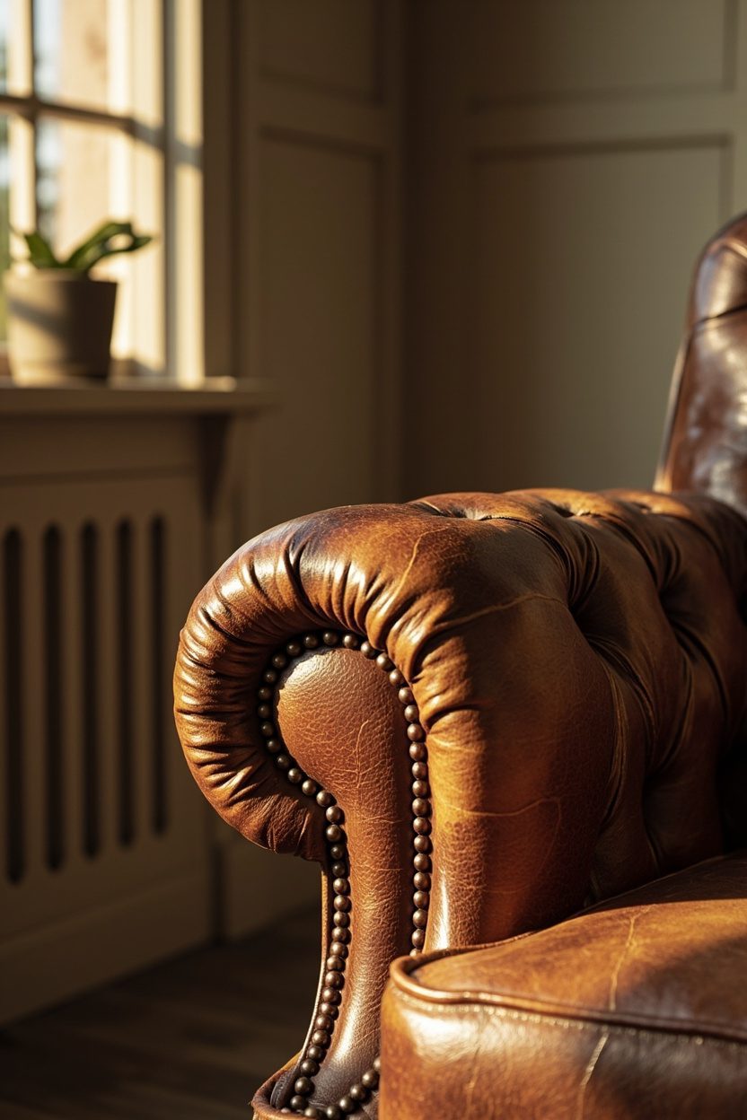
A single worn leather armchair or small settee reads instantly lived-in and anchors a cottage scheme with masculine warmth.
Pick full-grain leather in mid-to-dark brown that shows natural blemishes and develops patina; steer clear of uniform faux finishes that look manufactured from a distance.
Place leather opposite softer linen upholstery to balance textures, and choose a compact silhouette mno oversized club chairs, to maintain cottage scale.
For maintenance, use a neutral leather balm yearly and keep it away from direct sunlight to avoid uneven fading that ruins the intended aged look.
12. Floral Wallpaper Revival
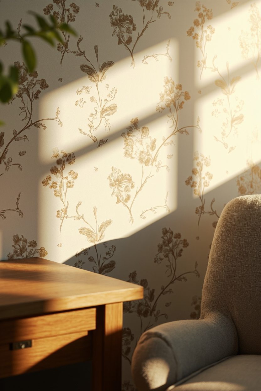
Small-scale floral wallpaper brings vintage cottage charm without overpowering; think ditsy prints, trailing vines, or faded English roses in a toned-down palette. For modern longevity, paste-the-wall vinyl or pre-pasted papers in matte finishes are more forgiving and easier to repair than glossy designer papers.
Use wallpaper on a single focal wall behind a bed or in a powder room to mimic decades of layering, or paper the ceiling for a true “always there” surprise.
Match your paint trim to a mid-tone from the pattern to make the wallpaper feel integrated rather than stuck-on; avoid wallpapering an entire small room in a high-contrast print, which reads dated rather than curated.
13. Built-In Window Seats
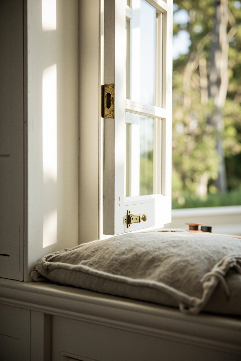
A built-in window seat anchors a vintage cottage room with architectural permanence; choose painted beadboard for the seat back and a finely scaled 18–20-inch-deep cushion so the bench reads like original millwork rather than an afterthought.
Position the seat under a double-hung window, keep cushion thickness to 4–6 inches, and select a washable linen blend in a muted sage or faded blue to read as if it’s aged with the house.
The storage below should read functional, not furniture-like: use inset shaker-style drawers with aged brass cup pulls and soft-close slides for modern convenience that doesn’t shout.
Avoid overly deep storage (over 16 inches), which prevents comfortable foot placement and looks bulky in older rooms.
What to Focus On?
- Seat depth 18–20 inches for comfortable lounging and period scale.
- Beadboard or tongue-and-groove back for authentic cottage detail.
- Linen-blend cushion in faded tones for that worn-in look.
- Aged brass hardware and inset drawers to preserve vintage character.
14. Layered Lighting Schemes
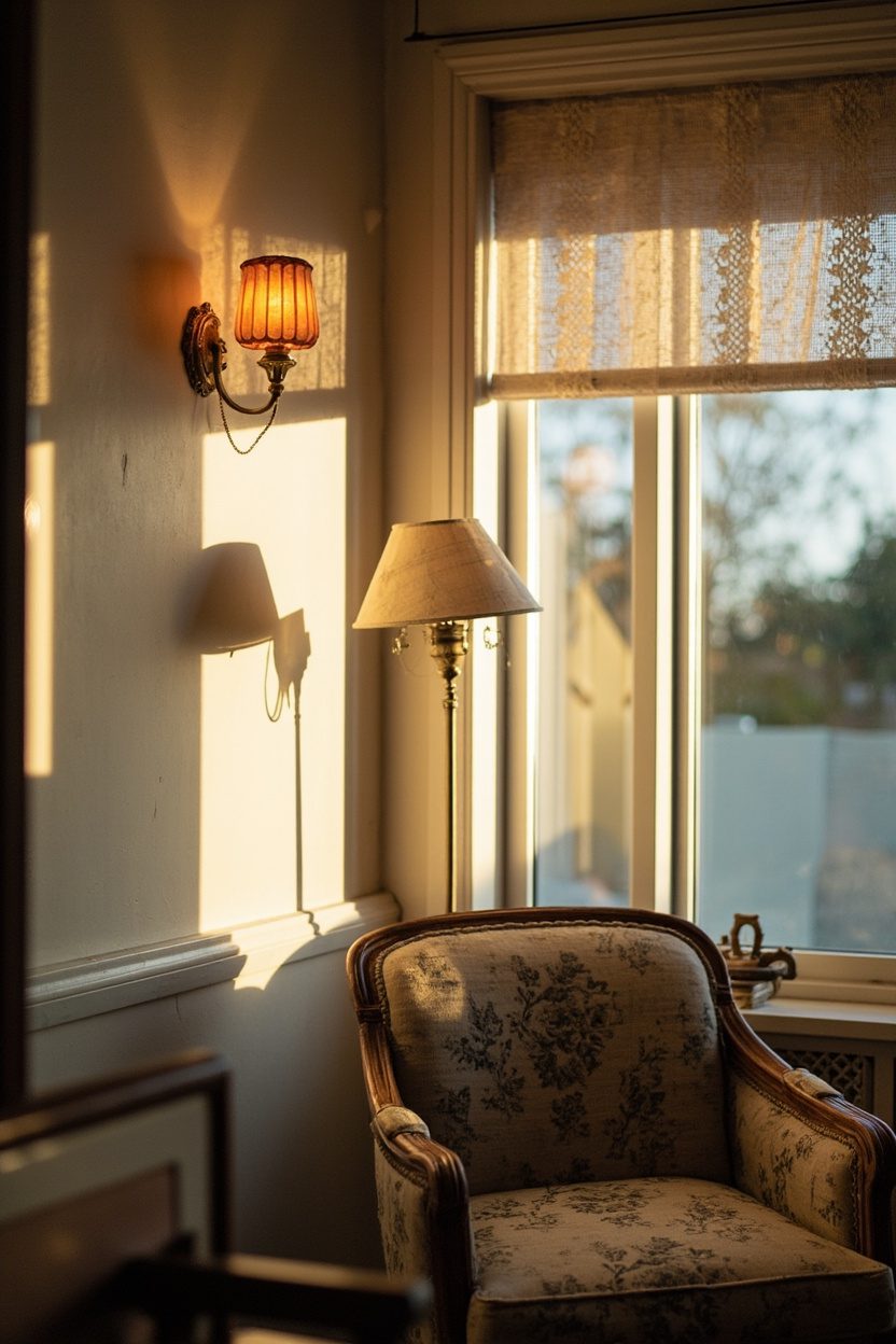
Vintage cottage lighting reads as if it accumulated over decades: combine a small-scale chandelier (think 12–18 inches across for a 10×12 room) with wall sconces flanking a focal mirror and a couple of plug-in lamps with pleated shades for reading nooks.
Select warm 2200–2700K bulbs on dimmers to mimic an incandescent glow; cooler LEDs kill the cozy, collected effect.
Mix metal finishes with restraint; an oxidized brass chandelier, matte black sconce, and silver-toned lamp can coexist if tied together by scale and warm light temperature.
Avoid oversized fixtures that dominate; cottages need fixtures with lightness of form and visible detailing like fluting or hand-forged touches.
Essential Elements
- Use three layers: ambient, task, and accent lighting for depth.
- Choose 2200–2700K dimmable bulbs to recreate warm vintage light.
- Select fixtures in small-to-medium scale to fit cottage rooms.
- Mix finishes, but repeat one finish twice to create cohesion.
15. Distressed Painted Furniture
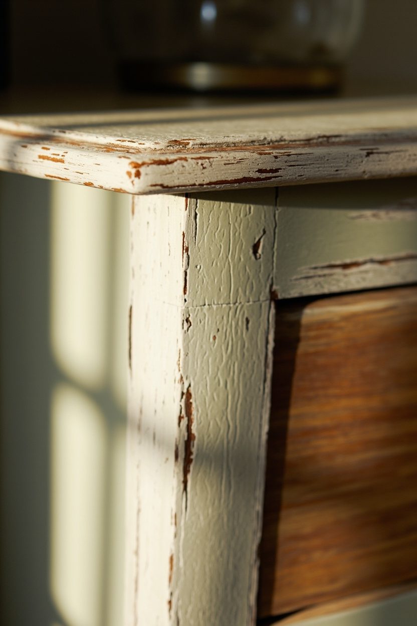
Distressed painted pieces—think a bleached-pine console or a creaking cabinet with rubbed-back cream paint bring immediate patina.
When selecting finishes, favor chalk or milk paints because they sand and wear authentically; distress edges and corners lightly, and keep the wood showing through at high-contact spots like drawer fronts and armrests.
Placement matters: Use distressed furniture sparingly against more intact pieces to avoid a contrived “themed” room. For scale, a distressed sideboard should be two-thirds the length of the sofa or wall it sits against to maintain balance; steer clear of extreme distressing that exposes raw, untreated timber, which reads unfinished rather than vintage.
Styling Blueprint
- Choose chalk or milk paint for authentic, sandable finishes.
- Distress only high-contact edges to simulate natural wear.
- Balance with one pristine piece to avoid a staged look.
- Stick to muted palettes: cream, sage, faded blue, or soft gray.
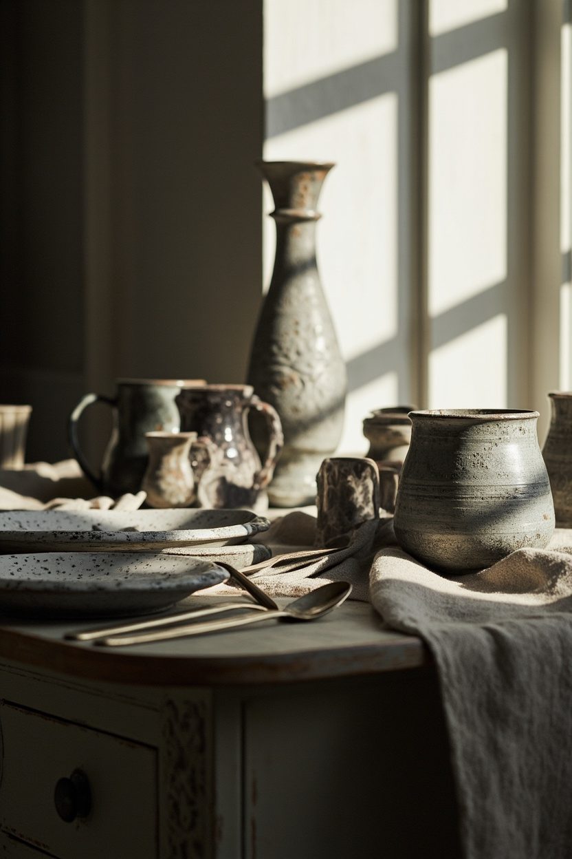
16. Handmade Ceramics
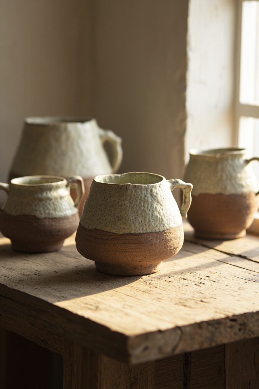
Handmade ceramics anchor a vintage cottage scheme with tactile warmth and honest imperfections, think slightly lopsided vases, matte glazes, and hairline crazing that catch the light.
Choose pieces with visible throwing marks or an uneven glaze edge; those are the signatures that make an object feel acquired over time rather than bought in a set.
For decision-making: prioritize local studio pottery for accent pieces (budget $40–$200 each) and reserve one statement earthenware jug or platter for a mantel or open shelf in a 24–30 inch span to avoid visual clutter.
Pair color choices with the room’s dominant undertone: warm ivory or honey-glazed ceramics complement the cottage trend’s moss greens and clay accents, while a soft celadon or gray glaze reads modern-cottage when placed beside painted furniture.
Avoid high-gloss mass-produced pieces; they read new. Instead, mix a trio of sizes (small bud vase, medium bowl, large pitcher) on a dining sideboard or open kitchen shelf to create layered height and an effortless, edited look.
Essential Elements
- Pick one statement piece (24–30 inch visual impact) and two supporting items of different heights to form a vignette.
- Prefer hand-thrown textures and matte or satin glazes over glossy, factory finishes.
- Match glaze undertones to room palette warm glazes with woods, celadon/gray with painted pieces.
- Display on open shelving or a mantel with 2–3 negative space inches around each piece to avoid crowding.
For a related idea, see Farmhouse Floor Plans.
Final Thoughts
Handmade ceramics are the quiet proof that a cottage interior has evolved rather than been staged; their small imperfections and kiln-fired colors add depth you can’t replicate with mass-produced decor.
Place them with intention, match glazes to your palette, and use scale as your guide. A few well-chosen pieces will read as they’ve always belonged.
FAQ
Groupings of three to five pieces read as intentional: one anchor, one mid-size, and one to three small accents provide rhythm and scale continuity.
Yes, most are durable for light daily use; choose glazed surfaces for bowls and pitchers, and reserve unglazed porous pottery for dry uses or decorative display.
Local pottery studios, craft fairs, and vetted online makers offer the most authentic pieces; avoid big-box reproductions if you want visible craftsmanship.
Handwash with mild soap; avoid thermal shock (no hot water on cold pottery) and use felt pads under heavy pieces to protect surfaces.