

Wabi sabi home interior design is not a look; it is a lens. I design with it when a space needs quiet confidence: fewer pieces with more presence, natural finishes that age honestly, and textures that invite touch.
What I love most is how it frees clients from perfection, and instead celebrates the patina of life, from a limewashed wall to a hand-thrown bowl.
In my projects, wabi-sabi succeeds when decisions slow down. You edit, simplify, then layer soul back in through materiality, proportion, and light.
Below is the practical playbook I use on site: which finishes earn their keep, how to source textured art that does not clutter, and the small styling rules that keep the room calm, not austere.
- Defining Wabi-Sabi: Beauty in Imperfection
- Materials That Matter: Limewash, Linen, Clay, Oak
- Textured Art Without Clutter: What to Choose
- Patina and Wear: Styling Pieces With History
- Color Palette: Soft Neutrals With Earthy Depth
- Sourcing Guide: Handmade, Vintage, and Local Finds
- Editing Clutter: Negative Space as a Design Tool
- Room-by-Room Tips: Living, Bath, Bedroom, Kitchen
- FAQ
- Final Thoughts
Defining Wabi-Sabi: Beauty in Imperfection
Core principles you can actually design with
Wabi-sabi honors natural irregularities, the trace of the maker, and the quiet of negative space. In practice, that means choosing pieces that look better with wear, allowing asymmetry, and editing visual noise.
I continually see clients chase “rustic” props, but wabi-sabi is restraint, not accumulation.
Patina over polish
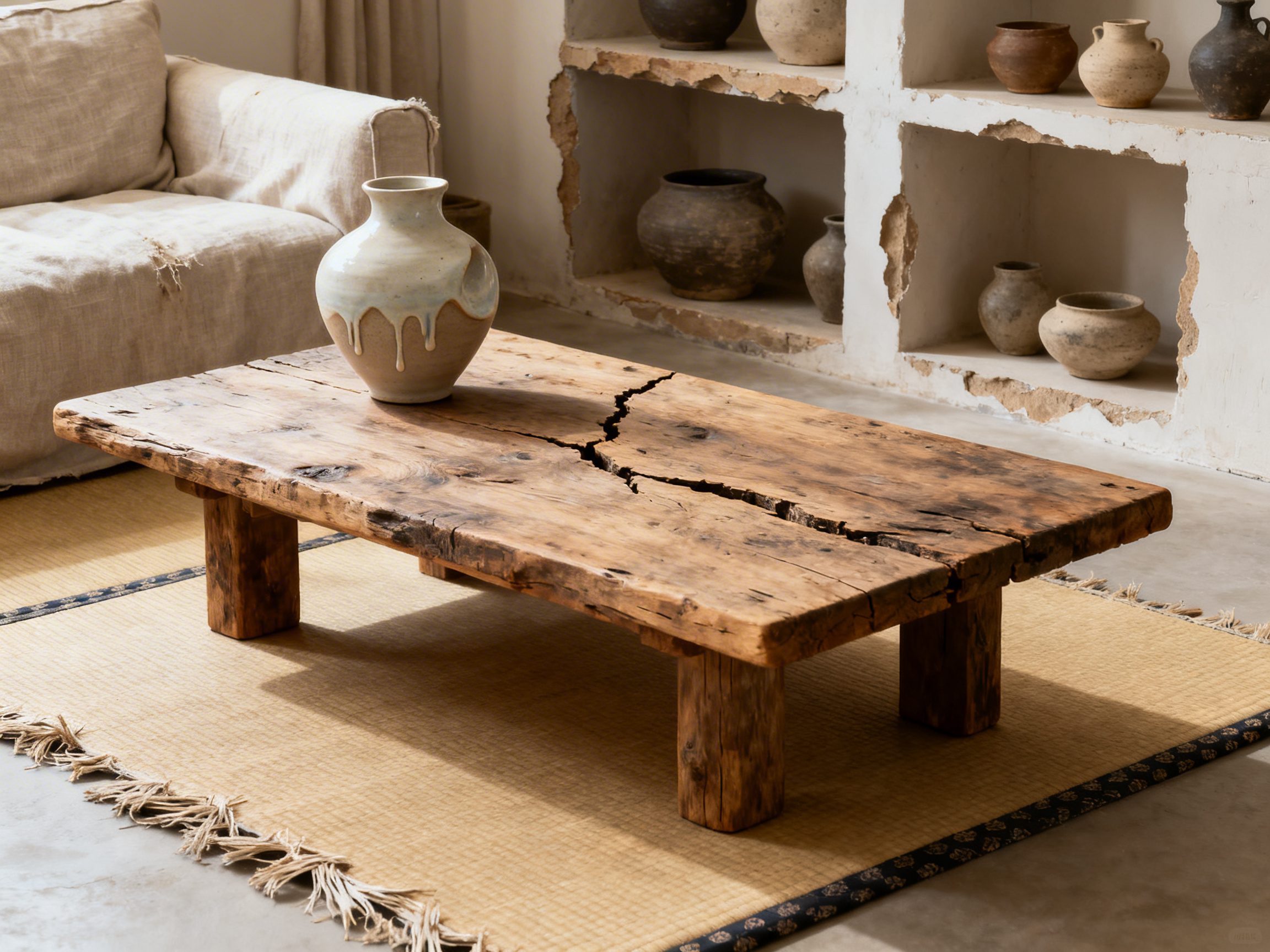
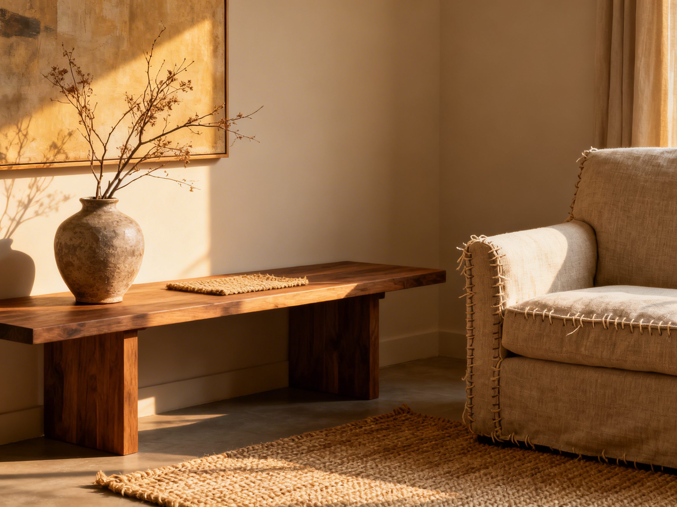
Each accessory should show its history of use. A clay vessel with a thumbprint, a stool with softened edges, a linen slipcover with subtle creasing, these add character without shouting.
Recent trend reports echo this, noting how objects that carry the maker’s fingerprint feel inherently calmer and more personal.
Scale, balance, and intentional emptiness
Negative space is a design tool here. I aim for one commanding, textural element per zone, then let breathing room frame it. If you feel tempted to fill a blank corner, pause, adjust sightlines, and test it under evening light first.
| Design Choice | Why it align with Wabi-Sabi? | Choose slightly uneven rims, matte glazes, and visible throwing lines | Budget Range |
|---|---|---|---|
| Asymmetrical vignette | Embraces natural irregularity | Offset a vase and stack of books, leave negative space to one side | $0–$100 |
| Handmade ceramics | Shows maker’s touch and patina | Choose slightly uneven rims, matte glazes, visible throwing lines | $30–$300 |
| Limewash walls | Depth without sheen, tonal movement | Two to three coats, burnish lightly for soft clouding | $200–$1,200 per room |
| Low, grounded furniture | Connects room to earth, reduces visual noise | Seat heights 15–17 in, wide arms, natural upholstery | $600–$4,000 |
Common mistakes I correct on installs
- Over-styling shelves with faux-aged props. Instead, invest in one authentic piece and leave space. If you do want curated warmth, anchor with something honest, as in these Modern Farmhouse Designs that prioritize material integrity: Modern Farmhouse Designs.
- Perfect paint finishes. High-build, plastic-looking paint flattens the soul. Choose mineral or eggshell textures that take light softly.
- Uniform lighting. Mix a low, warm lamp with a single pendant and candlelight to create gradation and shadow.
Materials That Matter: Limewash, Linen, Clay, Oak
Limewash: movement, depth, and calmer light
Limewash has a mineral matte that diffuses light, making rooms feel quieter. I specify it in entryways and bedrooms to soften hard lines.
Test two adjacent tones on the same wall, then choose the one that holds shape in evening light.
| Oil finish, not polyurethane, to keep the grain tactile | Best Location | Prep & Application | Maintenance | Approx. Cost (per room) |
|---|---|---|---|---|
| Limewash | Bedrooms, living rooms | Mineral primer, 2–3 cross-hatched coats, soft burnish | Spot touch-ups blend easily | $300–$1,200 |
| Linen | Upholstery, drapery, bedding | Pre-washed, heavyweight 10–12 oz for sofas, sheers for windows | Embrace creases, steam lightly | $100–$2,500 |
| Clay/Ceramic | Vessels, lighting bases, tiles | Choose matte glazes, visible throwing lines, tonal variation | Rinse, avoid harsh detergents | $30–$3,000 |
| Oak | Floors, tables, shelving | Oil finish, not polyurethane, to keep grain tactile | Re-oil annually, accept scratches as patina | $400–$8,000 |
Linen: let wrinkles live
Heavier linens ground upholstery, while open-weave sheers calm busy windows. I prefer undyed or oatmeal tones that read warm under both daylight and lamps. For drapery, double the window width for fullness without fuss.
Clay and ceramic: the maker’s fingerprint
Select pieces with irregular rims, sandy textures, or pooled glaze. One tall vessel on the floor can anchor a wall better than three small objects. If you favor eclectic warmth, pair a hand-thrown vase with restraint, as in this guide to considered accents.
Oak: oil, do not plastic-coat
Oil-finished oak brings warmth and will mark over time, which is the point. I spec wide planks, 7 to 9 inches, to reduce visual seams and emphasize grain. For tables, choose 1.25 to 1.5 inch thick tops to feel substantial without bulk.
Textured Art Without Clutter: What to Choose
Why texture works, not trinkets?
Textured art adds depth without adding objects, allowing walls to carry the story. A monochromatic canvas with tactile plaster or fabric relief becomes a quiet statement, which recent trend analyses highlight as a key 2026 shift toward depth over decor. I use it to replace gallery walls that fragment already small rooms.
Material options that read elevated
- Plaster or lime-based relief on raw canvas, tonal whites to warm taupes.
- Burlap or linen collages, sealed lightly so fibers remain visible.
- Clay tiles arranged as a single field, with slightly irregular spacing for shadow play.
| Art Type | Best Size | Where to Hang | Why It Works | Indicative Cost |
|---|---|---|---|---|
| Monochrome plaster canvas | 36–48 in wide | Above sofa, low over console at 56–60 in center height | Depth through shadow, no color noise | $150–$1,200 |
| Linen or burlap relief | 24–36 in | Bedrooms, entry niches | Soft texture complements linens and limewash | $80–$800 |
| Clay tile panel | 30–40 in | Dining wall, near natural light | Irregular joints cast evolving shadows | $200–$1,500 |
Placement and proportion rules I rely on
Keep centers at 57 inches from the floor in circulation areas, and 56 inches when seated viewing dominates. Over sofas, target two thirds the sofa width to avoid visual drift.
If your room is busy, choose one large textural piece rather than multiples.
DIY, but refined
If you make your own, mix joint compound with fine sand for grit, apply in thin passes, then knock back high points with a damp sponge.
Keep the color to one tone and let the shadow create variation. Frame simply in raw oak or ash to echo the broader material palette.
Patina and Wear: Styling Pieces With History
Why patina is the point
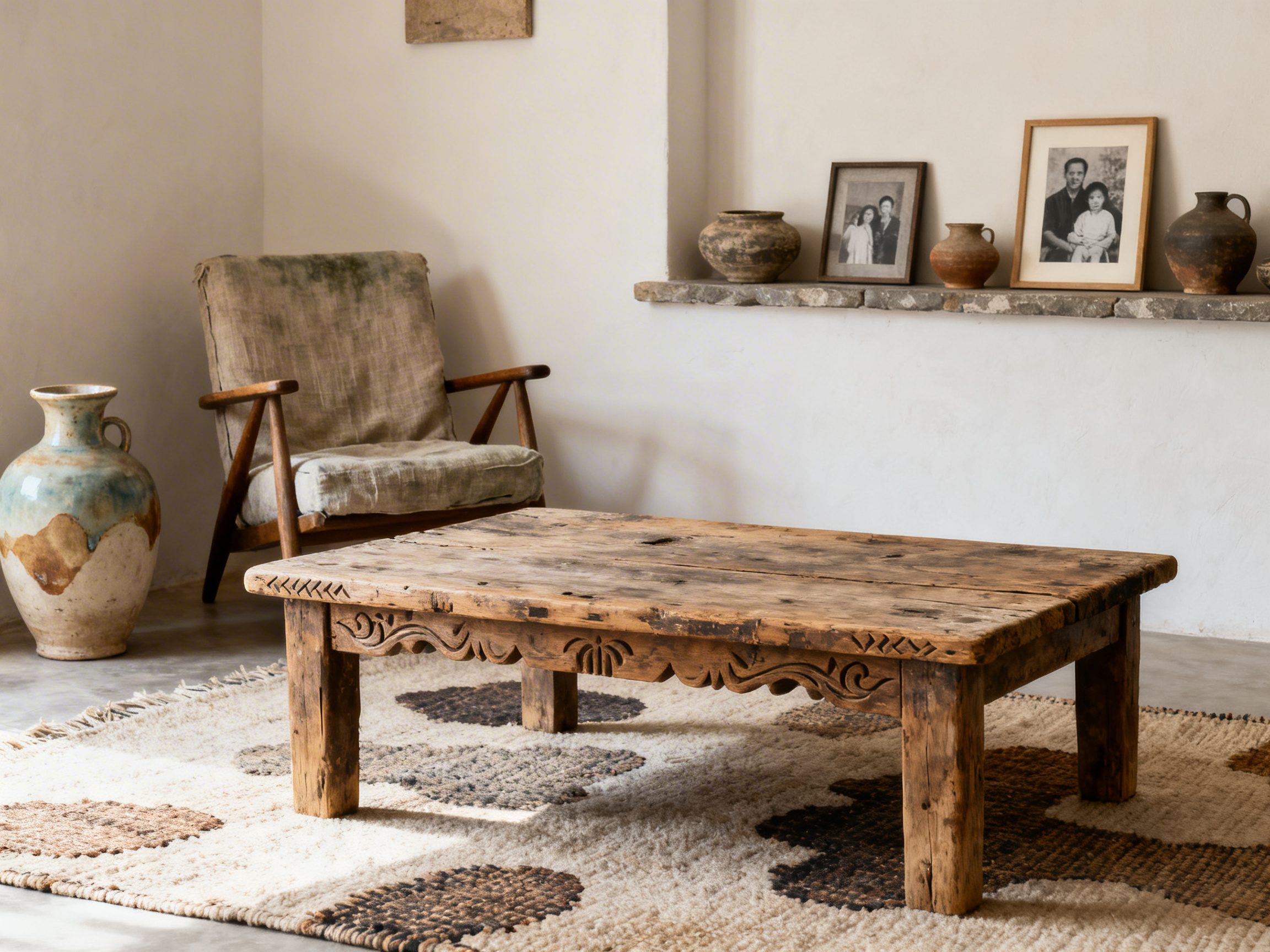
Wabi-sabi rewards visible life: a soft chip on a bowl rim, a dulled brass handle, a tabletop ring that tells you family gathered there.
These irregularities invite touch, calm glare, and add depth that new, glossy pieces cannot. In my projects, one timeworn hero per view keeps rooms from feeling stagey while letting newer items recede.
What to keep, what to repair?
Not all wear reads as soulful. I keep the age that is stable and tactile, and I correct damage that threatens function or hygiene. A hairline crack on a stoneware vase is charming, but a wobbly chair leg or flaking lead paint gets repaired or sealed.
| Pile wear adds movement, but stabilizes edges | Acceptable Patina | Fix or Upgrade | Notes |
|---|---|---|---|
| Oak dining table | Water rings, softened edges, minor dents | Refasten loose joints, buff and wax | Wax highlights grain and protects without plastic sheen |
| Brass lamp | Uneven tarnish, fingerprints | Rewire for safety | Spot-clean, do not fully polish to mirror finish |
| Linen sofa | Faded arms, relaxed cushions | Steam clean, add new fill | Embrace slouch, maintain hygiene |
| Stoneware bowls | Crazing, matte wear | Retire from food use if crack penetrates | Display as sculptural vessels |
| Vintage rug | Sun-fade, abrash color shifts | Patch holes, add pad | Pile wear adds movement, but stabilize edges |
Composing vignettes with age and restraint
Cluster old with new so age feels intentional, not flea-market random. I like a heavily pitted clay vessel next to a crisp white lamp and a clean-lined tray, which frames the imperfection.
Keep heights varied and leave negative space, since wabi-sabi needs air to breathe.
Finishes that respect the story
I avoid glossy polyurethane, which freezes an object in plastic. Oil, wax, and limewash let materials age further and deepen tone. If you must even out a tabletop, wet-sand oil into scratches, then buff so the repair reads as soft, not shiny.
Mistakes I continually see
Too many distressed look-alikes, all purchased new, read faux. Let one or two genuinely old anchors lead the room, then echo texture elsewhere with subtle textiles or textured art, which adds depth without clutter, a trend noted in recent design reporting. And do not ignore proportion: small patinaed objects get lost unless grounded by a larger, quiet surface.
Color Palette: Soft Neutrals With Earthy Depth
Build a quiet base, then muddy it a touch
Wabi-sabi neutrals are warm, mineral, and slightly dirty, never stark gallery white. Think chalky clay, rice paper, and weathered hemp, layered with olive-brown, soot, and river stone.
In my experience, two close whites plus one earthy dark gives rooms the hush everyone chases.
Undertones matter more than names
Test swatches in shadow and daylight, since cool morning light can turn beige pink or green. I always paint sample boards, move them around, and pair them with floors and textiles before committing.
If a neutral hums against your wood tones rather than shouting blue or yellow, you are close.
| Roll, then brush random strokes for texture | Undertone | Material Pairing | Effect | Budget Tip |
|---|---|---|---|---|
| Ceiling and trim | Warm off-white, hint of taupe | Limewash or matte acrylic | Softens edges, no harsh lines | Choose flat sheen to hide imperfections |
| Walls | Greige with green undertone | Limewash or clay paint | Depth with gentle movement | Roll then brush random strokes for texture |
| Anchor dark | Charred brown or soot, low chroma | Stained wood, iron, linen | Grounds the palette, avoids black glare | Use stain on pine to mimic hardwood depth |
| Accent neutral | Putty, mushroom | Stoneware, hemp, wool | Adds warmth without reading beige | Choose thrifted ceramics over new decor |
Textiles as color, texture as quiet pattern
Raw linen, nubby wool, and undyed cotton deliver color by way of fiber, not dye. I love a mushroom linen slipcover paired with a soot-toned wool throw and a pale clay cushion, all tone on tone.
If you lean boho, a restrained palette still plays well with organic forms, as in these ideas for a characterful yet low-key Boho Dining Room.
How to edit what you already own?
Group glossy, high-contrast items in one area and assess their glare at night, when the sheen is most aggressive. Replace two shiny accessories with one deeper, matte piece, like an unglazed vase, and dim your bulbs to 2700K to warm the palette. One coat of tinted wax on orangey woods can mute the red and harmonize the room.
Sourcing Guide: Handmade, Vintage, and Local Finds
Where to look, what to ask?
Shop small studios, pottery schools, estate sales, and local auctions first, because the conversation with the maker or seller often surfaces better pieces. I always ask about origin, clay body or wood species, and previous repairs, then I check for stability.
For online finds, request videos that show surfaces in raking light, which reveals cracks, filler, and over-polish.
| Source | Best For | Price Range | What to Inspect | Red Flags |
|---|---|---|---|---|
| Local potters | Unglazed vessels, tea bowls | $40–$300 | Foot ring wear, fingertip marks, balanced weight | Perfect symmetry, glassy sprayed glazes |
| Estate sales | Wood furniture, textiles, iron | $50–$1,200 | Joinery, even patina, useful scale | Musty rot, active woodworm |
| Architectural salvage | Doors, basins, stone slabs | $100–$2,500 | Structural integrity, lead content | Fresh machine distressing |
| Flea markets | Tools, baskets, stools | $10–$250 | Repair potential, regional craft | Over-varnish, loose weaving |
| Charity shops | Ceramics, frames | $5–$80 | Chips that feel honest, not contrived | Mass-produced fake crazing |
Dimensions and scales that actually work at home
Overscale rustic pieces are photogenic but awkward in tight rooms. I target vessels 8 to 14 inches high for mantels and 18 to 24 inches for floor vases, with a 1:1.5 ratio between object height and adjacent art or mirror.
Stools at 17 to 18 inches seat height tuck neatly under most consoles without visual clutter.
Stretching budget without compromising soul
Choose one handmade statement, like a large coil-built vase, then fill in with humble vintage, such as a beat-up pine bench and a wool runner. When clients are tight on funds, I repaint walls in a limewash tint and lean into found texture elsewhere, because surface treatment does more for mood than more objects.
For spring refreshes, even a simple hand-tied bouquet in an unglazed vase at the entry carries meaning, especially if you choose blooms for their symbolism, as outlined in this guide to Easter Flowers Meaning.
Verifying authenticity and avoiding faux-age traps
Real wear accrues in logical places: rim, handle, feet, and tops of rails. Machine distressing looks even, with scratches that ignore use patterns.
I rub a damp cloth over suspect finishes, and if dye transfers or an ammonia smell rises, it is probably staged aging.
Editing Clutter: Negative Space as a Design Tool
Why subtraction strengthens Wabi-Sabi?
Negative space, the purposeful gaps between objects, gives your imperfect pieces room to breathe. In my projects, the fastest way to make a handmade bowl or textured canvas feel elevated is to remove what competes with it.
The pause around an object lets you notice patina, grain, and tool marks, which is the point of Wabi-Sabi.
How to edit without sterilizing the room?
I coach clients to remove 30 percent of the surfaces’ contents, then stop and live with it for a week.
If the room feels flat, reintroduce one tactile item, such as a nubby throw or carved tray, not three. This seesaw prevents the minimalist mistake of stripping out warmth, while keeping sightlines calm.
Set visual capacity for each surface
Assign a “max count” for every plane so clutter cannot creep back. Coffee tables get three items, nightstands two, open shelves one object per 12 to 16 inches. I also group by material to avoid visual static, for example, one wood, one ceramic, one soft fiber per vignette.
Use scale and air to honor imperfection
A large, quiet piece carries more presence than many smalls. For example, one oversized, irregular vase beats five knick-knacks.
Leave at least one object‑width of air between pieces so the eye reads edges, shadows, and the maker’s hand.
Contain, rotate, and archive
Create a simple rotation box in a closet. Keep seasonal or sentimental items there, then swap monthly so rooms stay light without sacrificing personal history.
I prefer lidded seagrass bins and shallow archival boxes, labeled by mood, not season, which supports intuitive styling.
Lighting and negative space
Soft, directional light exaggerates texture and shadow in the empty zones. A shaded table lamp aimed at a bare stretch of plaster can make a hairline crack or limewash movement feel intentional.
Meanwhile, avoid blanket overhead glare that flattens both objects and the spaces between them.
Pairing with textured art
A monochrome, highly textured canvas invites negative space by acting as a “quiet statement,” adding depth without clutter, as noted in recent trend analyses on textured art’s rise.
I hang these pieces with generous margins around them so the wall remains part of the composition.
Room-by-Room Tips: Living, Bath, Bedroom, Kitchen
Living room: calm presence, not showroom silence
Keep the seating plan generous and low, with one honest material taking the lead, such as linen or wool. I let one hero piece carry the story, for instance, a hand-thrown floor vase beside a sofa, then edit the rest to supportive textures. Shelving should read like a breath, not a catalog.
| Element | Budget Option | Investment Option | Dimensions/Specs | Why it works |
|---|---|---|---|---|
| Sofa | Cotton slipcover | Linen blend with feather wrap | Seat height 16–18 in, depth 38–42 in | Low, deep seating promotes grounded calm and soft creasing over time |
| Coffee table | Reclaimed pine | Solid white oak, natural oil | Two thirds sofa length, 14–16 in high | Visible knots and grain give the patina Wabi-Sabi loves |
| Art | Monochrome textured canvas | Lime plaster relief panel | Leave 6–10 in margin to adjacent pieces | Texture adds depth without visual noise |
| Lighting | Paper lantern | Handmade ceramic lamp | 2700 K, dimmable | Soft pools of light emphasize negative space and irregularities |
- Step-by-step: Remove all decor from the coffee table, add one tray, one sculptural object, one book. Stop.
- Set a shelf rule: one object, one book stack, one plant per bay, then leave one bay empty.
- Layer a flatweave over old floors to let wear show at the edges, not everywhere.
Bath: honest materials and easy maintenance
Choose finishes that accept wear, not fight it. Tadelakt, honed marble, and matte ceramic hide water spotting better than gloss, and they patina gracefully. In my renovations, a single peg rail replaces three hooks, which instantly declutters visual lines.
| Component | Material | Finish | Dimensions/Specs | Notes |
|---|---|---|---|---|
| Vanity top | Honed marble or soapstone | Matte, sealed | Overhang 0.75–1 in | Micro-etching blends into the surface over time |
| Walls | Limewash paint | Flat | 2–3 coats, cross-hatched | Variation looks intentional, touch-ups are forgiving |
| Storage | Cedar or white oak shelves | Oil | 10–12 in deep | Open storage enforces edit; use one tray per person |
- Keep only daily-use items on the counter, corralled on a stone tray.
- Switch to waffle towels that dry quickly and age well.
- Install a dimmer and a 2700 K bulb to soften tile glare.
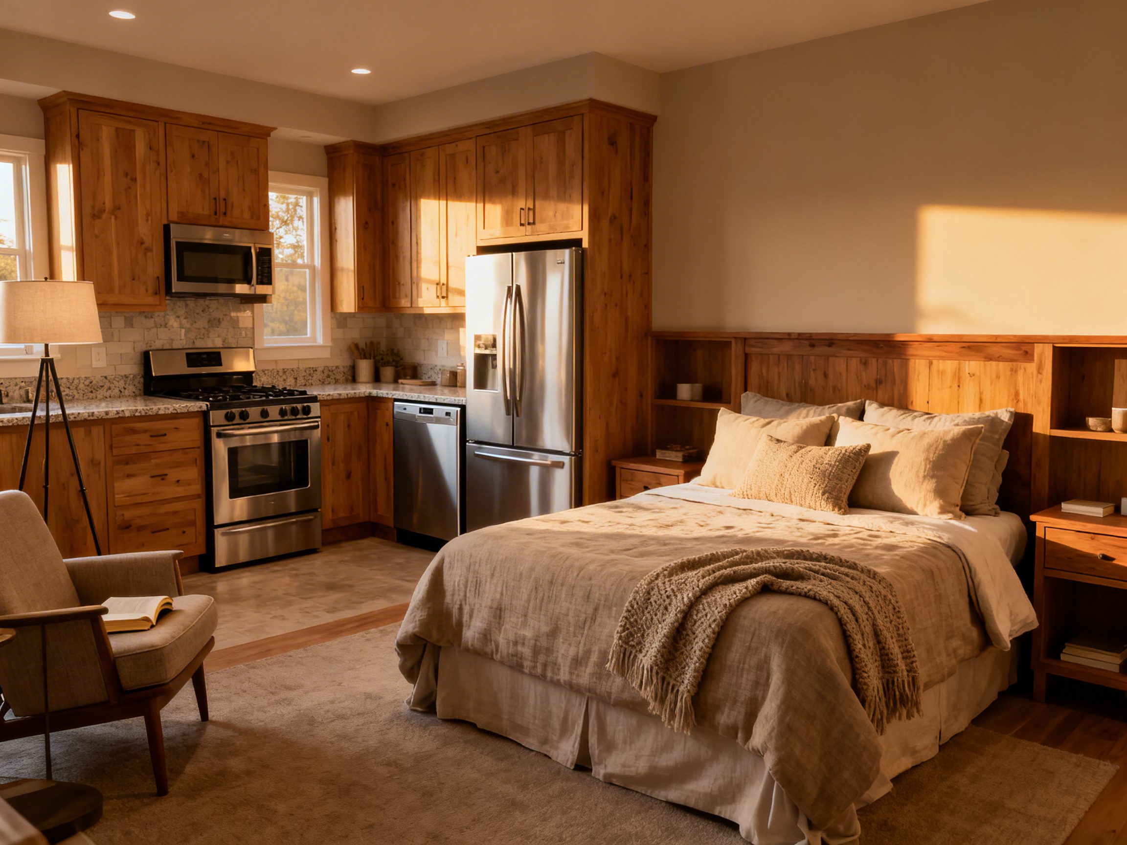
Bedroom: restful restraint with soulful texture
A quiet bedscape lets subtle textures do the talking. I prefer a simple wood or upholstered headboard, devoid of nailheads, paired with breathable natural bedding. Keep nightstands clear except for one lamp and a single personal object.
| Wood warms the room and shows a grain shift over the years | Budget | Upgrade | Dimensions/Specs | Reasoning |
|---|---|---|---|---|
| Headboard | Pine, oiled | Solid oak, oiled | 2–4 in taller than pillows | Wood warms the room and shows grain shift over years |
| Bedding | Cotton percale | European linen | 300 TC percale or midweight linen | Wrinkles read as lived-in, not messy |
| Rug | Jute flatweave | Wool kilim | 8×10 under queen, 9×12 under king | Natural fibers soften acoustics and welcome patina |
- Limit pillows to two sleeping, two euros. Anything more fights the calm.
- Choose one bedside artwork and hang it low to feel intimate.
- Leave one wall largely bare to become your negative space anchor.
Kitchen: workhorse beauty, visible use
Let prep marks and wood wear be part of the story. Open a single shelf run for daily ceramics, then keep the rest closed to avoid dust and noise.
In my kitchens, an oiled butcher block or honed stone island becomes the tactile heart of the room.
| Feature | Material | Cost Range | Dimensions/Specs | Wabi-Sabi Advantage |
|---|---|---|---|---|
| Counter | Butcher block | $40–$80/sq ft | Oil finish, quarterly | Knife marks mellow into character |
| Backsplash | Zellige tile | $12–$25/sq ft | 2×6 or 4×4, imperfect edges | Shade variation reads handmade and alive |
| Shelving | Solid oak plank | $15–$35/lin ft | 11–12 in deep, 16–18 in apart | Displays daily ware with generous air |
| Hardware | Raw brass or iron | $6–$20 each | Oil-rub, unlacquered | Develops a natural hand-rubbed patina |
- Keep counters at 20 percent display, 80 percent clear. If you cook daily, zone by task on trays.
- Use one large crock for tools rather than many small canisters.
- Install a single pendant with a wide shade to spotlight the island and leave the perimeter quiet.
For organic vases that pair beautifully with this approach, see Boho Vase Decor. If your entry needs seasonal freshness without fuss, borrow from Spring Front Door Ideas and translate the restraint indoors.
If you want another practical angle, read 11 Home Office Design Ideas for Every Space from a Cupboard to a Spare Room.
FAQ
Begin by editing one surface and one wall. Remove excess, keep a single handmade piece, and adjust lighting to 2700 K. Live with it for a week, then repeat room by room.
Yes, it thrives alongside clean lines and rustic woods. Keep silhouettes simple, let materials show wear, and avoid over-accessorizing. Blend matte finishes and natural textures to tie styles together.
Earth neutrals with depth, such as clay, bone, ink, and lichen. Use layered tones in the same family rather than high contrast. Limewash or mineral paint adds movement without pattern.
Create a rotation box and display a few pieces at a time. Group by material or memory theme for coherence. Photograph stored items so you enjoy them even off display.
Final Thoughts
Wabi-Sabi is mostly thoughtful editing and honest materials. Give your best imperfect pieces air, tune the light, and let us write the rest of the story. The room will feel quieter and far more yours.