

A living-room gallery wall should feel edited, not like a flea-market after-party. Start by deciding the mood — quiet and graphic, botanically layered, or gallery-minimal, then choose a dominant anchor piece and let surrounding items relate to it through scale, color, or material.
The goal is breathing space: negative margins, uneven mat widths, and a restrained palette make multiple objects read as one composed statement rather than visual noise.
Think like a collector making a single purchase: invest in one or two show-stoppers and let smaller pieces support them.
Practical constraints matter, such as sofa height, sightlines from the entry, and how the natural light reads prints and textiles, so plan the wall as a stage with focal points, not as a filling exercise. Below are 15 field-tested gallery-wall strategies that look curated, wearable, and lived-in.
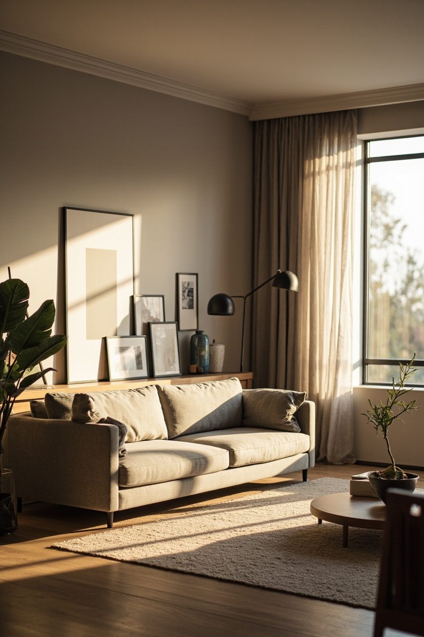
- 1. Oversized Statement Art
- 2. Panoramic Sofa Canvas
- 3. Built-In Display Wall
- 4. Botanical Print Cluster
- 5. Minimalist Frame Grid
- 6. Monochrome Photo Gallery
- 7. Mixed-Media Composition
- 8. Floating Shelf Vignettes
- 9. Symmetrical Pairing
- 10. Eclectic Frame Mix
- 11. Textile Wall Panels
- 12. Sculptural Wall Objects
- 13. Low-Profile Picture Ledge
- 14. Neutral Palette Gallery
- 15. Salon-Style Arrangement
- Final Thoughts
- FAQ
1. Oversized Statement Art
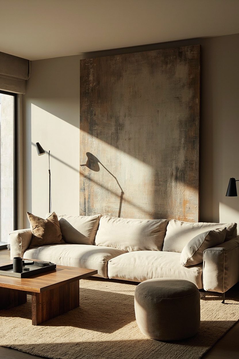
An oversized single artwork commands the wall and immediately reduces visual clutter by giving the eye a singular resting point.
Choose a canvas or framed piece at least two-thirds the length of the sofa for balance; for example, a 60–72 inch wide canvas above a standard three-seat sofa creates the right proportion and avoids the need for extra frames on either side.
Pick a material and finish that supports the room’s tone: heavily textured oil on linen for a cozy, traditional living room; raw-edge gesso or matte photographic print for modern spaces.
Avoid overly ornate frames with large-scale pieces, as heavy moulding competes with the artwork’s presence and risks looking top-heavy.
Essential Elements
- Scale: art width ≈ 60–75% of sofa width, measured horizontally for visual harmony.
- Finish: matte or satin surfaces reduce glare and read more calmly under living-room lighting.
- Placement: center 6–10 inches above the sofa back to keep sightlines open.
- Budget tip: buy a single large print on stretched canvas for a big impact under $800.
2. Panoramic Sofa Canvas
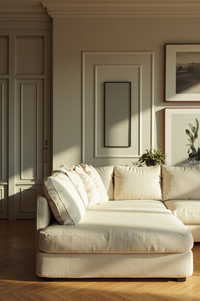
A panoramic canvas that runs the length of the seating creates a tailored, architectural feel while keeping the composition simple and controlled.
Opt for a horizontal landscape, abstract sweep, or photographic panorama in a limited color range to tie together cushions and rugs without adding framing clutter.
When selecting scale, go wider rather than taller to maintain the living room’s breathing room; a 20:1 width-to-height ratio keeps the canvas grounded.
If you have patterned upholstery or bold textiles, select a calmer panoramic image, muted tones, or high-contrast black-and-white so the wall reads as one composed layer instead of competing patterns.
Styling Blueprint
- Width: match or slightly under the sofa length to anchor seating visually.
- Color: pick two dominant hues from the room textiles and echo them in the canvas palette.
- Mounting: Use a floating frame or no frame for a modern, seamless look.
- Mistake to avoid: don’t hang too high — keep art at eye level when seated, not standing.
3. Built-In Display Wall
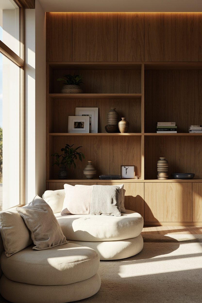
A built-in display wall with inset shelving or shallow niches makes a gallery feel like architecture rather than an afterthought.
Vary shelf heights to accommodate art, ceramics, and books; paint the back panel a single muted tone (deep olive, warm taupe) to unify disparate objects and create a deliberate collector’s vignette.
Use consistent framing or repeated materials, for instance, slim black frames and natural-woven baskets, to tie items together.
Avoid stuffing every shelf: leave one-third of each shelf empty or reserved for negative space to keep the display airy and intentional.
What to Focus On?
- Depth: choose shelves 8–12 inches deep to fit frames and small objects without crowding.
- Back color: a single accent paint unifies varied pieces; test swatches in natural light first.
- Grouping: mix one vertical and one horizontal piece per shelf to create rhythm.
- Construction detail: integrate hidden LED strips for even illumination and to highlight textures.
4. Botanical Print Cluster
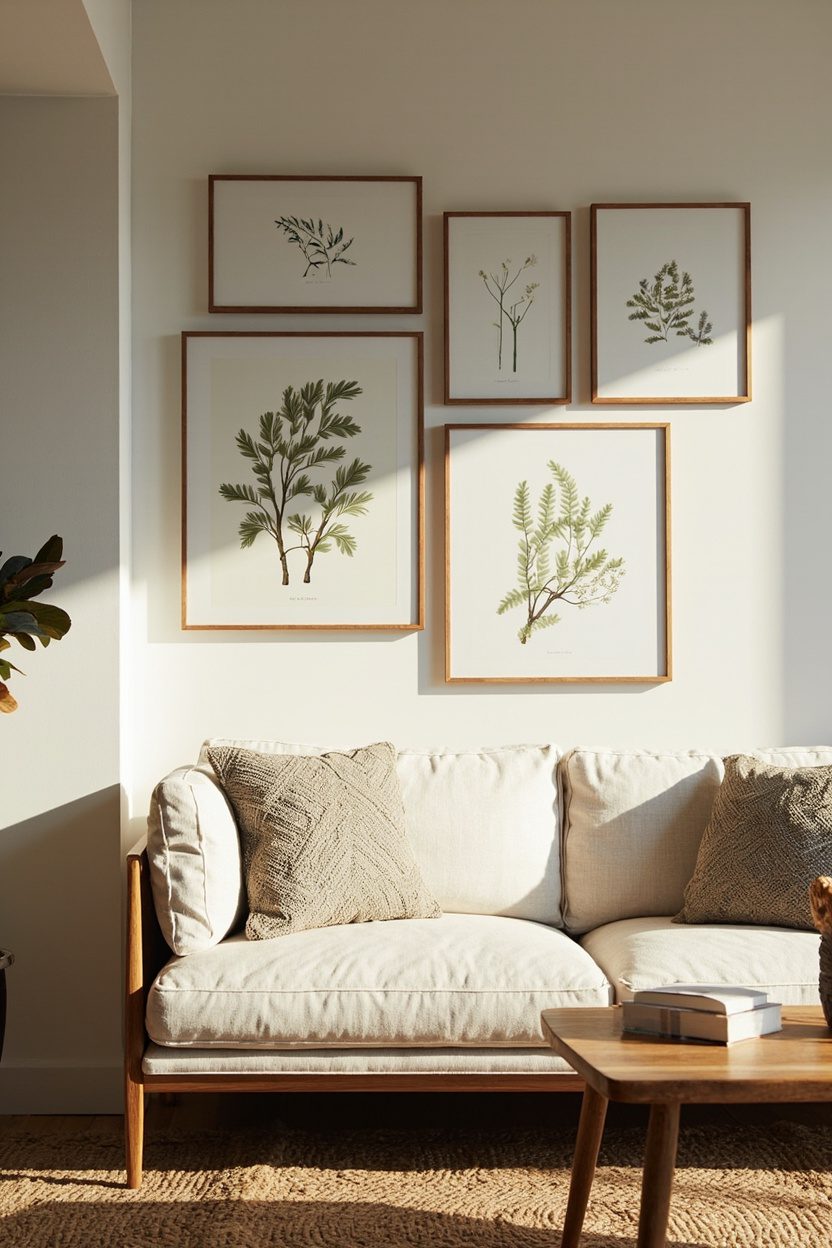
A well-edited cluster of botanical prints reads well when you stick to a clear theme and scale. Choose botanical lithographs or pressed-flower reproductions in identical thin black or rattan frames, limit the largest frame to no wider than two-thirds of your sofa cushion width to keep the composition grounded, not overpowering.
Group prints tightly with 2–3 inches of negative space between frames and anchor the cluster slightly off-center above a console or sideboard to feel intentional.
Avoid mixing in unrelated artwork; the mistake I see most is adding abstract pieces that dilute the botanical narrative and make the display look haphazard.
Styling Blueprint
- Use the same frame finish for cohesion (matte black or natural wood, depending on room warmth)..
- Limit color palette in prints to two dominant hues plus neutrals (e.g., olive and ochre)..
- Arrange with the largest print placed low-left to counterbalance furniture scale.
- Include one small shelf below for a real plant to echo the prints and add depth.
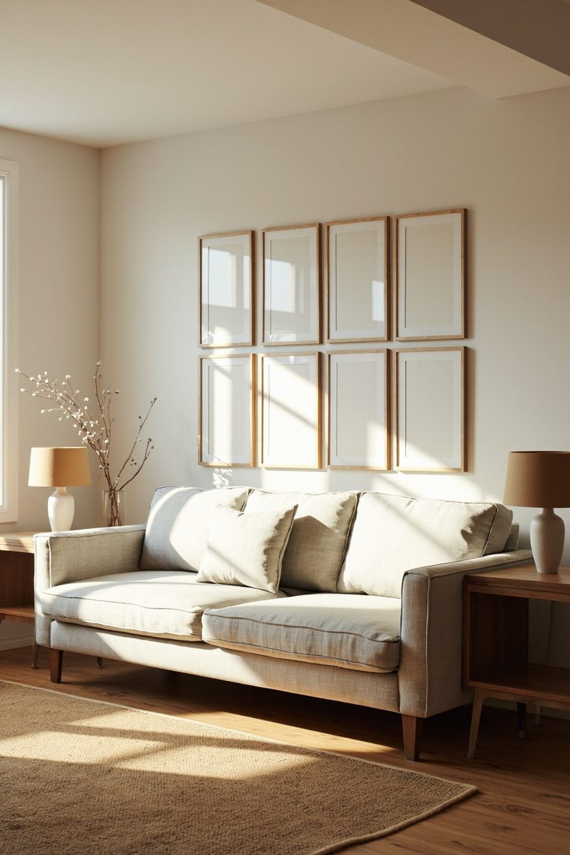
5. Minimalist Frame Grid
A strict grid of identical frames is the fastest way to achieve “collected, not cluttered” when your taste leans spare. Pick a single frame size (for example, 11×14 inches) and mat all images to the same visible area; uniform matting is the decision that reads most expensive and editor-approved.
Keep spacing exactly 30–50 mm (about 1.25–2 inches) between frames—and align the grid’s vertical center with the focal seating plane.
For materials, lightweight aluminum frames are smart if you plan many pieces: they’re easier to hang square and won’t stress walls in rented spaces.
What to Focus On?
- Stick to one image style (line drawings, single-color prints, or small-scale abstracts)..
- Measure and level carefully; use a ledger or template to avoid re-drilling holes.
- Consider an odd-numbered grid (3×3, 3×4) for dynamic balance over furniture pieces under 7 ft long.
- Choose a consistent mat width (e.g., 2 in.) to create breathing space inside each frame.
6. Monochrome Photo Gallery
A monochrome photo gallery feels curated when you select a single tonal range—warm sepia or true black-and-white and stay disciplined with print finishes (matte for a softer, vintage look).
Decide early on the grade of paper or print size: glossy 8x10s can feel trendy, while larger fine-art rag paper reads considered and enduring.
Mix subject matter portraits, architecture, and landscapes—but match contrast levels so the group reads unified from across the room. To avoid the “museum cold” pitfall, introduce one tactile element in the vicinity, such as a linen throw or a wooden frame, to soften the gallery’s graphic edge.
Essential Elements
- Select a single tonal family and stick to one paper finish for unity (matte recommended)..
- Vary scale slightly, include one larger anchor print (about 24×16 in.) among smaller 8x10s for hierarchy.
- Frame with thin black or natural wood and use uniform mats to maintain rhythm.
- Position the bottom row 6–8 inches above furniture tops for comfortable viewing and proportion.
7. Mixed-Media Composition
A mixed-media composition layers art, photography, woven textiles, and a single sculptural object to give a wall depth without chaos.
Choose a dominant medium, say a large linen textile or framed canvas, to anchor the arrangement, then punctuate with smaller metal or ceramic pieces; avoid more than three distinct material families to keep the look curated rather than busy.
Scale matters: place the largest piece slightly off-center and group smaller works closer together so negative space reads as intentional.
A practical decision: use consistent frame depth (even if finishes vary) so elements sit flush on the wall and cast unified shadows rather than competing ones.
Styling Blueprint
- Pick one anchor piece at least 36–48 inches wide for standard living walls to set the scale.
- Limit materials to three families (paper, textile, ceramic) to maintain cohesion.
- Use matching frame rabbet depth or float mounts to equalize visual weight.
- Arrange smaller pieces in groups of odd numbers for a natural rhythm.
8. Floating Shelf Vignettes
Floating shelves turn a gallery wall into a seasonal, changeable display, ideal when you want a “collected” look that evolves. Use shelves no deeper than 6–8 inches to avoid protruding into circulation space; stagger shelf lengths and keep the longest at eye level to anchor the composition.
Edit ruthlessly: one shelf should feel intentionally sparse (one plant, one book, one framed print) so the eye rests.
A smart decision is to secure heavier objects with museum putty and to stagger frame sizes (e.g., 8×10, 11×14, 16×20) but keep mat colors consistent to read as a set.
What to Focus On?
- Choose a shelf depth of 6–8 inches for standard frames and small objects to maintain proportion.
- Keep one intentionally empty shelf or single-item shelf to create negative space.
- Use consistent mat color or frame finish across shelves for unified rhythm.
- Anchor shelves into studs or use strong anchors for heavier vignettes to avoid sagging.
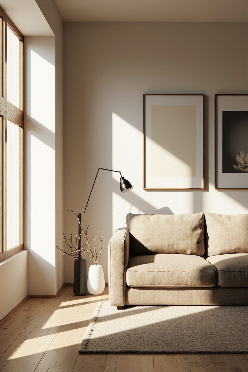
9. Symmetrical Pairing
Symmetrical pairing two large, identical frames or matching clusters flanking a sofa—reads formal yet collected when executed with restraint.
Select pieces that share a common element (palette or subject) rather than identical images; the repetition of scale and frame ties the look together without feeling museum-stiff.
Pay attention to centerline alignment: if items flank a sofa, measure the sofa’s midpoint and keep a 6–10 inch gap between the inner edges of the pairs and the sofa arms for proportion.
For a concrete choice, pick matte black or warm oak frames, depending on the room’s undertones, and stick to that finish for both sides.
Essential Elements
- Match scale exactly—same frame size and mat width for both sides to preserve symmetry.
- Keep inner spacing consistent (typically 2–3 inches between paired pieces) for visual balance.
- Choose a shared palette or subject to avoid the “mirror image” trap while keeping harmony.
- Position so the pair’s centerline aligns with the furniture’s center for architectural cohesion.
10. Eclectic Frame Mix
Layering a deliberately mismatched collection of frames—think aged brass, painted wood, and thin black metal reads curated when you limit the palette to two dominant tones (for example, warm wood + matte black).
Choose a single unifying element, such as a consistent mat size (2–3 inches) or a repeat color in the art, to keep the scale cohesive; without that, the arrangement looks chaotic rather than collected.
Use smaller frames at eye level and larger ones anchored horizontally to avoid a top-heavy composition when hung above a sofa or console.
Place frames with varied widths but keep consistent spacing (2–3 inches) to create rhythm; if you prefer an informal grid, align centers rather than edges for a relaxed, intentional look.
A practical decision: prioritize glazing—opt for non-reflective glass on pieces above seating to prevent glare, and reserve plexiglass for large, lightweight frames to reduce mounting hardware and wall damage.
Styling Blueprint
- Limit palette to two frame finishes to unify variety.
- Use consistent mat sizes for visual order inside diversity.
- Maintain 2–3 inches of spacing between frames for rhythm.
- Choose non-reflective glazing above seating areas.
11. Textile Wall Panels
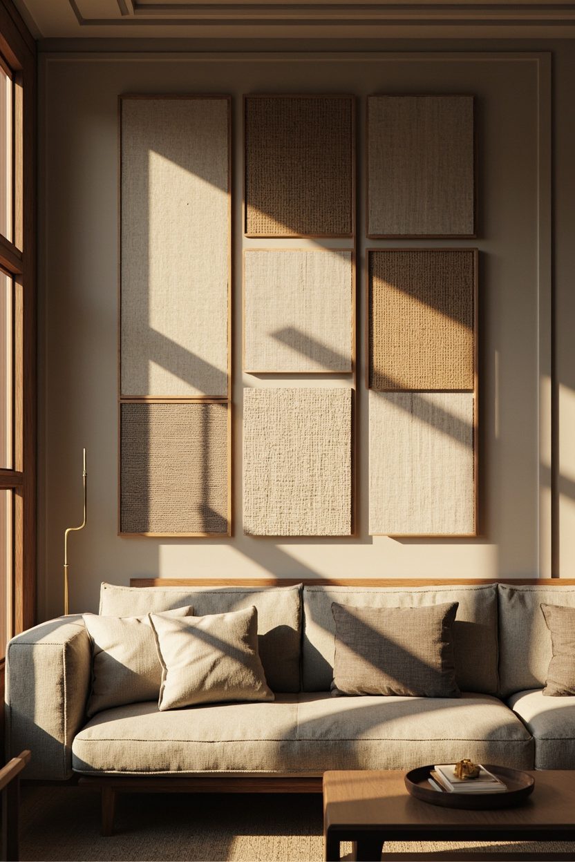
Mounting textile panels, kilims, woven tapestries, or large-scale artisan fabrics adds depth and sound absorption while feeling collected rather than cluttered when you work with three clear parameters: color family, repeat motif scale, and mounting style.
Opt for raw-edge cotton or wool panels stretched over frames for a contemporary look, or hang a single oversized handloom with a slim rod for an artisanal, relaxed energy; the material choice dictates maintenance and longevity, so choose wool for durability in high-traffic rooms and cotton for lighter, washable options.
Arrange textile panels in vertical or staggered groupings rather than tight grids to showcase each piece’s texture; keep hardware minimal, hidden French cleats or flat steel brackets to let the fabric read as art.
Budget tip: vintage scarves or pillow covers mounted on inexpensive stretcher bars can mimic an expensive gallery for under $150 per panel if you source wisely.
What to Focus On?
- Pick one dominant color family to harmonize with mixed textiles.
- Stretch heavier textiles over frames to avoid sagging over time.
- Use hidden hardware for a clean, gallery-style presentation.
- Choose wool for durability or cotton for easy washing.
12. Sculptural Wall Objects
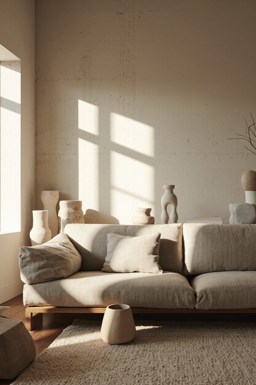
Introducing three-dimensional objects like metal sunbursts, carved wooden masks, or ceramic platters breaks flatness and reads purposefully when each piece has breathing room and a clear focal anchor.
Scale is crucial: a single large sculptural work (36–48 inches) can replace a cluster of small frames, while a curated trio of medium pieces should follow a deliberate triangle layout; never cram multiple deep objects in a narrow strip where shadows compete, and the display looks accidental.
Mind the projection from the wall: anything that extends more than 4–6 inches requires secure anchoring into studs or heavy-duty drywall anchors and should be placed above wider furniture to avoid accidental bumps.
For a polished, collected feel, repeat a material or finish (brass accents or bleached wood) across objects to create cohesion without uniformity. This is how sculptural walls feel like a single composition rather than a flea market heap.
Essential Elements
- Anchor with one dominant piece or a three-piece triangle for balance.
- Keep the projection under 4 inches unless securely anchored into studs.
- Repeat one material or finish for cohesion across varied objects.
- Place sculptural pieces above wider furniture to prevent collisions.
13. Low-Profile Picture Ledge
A low-profile picture ledge keeps artwork at eye level and makes rearranging effortless without damaging the wall. Choose a thin, wall-mounted shelf in matte black or stained oak; 3–4 inches deep is enough for standard frames and small sculptural pieces, and it prevents the visual clutter of too many individual hooks.
Place the ledge so its top sits about 4–6 inches above the back of the sofa for cohesion and to avoid the “floating art” look.
For scale, use one continuous 6–8-foot ledge on a long wall or two shorter ledges stacked with 6–8 inches between them for a layered, editorial effect.
Styling Blueprint
- Use mixed frame finishes but limit to two metals or wood tones to stay collected.
- Lean larger pieces at the back and smaller works in front for depth.
- Include one sculptural object (ceramic or brass) for contrast and weight balance.
- Rotate pieces seasonally to refresh without rehanging nails or anchors.
14. Neutral Palette Gallery
A neutral palette gallery reads serene and curated when you pick three tonal families: warm whites, greiges, and soft taupes.
Opt for prints and frames that vary only slightly in contrast, matte cream mats, pale wood frames, and artwork with subtle texture so the wall feels intentional rather than bland.
For a refined result, keep the largest piece within 60–70% of the sofa width and distribute smaller works around it with consistent spacing of 2–3 inches.
Using linen or handmade-paper artworks adds tactile interest without introducing busy color, which keeps the entire composition calming and sophisticated.
What to Focus On?
- Limit color accents to a single muted hue (e.g., dusty blue) and repeat it sparingly across pieces.
- Choose frames within a two-tone family, pale wood, and off-white to maintain cohesion.
- Introduce three different textures (paper, canvas, natural fiber) to avoid flatness.
- Keep frame sizes proportional, one large anchor plus 3–5 small supporting pieces.
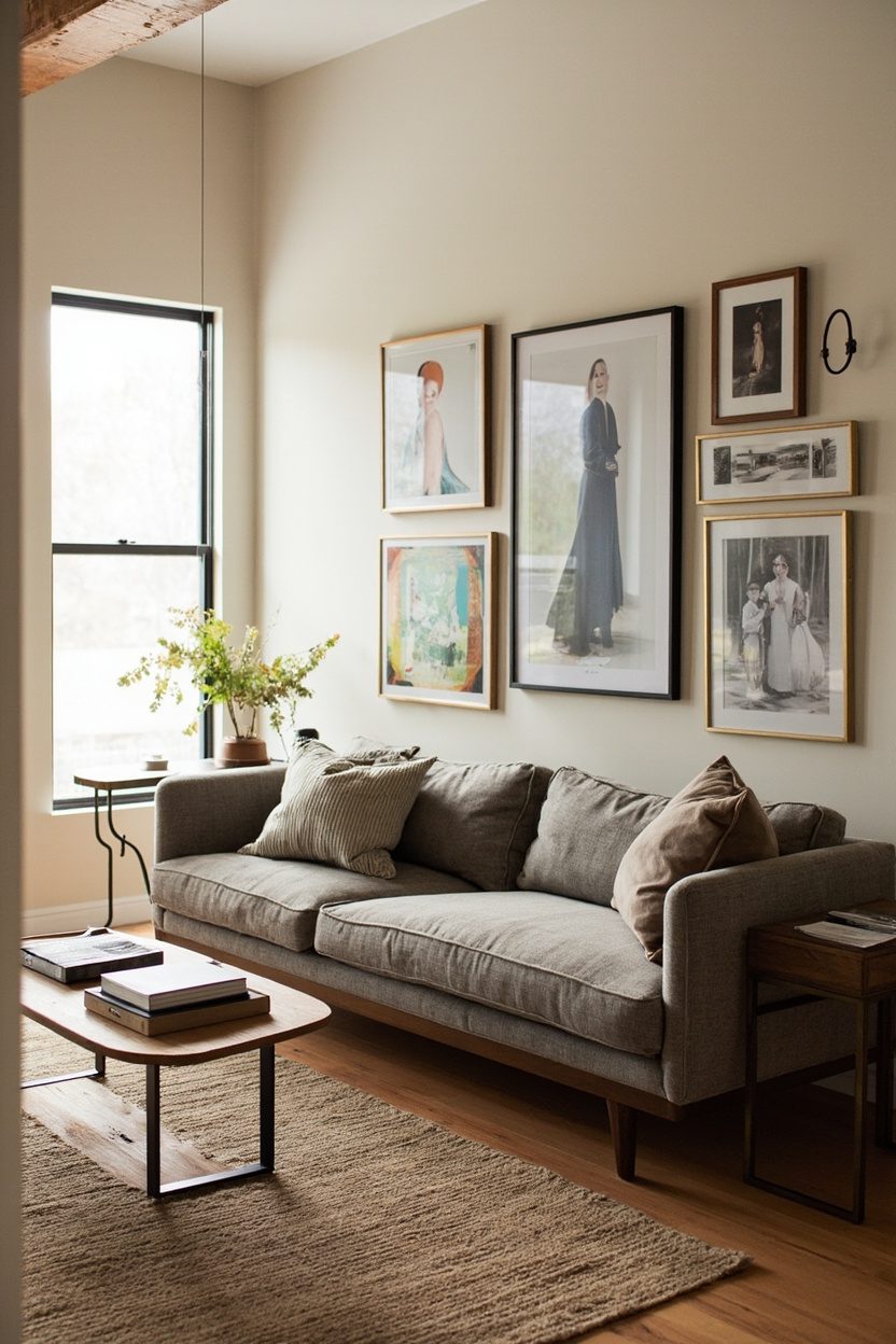
15. Salon-Style Arrangement
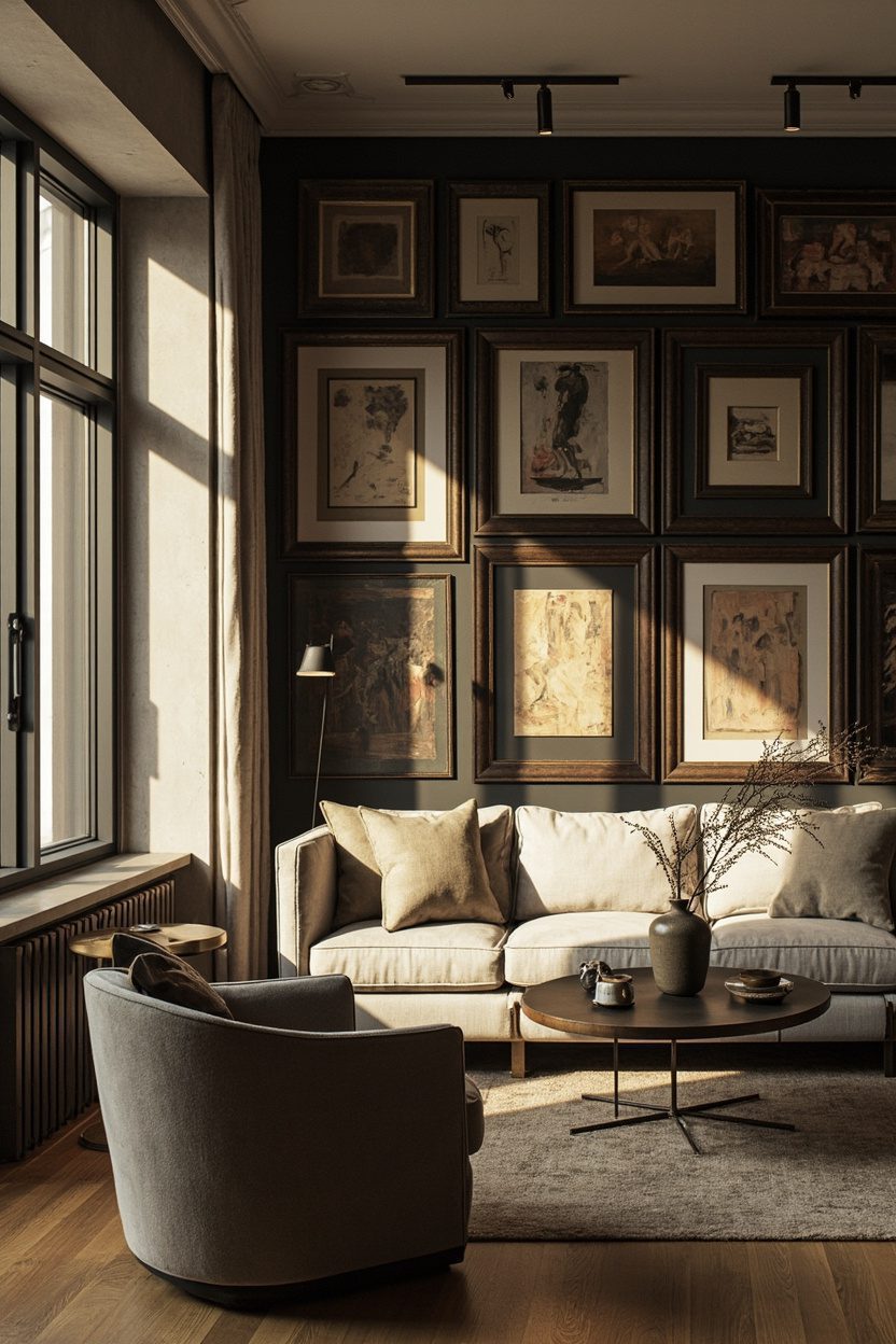
A salon-style wall delivers curated drama when executed with discipline: mix scales, eras, and subjects, but maintain a single unifying element, frame color, mat size, or a narrow color band in the artwork.
Use a pencil-sized spacing (1–2 inches) between frames to create an opinionated, gallery-like density without feeling chaotic.
Start by placing the largest work at the center or slightly off-center, then build outward with medium and small frames treat it like composing a still life on the wall.
Keep frames within a limited palette (e.g., black and antique gold) and avoid more than three different frame profiles to prevent the layout from reading as cluttered.
Essential Elements
- Anchor with one dominant piece (at least 50% of sofa width) to orient the arrangement.
- Maintain uniform inner mat widths to visually link varied art styles.
- Use two frame finishes max and repeat them across the grid for rhythm.
- Map placements on kraft paper first to avoid overhanging and re-holes in drywall.
Final Thoughts
A successful gallery wall feels like a collection, not a checklist: pick one unifying decision frame tone, mat size, or color accent and let it guide every other choice.
Small practical moves (consistent spacing, a single anchor piece, and pre-mapping layouts) deliver high-impact results that look edited, intentional, and lived-in.
For a complementary decor approach, see 12 Thrifted Home Decor Ideas That Give Your Cottage Instant Character.
FAQ
Aim for the center of the gallery to sit about 8–12 inches above the sofa back, or place the bottom edge 4–6 inches above it if you prefer a defined gap.
Yes—mixing is effective if you limit frame finishes to two and keep mat widths consistent; this creates variety while remaining collected.
Trace frames onto kraft paper, cut to size, and tape them to the wall to test arrangement and spacing before committing with nails.
Reference curated style guides like Boho Home Decor for relaxed palettes and Cottage Bedding Ideas for softer, layered compositions to adapt into gallery formats