

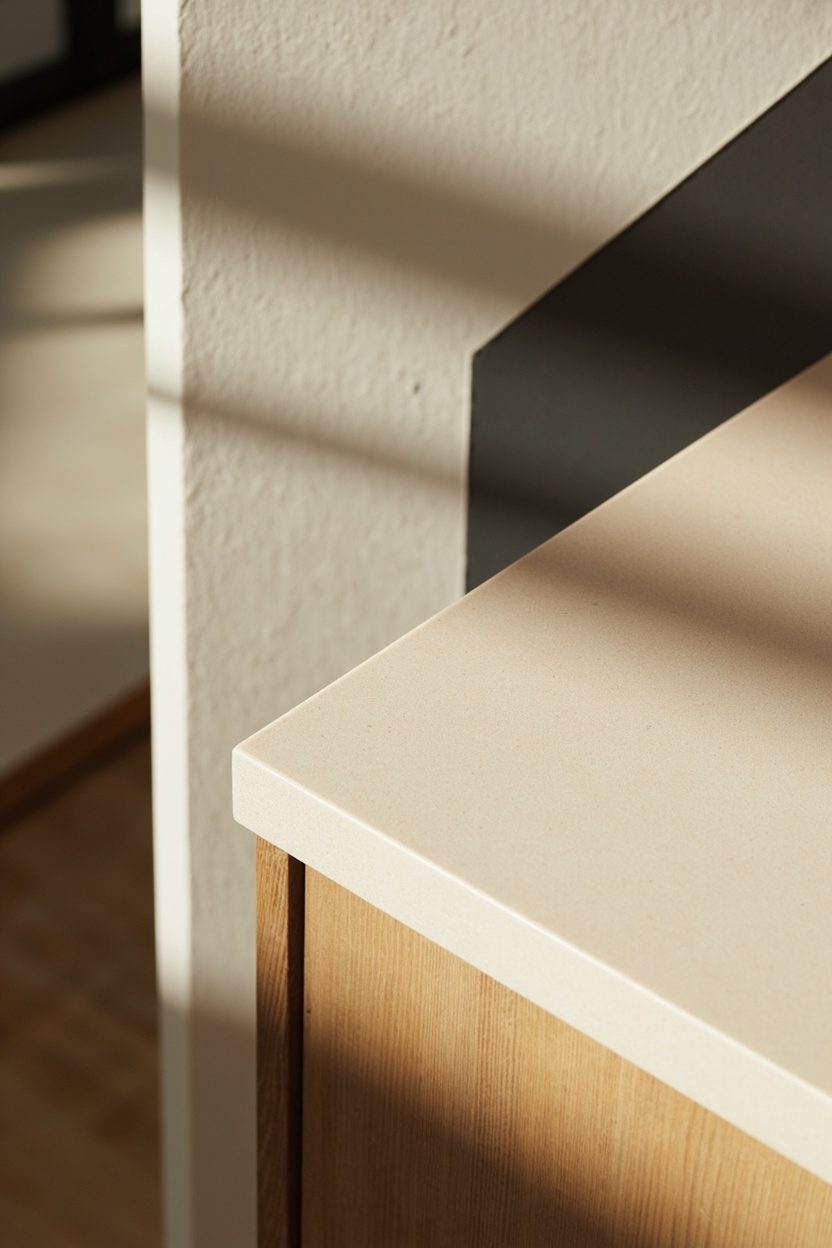
Neutral, restrained foundations are non-negotiable in eclectic minimalism: they provide the calm field where personality reads clearly rather than clashing.
Start with a pared-back palette of warm white, greige, or soft stone applied to major surfaces so artful, singular pieces register with intent.
Keep architectural decisions simple (flush baseboards, matte plaster walls) so the few chosen items feel curated, not cluttered.
That said, restraint doesn’t mean bland. The style hinges on purposeful exceptions—one vintage chair, a handcrafted lamp, or a sculptural rug that breathes character into the calm.
Think in terms of edit and contrast: choose scale deliberately, let each item earn its place, and avoid matching sets. The result is a space that reads modern and lived-in, where less truly becomes more.
- 1. Neutral Base Layers
- 2. Curated Color Pops
- 3. Textural Contrast Mix
- 4. Sculptural Furniture Forms
- 5. Handmade Ceramic Accents
- 6. Statement Lighting Fixtures
- 7. Greenstone Bathroom Elements
- 8. Bronze Hardware Details
- 9. Warm Earthy Tones
- 10. Monochrome Anchors
- 11. Minimalist Gallery Walls
- 12. Tactile Textile Layers
- 13. Mixed-Material Surfaces
- 14. Streamlined Storage Solutions
- 15. Organic Shapes Integration
- 16. Artful Antique Finds
- 17. Subtle Pattern Play
- 18. Calm Natural Light
- FAQ
- Final Thoughts
1. Neutral Base Layers
Start rooms with a coherent neutral foundation—paint, large rugs, and upholstery—so that eclectic accents can pop without fighting visual noise. Specify warm neutrals (eggshell, greige, warm gray) on walls and a low-pile wool or sisal rug in a tonal shade; these choices control reflectivity and texture, anchoring the room while keeping sightlines simple.
Keep major materials consistent: matte paint, natural wood (oak or walnut with a light oil finish), and linen or boucle upholstery for seating. A practical decision: choose upholstery fabric with a Martindale rub count suitable for use (25,000+ for everyday sofas) so your “minimal” pieces last; avoid glossy finishes that read loud next to subtle accents.
Essential Elements
- Walls: warm neutral paint (eggshell or matte, not satin) to minimize glare and hide imperfections.
- Flooring: neutral sisal or hand-knotted low-pile wool rug in 8’x10′ scale for living rooms.
- Wood tones: stick to one family (light oak or mid walnut) to prevent visual clutter.
- Upholstery: natural textiles (linen, cotton-linen blends, boucle) with performance finishes for durability.
2. Curated Color Pops
Introduce intentional color punctuation—one saturated sofa cushion, a single gallery frame, or a lacquered side table—rather than sprinkling multiple hues. Pick a dominant neutral then select one or two deep color notes (terra cotta, verdigris, or indigo) and repeat them in small doses across the room to create rhythm without excess.
Make concrete choices: use a single 24″x36″ art piece or a sculptural ceramic in your accent color at eye level; keep the rest monochrome. Budget-wise, invest in one artisan-made accent (e.g., a hand-glazed vase or vintage throw) and pair it with affordable supporting pieces to maintain authenticity without overspending.
Styling Blueprint
- Pick one dominant accent color plus one neutralized secondary hue for restraint and cohesion.
- Place the color at eye level (art, mirror) and at floor level (rug corner or pouf) to balance scale.
- Limit colorful objects to 3–5 focal pieces per room to maintain minimalism.
- Choose handcrafted finishes (glazed ceramic, hand-dyed textile) for tactile color depth.
3. Textural Contrast Mix
Fuse smooth, minimalist surfaces with a few tactile surprises: a carved wood stool, a raw-edge marble side table, or a looped wool blanket. The contrast—slick plaster walls versus knobbly ceramic—gives the eye a reason to linger and keeps the palette from feeling sterile. Prioritize one bold texture per plane: upholstery, floor, or accessory.
Decide on scale and maintenance up front: for example, heavyweight boucle on a statement chair reads luxe but traps dust—use it in lower-traffic spots or choose a treated fiber for busy homes. Place textured pieces where they invite touch (arm of a chair, bedside bench) to amplify warmth without adding visual clutter.
What to Focus On
- Limit textures to three types per room (smooth, nubby, metallic) to avoid overcomplication.
- Use natural materials—raw wood, honed stone, hand-thrown ceramics—for authentic patina.
- Scale texture to function: high-wear areas get durable weaves; delicate textures go in accent spots.
- Place one tactile piece within reach to invite interaction (throw, stool, or tactile lamp base).
4. Sculptural Furniture Forms
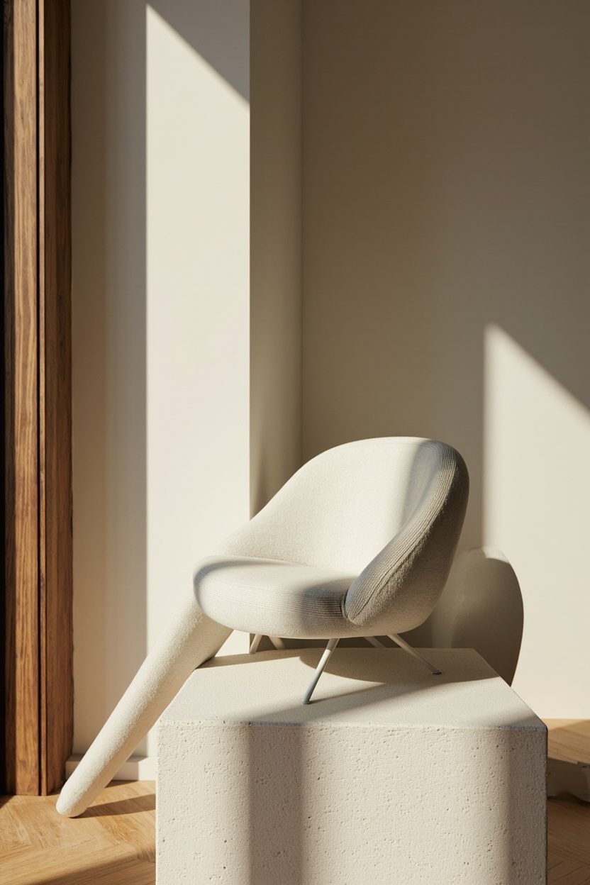
Sculptural furniture turns functional pieces into focal points without cluttering a room—think an arced lounge chair, a biomorphic side table, or a low-profile sofa with exaggerated rounded arms. Choose materials with a quiet luxury feel: matte walnut or powder-coated steel for structure and boucle or leather for upholstery; avoid glossy plastics that read cheap in a pared-back palette.
Use scale decisively: a single large sculptural armchair works better than multiple small statement pieces in an 18–25 m² living area. Budget-wise, prioritize one handcrafted or designer piece and pair it with thrifted or modular companions to keep costs sensible and layered rather than literal.
Styling Blueprint
- Pick one sculptural anchor piece per room, not per vista, to maintain calm composition.
- Limit upholstery colors to one muted accent (e.g., warm clay or charcoal) against neutral walls.
- Balance heavy silhouettes with open negative space—leave 30–40 cm clearance around the piece.
- Mix materials: pair a soft boucle seat with a stone or metal side table for tactile contrast.
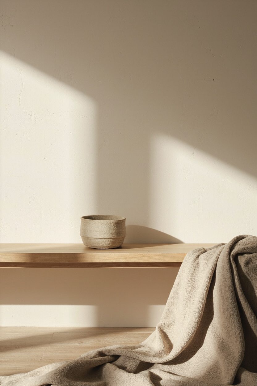
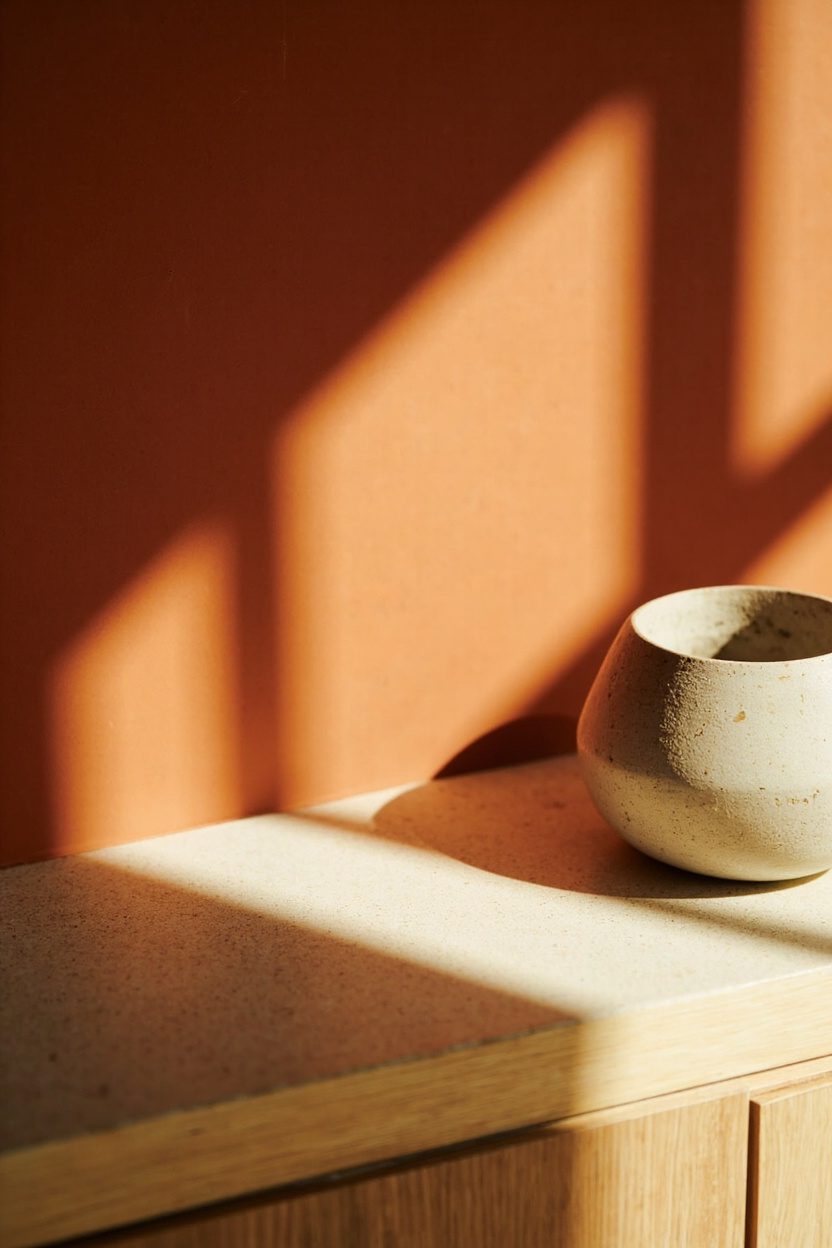
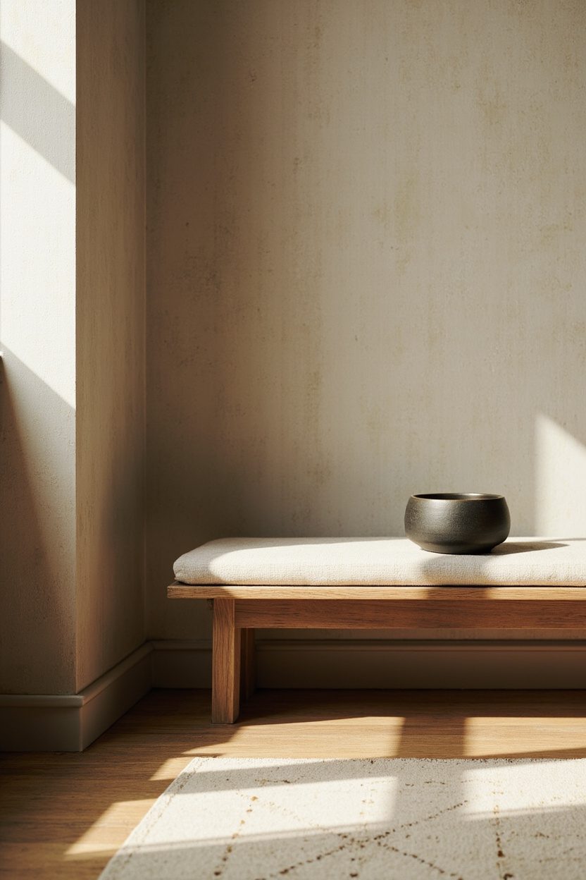
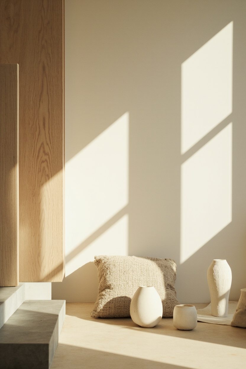
5. Handmade Ceramic Accents
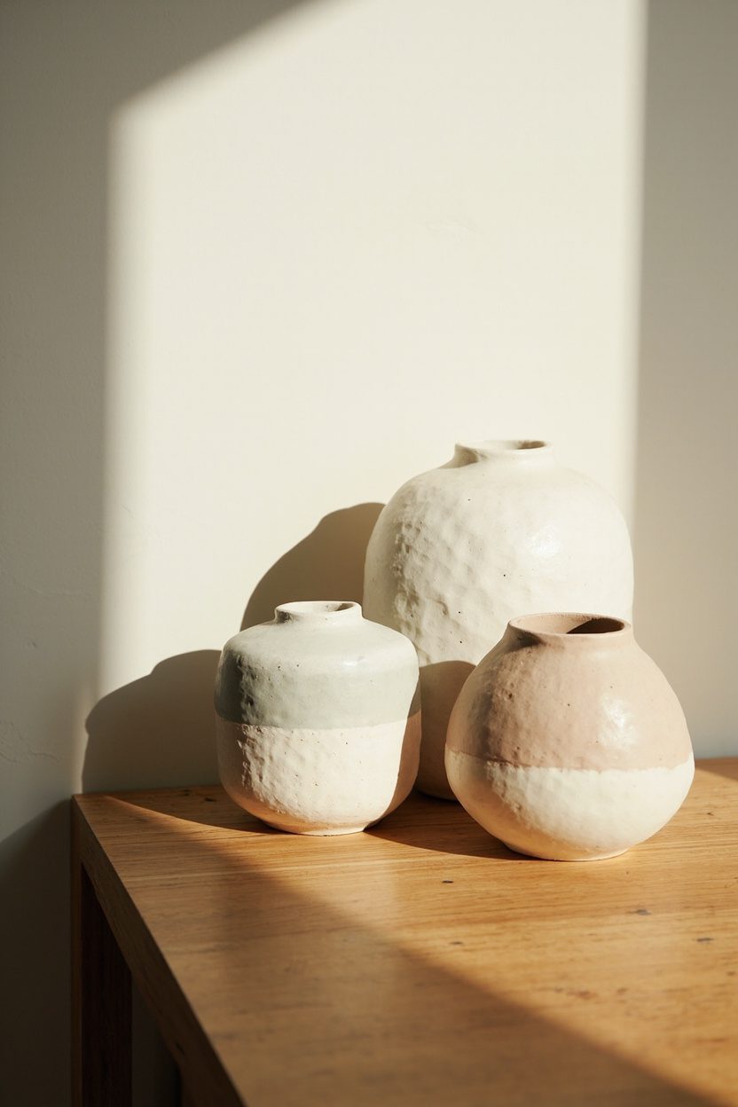
Handmade ceramics bring intentional imperfection into a minimalist shell—small bowls, vases, and wall-mounted platters with visible glazing marks read as collected rather than curated. Opt for pieces in soft, earthy glazes—sage, basalt, cream—with one piece in a deeper verde or indigo to nod to the 2026 trend for restrained color pops.
Placement matters: cluster three ceramics of varying heights on an open shelf or windowsill rather than scattering singles across surfaces. For durability, choose vitrified stoneware for kitchen pieces and softer earthenware for strictly decorative items; avoid placing delicate matte-finish pottery near food or heavy use areas.
Essential Elements
- Create clusters of 3 with varied heights to read intentional and artisanal.
- Select one accent glaze color for the room to maintain cohesive restraint.
- Use ceramics on floating shelving or console tables—keep at least 15 cm between items.
- Mix vintage studio pieces with one new handcrafted work to suggest a lived-in edit.
6. Statement Lighting Fixtures
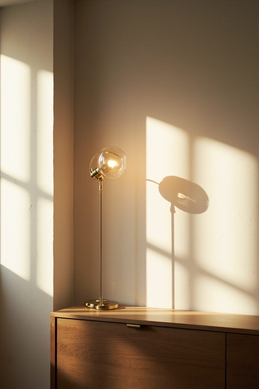
A single sculptural light fixture delivers personality without adding visual clutter—choose a pendant with an organic, asymmetric silhouette or a multi-arm sconce in burnished brass to add warmth. Prioritize dimmable LED sources with warm color temperature (2700–3000K) to preserve the soft, restrained palette described in recent 2026 trend reporting.
Scale is non-negotiable: in a dining area, fixture diameter should be roughly one-half to two-thirds the table width; over seating, keep pendants 60–75 cm above the tabletop or seat plane. Avoid overly intricate crystal chandeliers that fight the minimalist lean—select fixtures with clear structural logic and tactile finishes like bronze, aged nickel, or frosted glass.
What to Focus On
- Match fixture scale to furniture—measure before buying and follow the half-table guideline for pendants.
- Choose dimmable LEDs at 2700–3000K for warmth and flexibility in layered lighting plans.
- Favor tactile finishes (brushed brass, matte black, frosted glass) over high-gloss chrome.
- Limit ornamental detail—opt for fixtures with a single design gesture to read modern-minimalist.
7. Greenstone Bathroom Elements
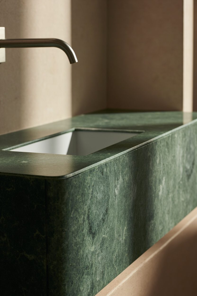
Greenstone—think verde caldia or verde scuro—adds sculptural presence to a pared-back bathroom without resorting to pattern overload. Use a single feature like a carved tub or sandblasted floor in greenstone to anchor the room; keep surrounding surfaces matte white or warm plaster to let the stone read as intentional, not ornate. A concrete mistake to avoid: don’t mix multiple exotic stones in a small bath—pick one and repeat its tone in accessories for cohesion.
Introduce bronze or aged brass fittings at a low-contrast scale (towel bars, spout, drawer pulls) to warm the palette; avoid high-polish chrome which fights the stone’s tactile depth. For cost control, use greenstone as a focal slab (tub surround or vanity top) and choose porcelain tiles that echo the hue for wet-wall areas, keeping the project in a mid-to-high budget tier depending on stone thickness and fabrication.
What to Focus On
- One dominant greenstone element (tub or floor) rather than multiple small pieces to maintain minimalism and impact..
- Matte white plaster walls to amplify natural light and let the stone’s texture read clearly..
- Warm metal accents like aged bronze for fittings to complement the green undertone of the stone..
- Porcelain tile matches for wet walls to reduce stone surface area and cost while preserving color continuity..
8. Bronze Hardware Details
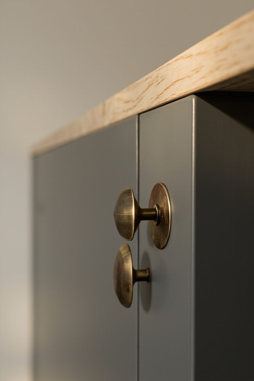
Bronze hardware reads like jewelry for a restrained interior; slim-line cabinet pulls, low-profile door levers, and exposed screwless faceplates introduce personality without clutter. Specify a satin or aged patina bronze rather than bright or polished finishes—this keeps the look grounded and pairs seamlessly with warm neutrals or greenstone elements. A common misstep: choosing oversized hardware that reads heavy—scale matters, so pick proportional pulls (3–5 inches for drawers, 8–12 inches for pantry doors).
Use bronze sparsely but strategically—clustered on the kitchen’s primary run and repeated in bathroom accessories creates an editorial through-line. For durability, select solid-bronze or bronze-plated stainless steel in a mid-budget bracket; cheaper alloys will tarnish unevenly and undermine the minimalist intent.
Styling Blueprint
- Choose satin or aged bronze finish for subtle warmth and longevity..
- Match hardware scale to door and drawer sizes—small pulls for upper cabinets, longer for base units..
- Repeat bronze in two key rooms (kitchen and master bath) to create a cohesive palette across the home..
- Invest in solid-bronze or plated steel for frequently used pieces to avoid uneven patination..
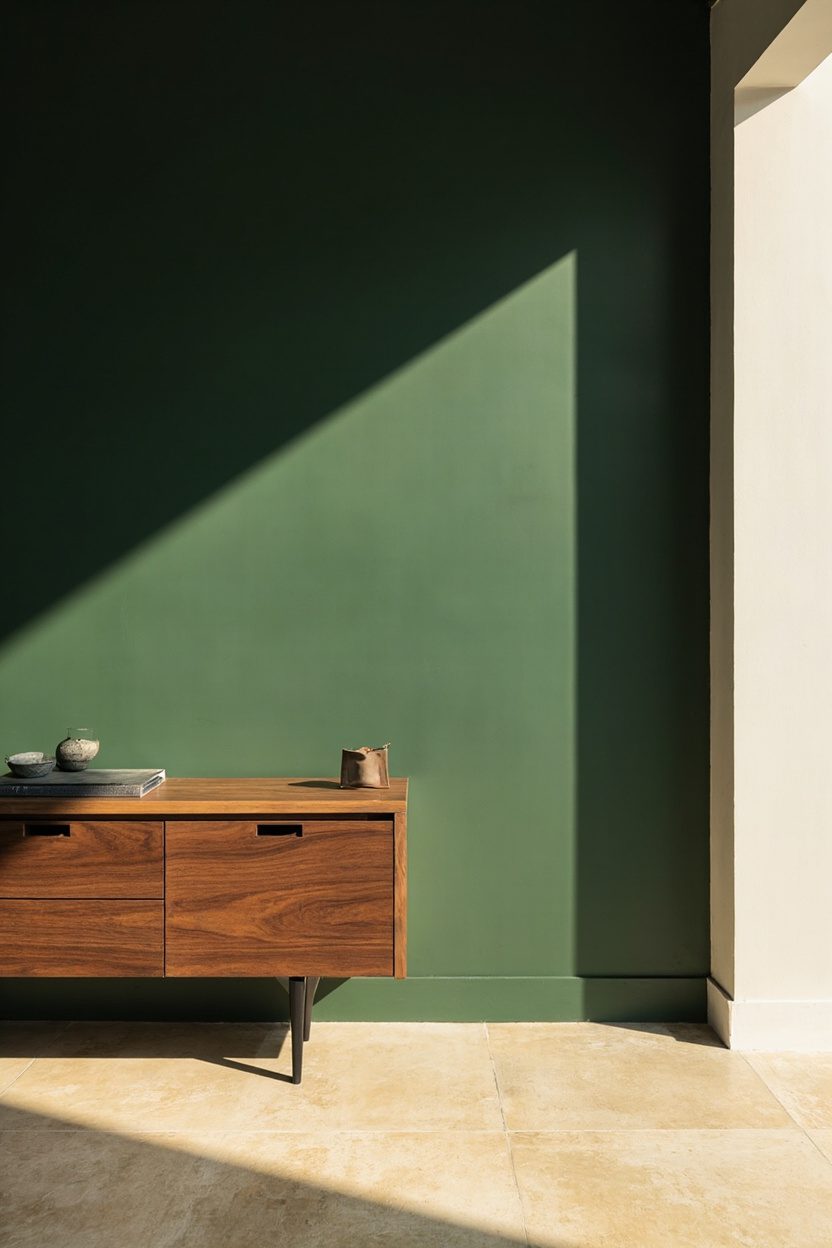
9. Warm Earthy Tones
A restrained palette of warm earth tones—burnt clay, soft umber, warm greys—anchors eclectic minimalism by adding depth without visual noise. Layer these hues through textiles (linen sofa in warm taupe, rust wool throw), a single clay-backed accent chair, and matte-painted trim rather than covering every surface. Decision detail: pick one dominant warm tone and use two supporting neutrals to avoid a muddled mix; for example, clay primary with warm grey and off-white accents.
Natural materials amplify the effect: terracotta planters, oak furniture with a golden oil finish, and matte ceramic lighting produce tactile richness. For rooms with limited square footage, keep larger pieces (sofa, rug) in neutral warm grey and introduce the clay or rust as smaller, replaceable elements to stay budget-friendly and flexible. Consider consulting floor plans for scale decisions on furniture placement using resources like Small Home Floor Plans to ensure proportions suit your layout.
Essential Elements
- One primary warm tone paired with two supporting neutrals to maintain a curated look..
- Natural materials (oak, terracotta, linen) for tactile warmth and longevity..
- Keep large upholstered pieces neutral; introduce color via smaller, replaceable items..
- Use matte finishes over gloss to keep the aesthetic calm and layered rather than flashy..
10. Monochrome Anchors
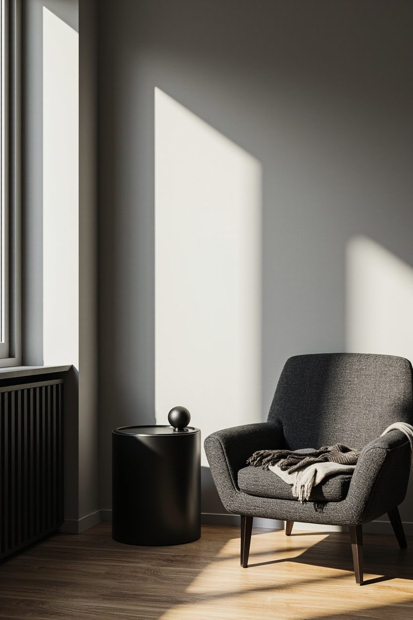
A monochrome anchor is a single, large-scale piece—sofa, rug, or cabinet—done in one disciplined color that grounds an otherwise varied palette. Choose a deep charcoal or warm taupe for living rooms; these read as intentional and hide wear better than absolute black, and commit to matte finishes to avoid visual noise.
Use the anchor to free up accents: ceramics, metalwork, and textiles can be expressive because the eye returns to that calm, single tone. Avoid matching everything; instead pair the anchor with one contrasting material—like a bleached oak coffee table—to keep scale balanced and circulation clear.
Styling Blueprint
- Pick one dominant hue for the anchor and limit it to one large piece per room to avoid monotony.
- Select matte upholstery or low-sheen paint to reduce glare and reinforce calmness.
- Contrast texture, not color—add a handwoven throw or leather ottoman for depth.
- Budget tier: invest in durable upholstery for the anchor; it’s the piece you’ll keep longest.
11. Minimalist Gallery Walls
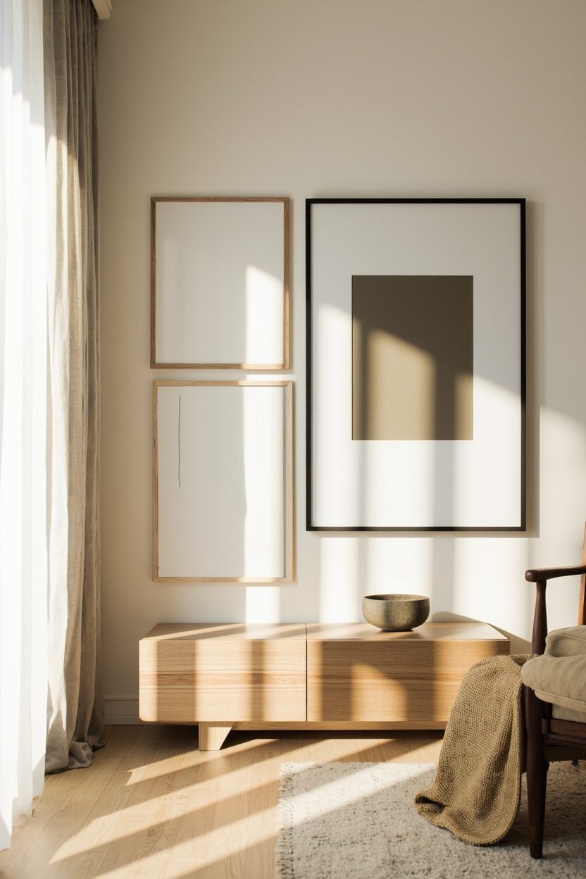
A minimalist gallery wall relies on restraint: fewer frames, consistent matting, and deliberate spacing. Use a single frame color—matte black, warm wood, or slim brass—and stick to a strict grid or an intentional asymmetry with a maximum of six works to maintain visual breathing room.
Scale is everything—choose works that relate to furniture height (centerline roughly 56–60 inches from the floor) and avoid tiny prints over a large sofa. For cohesion, pick a unifying element like paper tone or line weight rather than forcing a theme; charcoal sketches with one small color pop read modern and curated.
What to Focus On
- Use uniform frames and mats to create a calm baseline across diverse artworks.
- Hang the center at about 56–60 inches from the floor for human-scale alignment.
- Limit to 4–6 pieces; more fragments the composition and breaks the minimalist intent.
- Include mixed media sparingly—one sculptural piece or shelf can add depth without clutter.
12. Tactile Textile Layers
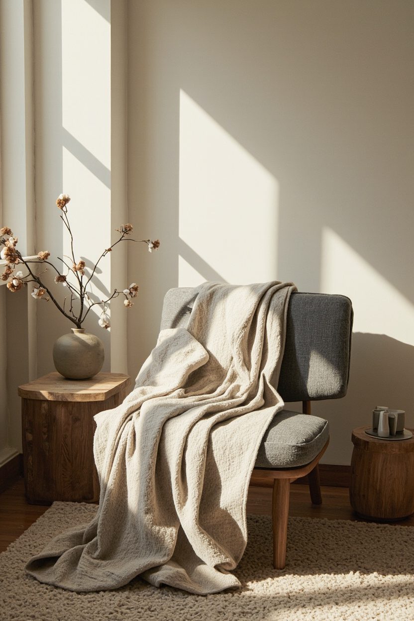
Tactile layering gives minimalist rooms an emotional heartbeat: add a boucle chair, a low-pile wool rug, and a linen bedcover in the same neutral family to elevate comfort without visual chaos. Mix fiber types—wool, linen, Alpaca or cotton—and vary pile heights so each layer reads as purposeful rather than repetitive.
Color direction should be close-knit: two to three harmonious neutrals with one accent fiber (for example, clay throw pillows). A common mistake is over-weighting the bed or sofa with equal-scale cushions; instead vary sizes (20″, 16″, lumbar) and keep the number modest to maintain the minimalist silhouette.
Essential Elements
- Combine three fiber types and two pile heights for visible and tactile contrast.
- Limit colors to a neutral trio plus one mild accent to avoid visual clutter.
- Scale cushions and throws—mix square and lumbar shapes for depth without bulk.
- Choose easy-care fabrics for high-use areas to keep the look low-maintenance.
13. Mixed-Material Surfaces
Layering materials—think honed stone counters with a matte-painted cabinet face or a raw plywood island with a lacquered top—creates visual depth without clutter. Prioritize tactile contrast: pair warm, textured woods (oak with a visible grain) against cool, honed stone to balance the palette; avoid more than three dominant finishes to keep the look cohesive rather than chaotic.
Introduce a repeating element to unify the mix, such as a brushed-bronze edge profile that appears on cabinet pulls and sink fixtures. A practical decision: on wet surfaces choose sealed, low-porosity materials (quartz or honed marble with a matte sealer) to prevent staining, especially if you’re working with light neutral tones commonly used in minimalist schemes.
What to Focus On
- Limit dominant finishes to three to maintain visual harmony.
- Use one consistent metal finish as an anchor across surfaces.
- Specify sealed or non-porous materials for high-use areas like kitchens or baths.
- Select materials with complementary scales—fine-grain wood with large-format stone slabs.
14. Streamlined Storage Solutions
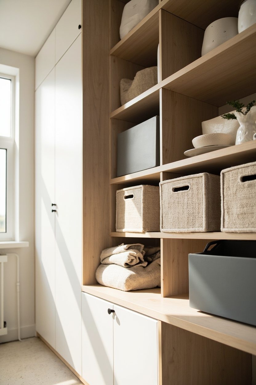
Concealed storage is the backbone of eclectic minimalism: it keeps personality pieces on display while stashing visual noise. Design built-ins with shallow depths for entryways or behind sofas—36 to 40 cm deep is enough for books and baskets—so they read as architectural rather than bulky furniture.
Prioritize pull-out or lift-mechanism hardware that feels effortless; soft-close drawers and push-to-open doors keep the lines clean. For a budget-conscious route, retrofit flat-front cabinet doors over open shelving to instantly simplify a busy wall, and paint them the same color as the surrounding wall to make the storage disappear.
Styling Blueprint
- Choose shallow built-ins (36–40 cm) where possible to preserve room scale.
- Use uniform cabinet fronts painted to match walls for visual continuity.
- Install soft-close or push-to-open hardware for a seamless experience.
- Reserve open shelving for a few curated objects to prevent visual clutter.
15. Organic Shapes Integration
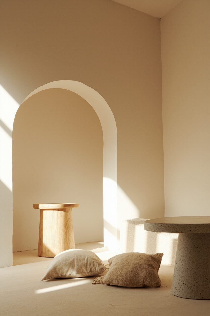
Introducing curves—an arched doorway, a rounded sofa, or a pebble-like coffee table—softens a minimalist grid and brings an intimate, human scale to a room. Commit to one dominant curvilinear piece per room (for example, a curved sectional in a living area) and balance it with rectilinear elements to avoid the space feeling overly thematic.
Material choice matters: choose matte, tactile finishes for curved pieces (linen upholstery, honed stone, or plaster) to emphasize the sculptural quality. Avoid skinny, delicate curves that read as decorative; instead, opt for robust, well-proportioned shapes that function comfortably—e.g., a 120–140 cm diameter rounded table for small dining nooks.
Essential Elements
- Select one dominant curved object per room to anchor the scheme.
- Pair organic shapes with rectilinear furnishings for balance.
- Prefer matte, tactile materials to accentuate shape and scale.
- Scale rounded pieces generously—avoid fragile, undersized curves.
16. Artful Antique Finds
Antique pieces add instant character to a minimalist canvas—think a single mid-century credenza or a weathered Moroccan runner rather than a crowded flea-market look. Choose one anchor antique per room so the object reads as a considered collectible: a brass bedside lamp with a new linen shade or a carved wood console in a muted stain works best with restrained palettes and prevents visual clutter.
Collectors often over-restore; avoid polishing patina away. Keep scale in check—avoid an oversized armoire in a small apartment; instead pick a slim profile sideboard (around 30–36 inches high) to maintain sightlines and storage. For a budget-forward approach, target pieces with solid frames that can be refinished or reupholstered rather than delicate veneers that require costly repair.
Styling Blueprint
- Limit to one or two antiques per room to maintain minimalism and emphasize each object.
- Pair warm patina metals (brass, bronze) with soft neutrals like warm gray or cream.
- Prefer furniture with clean lines and authentic wear over ornate, oversized pieces.
- Allocate 10–20% of the room budget to restoration or appropriate upholstery if needed.
17. Subtle Pattern Play
Introduce pattern as a whisper, not a shout—small-scale geometric rugs, micro-houndstooth cushions, or a linen curtain with faint stripes provide depth without breaking the serene feel. Keep patterns within a tight tonal range (two to three colors max) so they read as texture from afar but reveal detail up close.
Avoid mixing more than two pattern types in a single sightline; for example, pair a tonal patterned rug with a solid sofa and one patterned pillow. Scale matters: in compact living rooms, choose patterns with a repeat no larger than 6–8 inches to prevent the room from feeling busy. Fabrics with natural fibers (wool, linen, cotton) give patterns a softer, grounded presence.
What to Focus On
- Stick to a two- or three-color palette for all patterns to keep cohesion with minimalist finishes.
- Use small- to medium-scale repeats in small rooms; reserve large-scale patterns for high ceilings or big sofas.
- Introduce pattern through textiles and rugs rather than wallpaper to keep changes reversible.
- Choose natural-fiber weaves for tactile warmth and longevity over delicate synthetics.
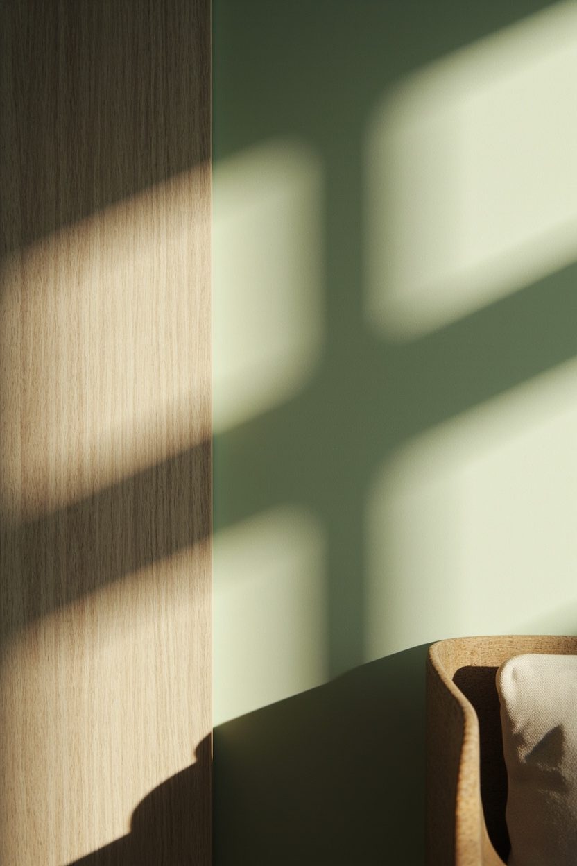
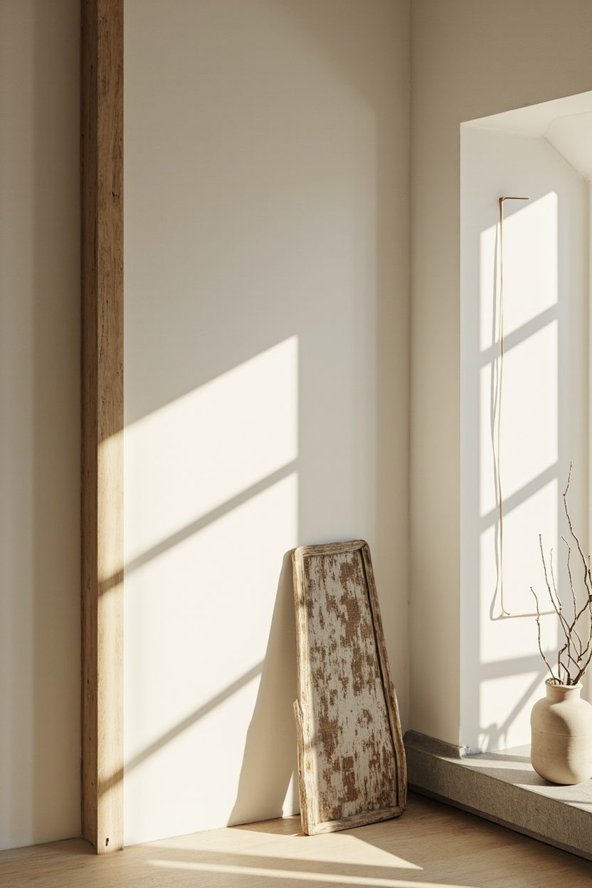
18. Calm Natural Light
Maximizing soft natural light is a cornerstone of eclectic minimalism—it lets carefully chosen objects breathe and reveals material nuance. Prioritize window treatments that filter rather than block: sheer linen panels, top-down shades, or motorized light-diffusing blinds preserve privacy while maintaining an even, calming glow.
Placement of reflective surfaces is a practical decision: a low-slung silvered mirror across from a window amplifies daylight without adding visual clutter. In rooms with limited glazing, supplement with warm layered lighting (wall sconce plus floor lamp) on a dimmer to mimic natural cycles; aim for 2700–3000K for a cozy, gallery-like effect.
Essential Elements
- Use sheer linen panels or light-filtering shades to maintain privacy and diffuse light evenly.
- Place a medium mirror opposite windows to increase daylight without crowding the room.
- Install layered lighting with dimmers, targeting 2700–3000K for ambient warmth at night.
- Keep window sills clear or styled with one low object to avoid blocking light and sightlines.
For a complementary decor approach, see 13 Minimalist Balcony Decor Ideas for Small Outdoor Spaces.
FAQ
Limit ornament to one focal antique or art piece per sightline, and balance with soft textiles and warm materials like wood or brass to maintain intimacy.
Yes—match seat height and visual weight: keep legs at a similar height and choose streamlined vintage pieces to harmonize with modern silhouettes.
Start with a neutral base (warm white, soft gray, earthy beige) and add one accent tone—muted terracotta, sage, or indigo kept at low saturation for personality without noise.
Consult floor-plan resources to determine clear circulation paths and furniture scale; a helpful primer is Small Home Floor Plans.
Final Thoughts
Eclectic minimalism is an editing exercise: choose fewer, better things and let materiality, light, and one well-chosen antique or pattern carry the story.
Be deliberate about scale, keep palettes restrained, and prioritize pieces that age gracefully. Those are the decisions that turn restraint into personality.